
Lessons. How to Make a Heatmap – a Quick and Easy Solution. The Heatmap In case you don't know what a heatmap is, it's basically a table that has colors in place of numbers.
Colors correspond to the level of the measurement. Each column can be a different metric like above, or it can be all the same like this one. It's useful for finding highs and lows and sometimes, patterns. On to the tutorial. Step 0. We're going to use R for this. Did you download and install R? Step 1. Like all visualization, you should start with the data. For this tutorial, we'll use NBA basketball statistics from last season that I downloaded from databaseBasketball. I'm assuming you started R already. Initial R window when you open it.
Now we'll load the data using read.csv(). We've read a CSV file from a URL and specified the field separator as a comma. Type nba in the window, and you can see the data. What the data looks like when you load it into R. How to Make Bubble Charts. A bubble chart can also just be straight up proportionally sized bubbles, but here we're going to cover how to create the variety that is like a scatterplot with a third, bubbly dimension.
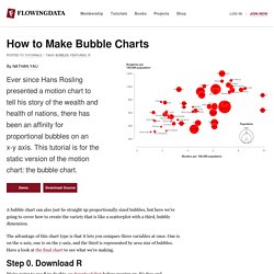
The advantage of this chart type is that it lets you compare three variables at once. One is on the x-axis, one is on the y-axis, and the third is represented by area size of bubbles. Agelab.mit.edu/system/files/Blue365Webinar.pdf. How to Conduct Hypothesis Test. This lesson describes a general procedure that can be used to test statistical hypotheses.
How to Conduct Hypothesis Tests All hypothesis tests are conducted the same way. The researcher states a hypothesis to be tested, formulates an analysis plan, analyzes sample data according to the plan, and accepts or rejects the null hypothesis, based on results of the analysis. Rock Report: Personalization in Consumer Health by @Rock_Health. Rock Report: Sensors. Q3 2012 Digital Health Funding Report by @Rock_Health. Rock Report: Big Data. Lecture 14 - Support Vector Machines. UC Berkeley Course Lectures: Analyzing Big Data With Twitter. Tutorials. How to Make a State Grid Map in R Something of a cross between a reference table and a map, the state grid provides equal space to each state and a semblance of the country to quickly pick out individual states.
How to Make Animated Line Charts in R Sometimes it's useful to animate the multiple lines instead of showing them all at once. How to Make a Multi-line Step Chart in R For the times your data represents immediate changes in value. Symbols-based Charts to Show Counts in R Add visual weight by using individual items to show counts. Introducing a Course for Mapping in R Mapping geographic data in R can be tricky, because there are so many ways to complete separate tasks.
How to Edit R Charts in Adobe Illustrator A detailed guide for R users who want to polish their charts in the popular graphic design app for readability and aesthetics. How to Make an Animated Map in R, Part 4 In the the last part of the four-part series, you make a longer animation with more data and annotate. The Faculty Project.
Www.thehighimpactnetwork.org/uploads/ag9zfnRoaW5rLW5ldHdvcmtyDgsSBk1vZHVsZRjK1gUM/THINK_Social_Resilience.pdf. Www.thehighimpactnetwork.org/uploads/ag9zfnRoaW5rLW5ldHdvcmtyDgsSBk1vZHVsZRiJlQYM/THINK_Self_Improvement.pdf. Www.thehighimpactnetwork.org/uploads/ag9zfnRoaW5rLW5ldHdvcmtyDgsSBk1vZHVsZRihjQYM/THINK_Making_Science_Better.pdf. Www.thehighimpactnetwork.org/uploads/ag9zfnRoaW5rLW5ldHdvcmtyDgsSBk1vZHVsZRjKygkM/Effective Activism Case Studies.pdf. Www.thehighimpactnetwork.org/uploads/ag9zfnRoaW5rLW5ldHdvcmtyDgsSBk1vZHVsZRjBoAoM/Finding Potential Effective Altruists.pdf. Www.thehighimpactnetwork.org/uploads/ag9zfnRoaW5rLW5ldHdvcmtyDgsSBk1vZHVsZRjM1gUM/THINK_Future_Generations.pdf. Www.thehighimpactnetwork.org/uploads/ag9zfnRoaW5rLW5ldHdvcmtyDgsSBk1vZHVsZRjkwgkM/Introduction to animal rights.pdf. Www.thehighimpactnetwork.org/uploads/ag9zfnRoaW5rLW5ldHdvcmtyDgsSBk1vZHVsZRib5gUM/THINK_Achievement_Through_Effort.pdf. The High Impact Network - Www.thehighimpactnetwork.org/uploads/ag9zfnRoaW5rLW5ldHdvcmtyDgsSBk1vZHVsZRiZ5gUM/THINK_Strategic_Planning_Module.pdf.
Memome Project QS London Oct 2012. A Physics Of Ideas - Measuring the Physical Properties of Memes. The Memome Project (Quantified Self London 2012) Udacity - 21st Century University. Course Catalog. Coursera.org. Social Media Videos. Skip to main content area Or try searching for it Case Foundation All Videos about Social Media Social Media for Good Videos Tabs Established by Jean and Steve Case in 1997, the Case Foundation invests in people and ideas that can change the world.

Social Media Publications. Emerging Technologies. Blogging. Upload & Share PowerPoint presentations and documents. You Suck At PowerPoint! Learn how to be an awesome entrepreneur. Top-tier management education minus the tuition. Having an impact. LearningJar: Make what you learn count. Physics. Chemistry. Organic Chemistry. Computer Science. Microeconomics. Probability. Venture Capital and Capital Markets. Valuation and Investing. Statistics. Khan Academy. Etsy Activity Feeds Architecture. UC Berkeley Video and Podcasts for Courses & Events.
Academic Video Lectures. Study Guides, Lecture Notes, Flashcards, Practice Exams, Lecture Videos. Enhance Your Icon Designing Skills - 35 Creative Tutorials. Every person who is using internet must watch the icons, because icons are the part and parcel of every site and we can say that icons also make some extra attraction in your site.
Icons not only play an important role for a website but also in many fields of the graphics designing. If you are also a designer then today I am going to provide you something interesting and valuable, so now for your icon designing isn’t a big deal you can easily improve your designing skills, below you can see the 35 creative and useful tutorials for all the people who want to have icon designing skills at their finger tips. USB Hard Drive Device Icon – Photoshop Tutorial USB Hard Drive Device Design. Create a Download Folder Icon in Photoshop In today’s tutorial we will demonstrate how to create a download folder icon using different shapes and reflections in Photoshop. Design a Vintage Radio Icon in Photoshop Photoshop Tutorial: Make A Glossy Flash Drive Icon From Scratch.
W3Schools Online Web Tutorials. HTML Tutorial. CSS Tutorial. General Assembly Online Classroom. General Assembly Online Classroom. General Assembly Online Classroom. General Assembly Online Classroom. General Assembly Online Classroom. General Assembly Online Classroom. General Assembly Online Classroom. General Assembly Online Classroom. General Assembly Online Classroom. General Assembly Online Classroom. General Assembly Online Classroom. General Assembly Online Classroom. General Assembly Online Classroom.
General Assembly Online Classroom. General Assembly Online Classroom. General Assembly Online Classroom. Business Models Template E145. The Art of the Pitching. The startup owners manual sxsw. Learn to code. University of the People – The world’s first tuition-free online university. Free Online Course Materials. Free Online Course Materials. Free Online Course Materials. 15.391 Early Stage Capital, Fall 2010. 15.351 Managing Innovation and Entrepreneurship, Spring 2008. 15.352 Managing Innovation: Emerging Trends, Spring 2005. 15.093J Optimization Methods, Fall 2009. 15.082J Network Optimization, Fall 2010.