
Nice Interactive Tracking U.S. Immigration Over Last 200 Years. Import. Tvořte infografiku jako profesionálové. Text článku:
10 free tools for creating infographics. Done right, infographics can be a great way to make sense of complex data.
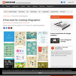
The best infographics transform complex information and data into graphics that are both easy to grasp and visually appealing. The only problem is, infographics that look like they were simple to make are often anything but. Exclusive offer: Save 15% on Adobe Creative Cloud now Here, we've selected our top free tools and apps for making infographics. Some of the options here are even suitable for non-designers, as templates and other features make them easy to use. Give these free tools a try and let us know which ones you get on best with on Facebook or Twitter. Course: Vizualizace informací se zaměřením na tvorbu infografiky, Topic: Co je to infografika a proč je vizualizace informací užitečná? Exhibit. Data Visualization Principles: Lessons from Tufte. The author's posts are entirely his or her own (excluding the unlikely event of hypnosis) and may not always reflect the views of Moz.
When I began to practice SEO 8 years ago, I never would have guessed that I'd be writing a post about data visualization. Perhaps I might have foreseen myself writing about web analytics or information architecture, but data visualization seemed like something for the statistics fans. But today in web marketing, the emphasis on content has never been stronger, and it just so happens that one eminently shareable form of content is the data visualization. And I've come to love the crap out of data viz. Another person that loves the crap out of data viz is Edward Tufte. David McCandless's Information Is Beautiful Blog is a must-bookmark, and his TED talk below is a great data viz primer. What's This Gotta Do With SEO? Alright, enough with the intro. Understanding of what makes great data viz great. Create and share visual ideas online.
Create infographics & online charts. Free Structured Web Data Scraping Tool. Piktochart - Create Easy Infographics, Reports, Presentations. Dashboard.
Infogr.am + Import.io - The Richest Football Teams Data + Viz. Gephi: z hromady dat přehledný grafický výstup. Youtube. Tři způsoby, jak si zdarma vytvořit vlastní infografiku. Autor: Katka Kalferstová 5.
Prosinec , 2012 Jednou z možností jak prezentovat velké množství dat a informací je infografika (skvělý způsob, kterým můžete informace publikovat ve zjednodušené grafické podobě a získat tak na atraktivnosti sdíleného obsahu). Co to je infografika a v čem vám pomůže. Současným světem hýbe nepředstavitelné množství informací.
Denně se jejich počet velice zvyšuje – neustále přibývají nějaké nové, stávající se aktualizují… Lidé, kteří chtějí být v obraze, se musejí probrat mnoha zprávami, což jim zabere spoustu času. Nejde však jenom o dobu strávenou nad novinkami ze zajímavých oborů, jedná se též o psychickou náročnost se s uvedenými daty vypořádat dobře, rychle a dostatečně vstřebat jejich obsah.
Právě tento fakt mohl přispět k vyvinutí infografik. The Do's And Don'ts Of Infographic Design. Advertisement Editor’s Note: You might want to read Nathan Yau’s article The Do’s And Don’ts Of Infographic Design: Revisited1 here on Smashing Magazine which is a response to this article.
Since the dawn of the Internet, the demand for good design has continued to skyrocket. From Web 1.0 to Web 2.0 and beyond, designers have remained on their toes as they define the trends and expectations of our online universe. The Internet is a great designer’s playground, and online businesses are growing more and more appreciative of what can be gained from a bit of well-executed eye candy. Over the past two years, this fact has become the backbone of a growing trend in online marketing: the infographic. Infographics are visual representations of information, or “data viz” as the cool kids call it these days. Infografika.cz - informujeme přehledně. Final Infographics (Pictures) The Best Resources For Creating Infographics. Infographics are visual representations of data design to help communicate information clearly.
They are great for English Language Learners, and the rest of us, too! The information can also be either serious or humorous. To see examples of some of the best ones, you can visit: The Best Infographics — 2010 The Best Interactive Infographics — 2009. The Graphic Works of Charles Joseph Minard. Michael Friendly Updated 06/12/2014 19:41:09 The following list of graphic works includes all of the known thematic maps and graphic tables produced by Minard from 1844--1870.
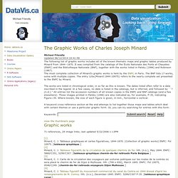
It was compiled from the catalogs of the École Nationale des Ponts et Chausées (ENPC) and the Bibliotheque Nationale (BNF), together with the works listed in Palsky (1996) and Robinson (1967). The works are listed in chronlogical order, in so far as this is known. The dates listed often refer to a date inscribed in the legend. In a few cases, no date is listed in the catalogs, but is inferred, and followed by ``? A keyword cross-reference section at the end attemps to list together those maps and tables which deal with certain themes or use a particular graphic form.
View the thumbnails page Graphic works 71 references, 24 image links; last updated 5/22/2006 1:13PM. Minard.png (PNG Image, 2003 × 955 pixels) - Scaled (51%)