
The Hobbit: The Desolation of Smaug - A Journey Through Middle-earth. Robots qui seront développés. JACKSONPOLLOCK .ORG by MILTOS MANETAS, 2003, a website readymade. Dataveyes est une start-up de visualisations interactives de données. Quand des classiques de la peinture s'animent. Portfolio de Michel Doudin - étudiant à l'école d'ingénieur IMAC (Image Multimedia Audiovisuel Communication) Paris/Est. This 3D-Printed Exoskeleton Could One Day Turn You Into a Cyborg.
For years, the military has worked on exoskeletons to help turn soldiers into heavy-lifting cyborgs.
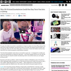
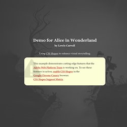
Now with the first civilian exoskeleton manufactured using a 3-D printer, the budding robosuit industry may someday get a little more DIY. If the military gets in on the trend, it means that soldiers could one day make their own combat exoskeletons using desktop computers. Demo for Alice's Adventures in Wonderland, by Lewis Carroll. 'There's certainly too much pepper in that soup!
' Alice said to herself, as well as she could for sneezing. There was certainly too much of it in the air. Even the Duchess sneezed occasionally; and as for the baby, it was sneezing and howling alternately without a moment's pause. The only things in the kitchen that did not sneeze, were the cook, and a large cat which was sitting on the hearth and grinning from ear to ear. jInvertScroll - A lightweight jQuery horizontal Parallax scrolling plugin. jInvertScroll - A lightweight jQuery horizontal Parallax Plugin What is it?
It's a lightweight plugin for jQuery that allows you to move in horizontal with a parallax effect while scrolling down. It's extremely easy to setup and requires nearly no configuration. Note: By using this plugin, we expect that you know the limitations of horizontal parallax scrolling, for instance if the screen height is smaller than the content, the content will be clipped, but this plugin is intended anyway for webdesigners and -developers, so we think that you know what you're doing. ;-) Quickstart 1.)
Position: fixed; // All scrollable elements have to be position:fixed bottom: 0; // Make it stick to the bottom (or top) width: xxxxpx; // I recommend to assign the width in px, prevents preloading issues. High-end PSD to XHTML convertion. Witmo.ro Witmo.ro aggregates learning opportunities for Romanian yougsters.
The challenge was to structure the site so that the information would be easy to access and to share. Witmo.ro Events Site Rockt.tv Jumpage When Rock.tv became a series of festivals, and not just one, they requested an jump page from us. Rockt.tv Jump Page Noflyers Noflyers is the portfolio website of the talented Cléophée Demoustier. Hot Dot. Hashima Island: A Forgotten World. Créez votre menu interactif en images en HTML/CSS ! Blur Menu with CSS3 Transitions. There are so many great things we can do with the additional properties and possibilities that CSS3 brings along.
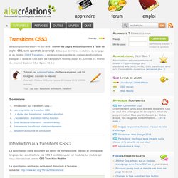
Today I want to show you how to experiment with text shadows and with transitions in order to achieve a blur effect that we'll apply to a menu on hovering over the elements. The main idea is to blur the other items while enhancing the one we are currently hovering. View demo Download source There are so many great things we can do with the additional properties and possibilities that CSS3 brings along.
Today I want to show you how to experiment with text shadows and with transitions in order to achieve a blur effect that we’ll apply to a menu on hovering over the elements. The images in the demos are by fabulous Mark Sebastian and they are licensed under the Attribution-ShareAlike 2.0 Generic (CC BY-SA 2.0) License. The Markup Let’s create the HTML structure for our menu first. 20 tutoriels pour créer un menu original avec HTML 5 et CSS 3 - ressources.
Blur Menu with CSS3 Transitions. Créer un menu horizontal centré en CSS (sans JavaScript) Cet article a 3 années.
Il commence à dater, lisez-le donc en gardant son âge en tête ! Merci publié le Lu 93 383 fois. C’est une chose qui peut paraître très simple à faire, mais sur laquelle beaucoup de personnes se sont cassés les dents. Tutoriel CSS3 : fonds multiples et animés. Tutoriel HTML-CSS : Effet de parallaxe en CSS. Un background animé en CSS3 - Blog Infoject' Présentation.
L'actualité du Web – Webdesign – Développement Web. CSS Débutant : tutoriels sur les CSS3. Réaliser des coins arrondis Arrondir les coins est sûrement l'un des effets graphiques les plus recherchés par les webdesigners.
Ressources et Tutoriels : transitions et animations en CSS3. Je le prédis comme une grosse tendance pour 2013 : l’adoption et l’utilisation massive d’animations en CSS3 pour agrémenter l’expérience utilisateur et apporter de l’originalité au design.

Les possibilités d’animation offertes par le CSS3 poussent l’interaction plus loin, et cela relativement facilement. Animez votre site avec CSS3 ! CSS3 Generator. Transitions CSS3. Beaucoup d'intégrateurs en ont rêvé : animer les pages web uniquement à l'aide de styles CSS, sans apport de JavaScript.
Grâce aux dernières évolutions du langage et au module CSS3 Transitions, il est désormais possible de réaliser des transitions basiques à l'aide de CSS dans les navigateurs récents (Safari 4+, Chrome 2+, Firefox 4+, Internet Explorer 10 et Opera 10.6+) La spécification est le document qui définit de manière claire, précise et univoque le langage. Les spécifications des CSS 3 sont découpées en modules. Le module qui nous intéresse est nommé CSS Transition Module. CSS3 Create - Démos, tutoriels et expériences CSS : menus, galerie photos, interfaces web. CSS Button Generator - Imageless CSS Buttons Simplified.