
A Periodic Table of Visualization Methods. Choisir le bon visuel pour ses données. HelpMeViz - Helping people with everyday data visualizations. Data visualization chart. Fundamentals-of-visual-analytics-6-new.jpg (JPEG Image, 1200 × 1000 pixels) - Scaled (85%) The Data Visualisation Catalogue. Visual analytics 101: when to use numbers vs. visualizations. Bar charts just so happen to be one of the best visualizations for comparing data.
Knowing the order of east region sales by Product Type, highest to lowest (Coffee, Espresso, Herbal Tea, and Tea), is much more important than knowing the actual numbers for any one metric (e.g., sales in the west region for herbal tea are $72,285). These examples get to the heart of this discussion: the point isn't just to have the data; the point is to understand the data, create insights, and make better decisions faster. Let’s discuss how to create these data-driven insights for a user through proper uses of numbers and careful selections of visualizations. Using numbers for precision rather than context It is often said that the three rules of real estate are “location, location, location.” Unfortunately, showing a bunch of raw numbers together (think of our crosstab from earlier) doesn’t create quickly consumable context, either. Many Eyes. Jeffrey Heer - Digital information. Datavisualization.ch Selected Tools.
E90E50charts - Excel Charts Gallery. Obama's 2014 budget proposal Iceberg chart Pie+ring Arrow chart - Critical step Combinatorics - with formatting Rectangle tangled Square chart with legend Arrow circle chart Percentage Chart.
A Periodic Table of Visualization Methods. Let's focus Export - Mapping Tools Radar visual literacy.pos. Version 2.6.
A simple and versatile visual brainstorming software supporting a variety of visual templates and methods (incl. mind mapping). www.mind-pad.com The Headcase Mind Mapper is a reasonably priced mind mapping program that - according to some reviews- is still quite buggy. www.nobox.de A comprehensive, high-quality mapping suite enabling concept and mind maps, as well as a variety of other formats, such as network diagrams or technical drawings. www.conceptdraw.com/ Supports a whole range of mapping methods, incl. Seven dirty secrets of data visualisation. Net magazine is the number one choice for the professional web designer and developer.
It’s here that you find out about the latest new web trends, technologies and techniques – all in one handy package. Each issue boasts a wealth of expert tips and advice, including in-depth features and over 30 pages of advanced front- and backend tutorials on subjects as diverse as CSS, HTML, JavaScript, WordPress, PHP, and plenty more. net compiles the hottest new sites from around the web, and being the voice of web design, our mission is to source the best articles written by the best people in the industry and feature interviews and opinions crammed with inspiration and creative advice.
In short, If you're serious about web design and development, then net is the magazine for you. Editorial. Représentation graphique de données statistiques. Un article de Wikipédia, l'encyclopédie libre.
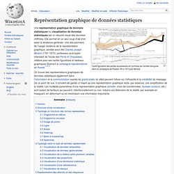
Carte figurative des pertes successives en hommes de l'armée française dans la campagne de Russie 1812-1813 par Minard Histoire[modifier | modifier le code] C'est à la fin du XVIIIe siècle, avec la publication en 1986 par William Playfair (1759-1823) d'un ouvrage intitulé The Commercial and Political Atlas, dans lequel l'auteur trace une série de graphiques de séries temporelles représentant l'évolution de données économiques concernant l'Angleterre et notamment l'évolution de sa balance commerciale au cours du XVIIIe siècle, que naît la représentation graphique moderne des données. Dans le même ouvrage, l'auteur représente aussi le premier diagramme en bâtons de l'histoire[5],[6],[7]. C'est aussi à William Playfair que l'on doit le premier graphique circulaire connu. La carte représentant le nombre de morts dû au choléra à Londres en 1854. Dans les années 1820, on commence à représenter des données statistiques sur une carte.
List of data journalism tools. Visualize Complex Data. Data can be overwhelming, intimidating, and obscure.
When you’re trying to make your case, it’s important that you convey the story to your audience. That’s where data visualization can play a big role. Here are a few of the potential benefits of visualizing your data: * Same data, very different presentationsFind new info in your data. Putting data in a visual format can reveal new patterns. And finally, a caveat: Ask questions. When you’re ready to go, here are some tools that I’ve found useful for visualizing different types of data: * Excel has some decent options for creating graphs and charts. * Mapbox is a great tool for polishing custom maps. * Tableau Public is a free tool with very flexible display features (but requires that your data be made public, so not good for confidential information). * Quantum GIS is an Open Source geospatial information system project.
Nos conseils pour réussir vos présentations PowerPoint.