
Make Dynamic Dashboards using Excel 2010 [Video Tutorial & FREE Download Workbook] Posted on December 8th, 2010 in Charts and Graphs , Pivot Tables & Charts - 55 comments Do you know that Excel 2010 makes creation of dynamic dashboards very simple?
![Make Dynamic Dashboards using Excel 2010 [Video Tutorial & FREE Download Workbook]](http://cdn.pearltrees.com/s/pic/th/dashboards-tutorial-download-23828174)
Yes, that is right. Using slicers feature, you can create dynamic excel dashboards from your data in very little time. Today we are going to learn a technique that will help you create a dashboard like below. (Note: The technique works only Excel 2010 or above.) [View the dashboard image in large size] How to make a Dynamic Dashboard in Excel using Pivot Tables & Slicers I made a short (12 min) video tutorial explaining the concept and construction of this dynamic dashboard.
[Watch the dynamic dashboard tutorial on YouTube] If you are new to Pivot Tables, Read this excellent pivot tables tutorial & watch the video on pivot tables. Download Dynamic Dashboard Workbook: Click here to download the Excel 2010 workbook. Do you use Slicers? I have been using Excel 2010 for the last several months. What about you?
More awesome tips for you: Excel Dashboards - Templates, Tutorials, Downloads and Examples. Dashboard reports allow managers to get high-level overview of the business.
Excel is an excellent tool to make powerful dashboards that can provide analysis, insight and alert managers in timely manner. In this page (and others linked here) you can find a lot resources, templates, tutorials, downloads and examples related to creating dashboards using Microsoft Excel. Use the below links to quickly access various sections of this page. What is a Dashboard? Dashboard reports allow managers to get high-level overview of the business and help them make quick decisions. How to create speedometer/gauge chart in Excel? Have you ever imaged to create a speedometer chart in Excel?
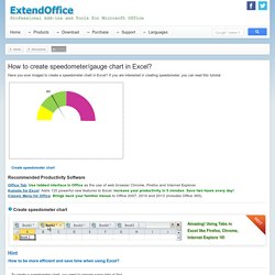
If you are interested in creating speedometer, you can read this tutorial. Create speedometer chart Recommended Productivity Software Office Tab: Use tabbed interface in Office as the use of web browser Chrome, Firefox and Internet Explorer.Kutools for Excel: Adds 120 powerful new features to Excel. Increase your productivity in 5 minutes. Create speedometer chart Hint To create a speedometer chart, you need to prepare some data at first. 1. 2. Tip: In the Cell D4, type this formula =360-(D2+D3). 3. In Excel 2013, click Insert > Insert Pie or Doughnut Chart. Ms-office - Excel - Create A Speedometer Chart Tutorials.
[Previous] [Contents] [Next] You can create a really impressive, workable speedometer (or "speedo") chart, complete with moving needle, by using a combination of doughnuts and pie charts.
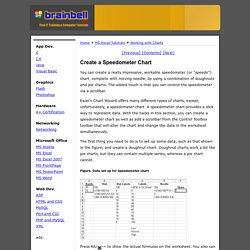
The added touch is that you can control the speedometer via a scrollbar. Excel's Chart Wizard offers many different types of charts, except, unfortunately, a speedometer chart. A speedometer chart provides a slick way to represent data. With the hacks in this section, you can create a speedometer chart as well as add a scrollbar from the Control Toolbox toolbar that will alter the chart and change the data in the worksheet simultaneously. The first thing you need to do is to set up some data, such as that shown in the figure, and create a doughnut chart. Figure. Press Alt/ -~ to show the actual formulas on the worksheet.
Now highlight the range B2:B5 and select the Chart Wizard. Figure. Figure. Figure. At this point, the speedometer is starting to take shape. Chart Size Export Picture Text Size. Speedometer kpi dashboard - Excel KPI Templates. Speedometer KPI Dashboard The speedometer kpi dashboard offers a spectacular visualization to present sales performance of representatives.
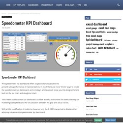
In Excel there are more “tricky” ways to create the speedometer kpi dashboard, and in today’s article we will show you the designs that are built on the pie chart and doughnut chart. The created speedometer kpi dashboard could be a useful instrument for other (not only for marketing/sales) fields also for visualization between the goal and actual values. With a little modification it is able to show not only the 0-100% range but to display other arbitrary values on the speedometer kpi dashboard. In the first step we have to create the data structures used by the dashboard and fill them up with the desired values. In the first data table there is the performance of the sales representatives (their name, actual value and goal value) which here we filled out with arbitrary values.