
960 Grid System. About rich snippets - Webmaster Tools Help. Css Zen Garden: The Beauty in CSS Design. The Perfect 3 Column Liquid Layout: No CSS hacks. SEO friendly. iPhone compatible. Download this layout (25kb zip file).
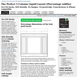
Percentage dimensions of the holy grail layout All the dimensions are in percentage widths so the layout adjusts to any screen resolution. Vertical dimensions are not set so they stretch to the height of the content. Frameworks for Designers. These days, “framework” is quite a buzzword in web development.
With JavaScript frameworks like the Yahoo User Interface library, jQuery, and Prototype getting a lot of attention and web application frameworks like Rails and Django getting even more, it seems like everyone is using some kind of framework to build their sites. But what exactly is a framework? And are they only useful to programmers, or can we web designers benefit from the concept, as well? Microformats. CSS Full property table. A Comprehensive Guide to CSS Resets. This guide examines the infinite-like variety of CSS resets created by web developers and designers across the world.
CSS Reset.com - CSS Resets and Free CSS Tutorials & Resources. CSS-Tricks. Here is an example of a simple three-column class: Of which you would apply to a block of text like so: <p class="three-col">Pellentesque habitant morbi tristique senectus et netus et malesuada fames ac turpis egestas.
Vestibulum tortor quam, feugiat vitae, ultricies eget, tempor sit amet, ante. Donec eu libero sit amet quam egestas semper. Aenean ultricies mi vitae est. Example Pellentesque habitant morbi tristique senectus et netus et malesuada fames ac turpis egestas. Note that the height of each column is auto-balanced, as per the spec. Also note this demo and sample code is using moz and webkit vendor prefixes, should only work in Gecko (Firefox 1.5+, et al.) and Webkit (Safari 3+, Chrome, et al.) browsers.
All Related Properties You can also set the column-width (with prefixes) but it generally makes more sense to let it auto calculate that. The rule ("rule", as in, a line) will split the gap down the middle. Guide to Cascading Style Sheets. Also available in Chinese, Japanese, and Spanish Style Sheets Now!
Change the appearance of hundreds of Web pages by changing just one file... Influence presentation without losing visitors... All with the power and flexibility of Web style sheets. All About Floats. What is "Float"?
Float is a CSS positioning property. To understand its purpose and origin, we can look to print design. In a print layout, images may be set into the page such that text wraps around them as needed.
CSS3.com – A comprehensive CSS 3 reference guide, tutorial, and blog StatCounter Global Stats. Tutorial 8 - Step 1. Tutorial 8 - Liquid two column layout Step 1 - Start with the semantically marked up code To lay out a page into two columns, you need to start with the basic page structure.
In this case we will use some dummy content to create a two column template. The page has been grouped into five separate divs, and each of these divs has been given a unique ID selector. The divs are labeled; "container" (wrapped around the entire page's content), "top" (for the top banner), "leftnav" (for the smaller, left column), "content" (for the main content) and "footer" (for the footer across the bottom of the page).
For this tutorial, obvious names have been used to help illustrate the point, but any name can be used. Go to Step 2 → Subheading Lorem ipsum dolor sit amet, consectetuer adipiscing elit, sed diam nonummy nibh euismod tincidunt ut laoreet dolore magna aliquam erat volutpat. CSS examples - Equalising columns. ::You are here: Home > Equal Columns Before you start you should know that the only element that will base its height dependent on another elements height is a table-cell.
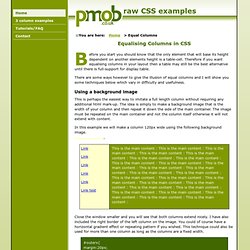
Therefore if you want equalising columns in your layout then a table may still be the best alternative until there is full-support for display:table. There are some ways however to give the illusion of equal columns and I will show you some techniques below which vary in difficulty and usefulness. Using a background image This is perhaps the easiest way to imitate a full length column without requiring any additional html mark-up. In this example we will make a column 120px wide using the following background image.
Close the window smaller and you will see that both columns extend nicely. Eric Meyer: CSS. CSS Work Books by Eric Including Smashing CSS, CSS: The Definitive Guide, Third Edition, CSS Pocket Reference, and Cascading Style Sheets 2.0 Programmer’s Reference, among several others.

Articles by Eric Local copies of CSS articles, as well as other writing I've done. Inline model document A terse, but hopefully complete, description of how the CSS inline box model really works. Color equivalents table All 147 SVG-derived color keywords permitted in CSS3 in a sortable table showing the keywords with their equivalents in both hexadecimal notations, both (non-alpha) RGB notations, and non-alpha HSL. CSS Module Timelines A visualization of the activity of the CSS Working Group by plotting draft publication dates and W3C statuses over time.
ID.