
Logo Inspiration Gallery. World's finest selection of logos. Ambigram logos. An ambigram, also sometimes known as an inversion, or flipscript, is a graphical figure that spells out one or more words not only as presented, but also in another direction or orientation (from Wikipedia).
Here are a few examples, with ambigram resources afterward. Aerosmith John Langdon designed this logo for Aerosmith. “Created to be a gift from Dan Brown to Stephen Tyler. I was able to retain the look of Aerosmith’s long-standing logo, while turning it into a rotational ambigram.” John has written some great tips for those wanting to create their own ambigrams, and I’ve referenced his website in the resources below. Wachovia More info about Brian Risk’s take on the Wachovia logo.
Balance A personal design from Agency26. Edge Edge logo, designed by Raja Sandhu. Ann Logo designer: Kevin Burr of Ocularink. Delorean Motor Company Designed by Phil Gibbon, this one’s a mirror-image ambigram, for the car made famous in Back to the Future. Nine Inch Nails For the band Nine Inch Nails. Blacksmith Society 27. The Logo Factory Design Studio. Logo Design & Brand Identity Agency. Download vector logos and logotypes.
40 More Clever Logos With Hidden Symbolism. You probably already think that we are obsessed with logo design (and you’re probably right), but our numbers show that most of you guys enjoy logos as much as we do.
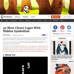
That’s why we proudly present 40 more clever logos with hidden symbolism. If you missed part I, you can find it here. But before you start scrolling down the list, let me quickly run trough the list of logotype posts we had earlier: Top 15 Worst Logo FAILS Ever, 21 Logo Evolutions of the World’s Well Known Logo Designs, and Honest Logos by Viktor Hertz. You may open them somewhere in a new browser tab and continue from here. [Read more...] Oh, and don’t forget to tell us which logo design you liked or hated most! 1. Letters “c” are also cat’s eyes. 2. A swarm of bees forming a “B”. 3. The mouse cursor and the dot forms a sign of a female. 4. There’s a hidden tie in the logo. 5. The golf ball is lit like a moon. 6. The missing puzzle part is also a pictogram of a human.
83 Crazy/Beautiful Letterhead and Logo Designs. Inspiration December 22, 2009 Whap! Like a flash of satori, your company letterhead should be a slap in the face of consciousness. The whole point is to grab your readers’ attention by the throat on first contact, then make them beg for more in the long run. Considering the chronic short-attention span of a generation raised on cable TV and the internet, this is saying a lot. I’ve gathered 83 of the most eye-popping letterhead designs so far to illustrate my meaning. Creating your own letterhead design? Author: Cadence Wu Cadence is You The Designer's senior blogger, and the most jack-of-all-trades of the staff. Logo Design Love. The best 15 simple logos. It’s no coincidence that the most memorable logos are also the most simple in appearance.
You want the identities you create to be instantly recognisable, acting as a memorable identifier for the company they represent. A consumer will normally just take a fleeting glimpse at a logo, and an overly complex mark will make that opportunity redundant. Here are 15 examples of simple, successful designs. 1/ WWF Designed by Sir Peter Scott, in 1961. 2/ Shell Designed by Raymond Loewy, in 1971. 3/ Bayer Designed by Bayer, in 1904. 4/ Message Designed by Sam Dallyn, in 2001. 5/ USA Network Designed by Peloton Design, in 2005. 6/ Innocent Designed by Deepend, in 1999. 7/ British Golf Museum Designed by Tayburn, in 2004. 8/ London Underground Designed by Edward Johnston, in 1918. 9/ Mitsubishi Motors Designed by Yataro Iwasaki, in 1870. 10/ Shelter Designed by Johnson Banks, in 2003.