
Typography. Responsive CSS Framework Comparison: Bootstrap, Foundation, Skeleton. Bootstrap 4.0.0-alpha is a fairly large update to the framework.
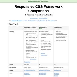
It has dropped Less support in favor of Sass, converted from px-based to rem-based sizing, improved its grid system, and dropped IE8 support. Also, all its JS plugins were re-written in ES6, it now uses a customized reset CSS file called Reboot, and offers flexbox support via a Sass boolean variable. In addition to this update, Bootstrap now offers themes at themes.getbootstrap.com. Also, Bootstrap will continue supporting version 3, unlike the dropping of version 2 support after the release of version 3. You can read more here. Foundation 6 is a fairly major update which includes more grid flexibility, custom breakpoints, optional flexbox, and more.
Like Bootstrap 4, Flexbox is now toggleable via Sass in Foundation 6. The Sass/CSS has been reworked and consolidated, and there are fewer default styles to override on common elements. Skeleton 2 was updated in December 2014 after remaining mostly unchanged for about three years.
Responsive Web Design. The English architect Christopher Wren once quipped that his chosen field “aims for Eternity,” and there’s something appealing about that formula: Unlike the web, which often feels like aiming for next week, architecture is a discipline very much defined by its permanence.
Article Continues Below A building’s foundation defines its footprint, which defines its frame, which shapes the facade. Each phase of the architectural process is more immutable, more unchanging than the last. Creative decisions quite literally shape a physical space, defining the way in which people move through its confines for decades or even centuries. The Golden Grid - A complete grid system for super fast wireframing and visual design. Responsive Design with CSS3 Media Queries. Screen resolution nowsaday ranges from 320px (iPhone) to 2560px (large monitor) or even higher.
Users no longer just browse the web with desktop computers. Users now use mobile phones, small notebooks, tablet devices such as iPad or Playbook to access the web. So the traditional fixed width design doesn't work any more. Web design needs to be adaptive. The layout needs to be automatically adjusted to fit all display resolution and devices. View Demo Responsive Design Download Demo ZIP See It in Action First Before you start, check the final demo to see how it looks like. More Examples. 25 Awesome Still Life Digital Paintings for Inspiration. Inspiration February 22, 2012 There used to be a time when paintings were accomplished only by putting brush on canvas.
However, with the growth of technology, all genres of art evolved with time. Today, digital paintings have emerged as a wonderful category of art — one that combines both precision and enigma. In this article, we take a look at some stunning digital paintings. All of these capture still life at its best! 1949 by robertmekis Apple by katzai boy with a coin by Fleana93 Color Study 2 by TheBlackVerse Dragonblood by ELConsigliere Feather Fruit Skull by KatePfeilschiefter Fruit Bowl by saintchase Grapes by KoryTheAnimator Heartburn by phantastes Mindcage by I-NetGraFX Happy New Lunar Year by fxEVo Night at the Saloon by DawnFrost Pen and Ink by LancerMoo Pomegranate Still Life by Hamsterfly Purity by ebrulii Red Queen by ketka Rose Coffee by depingo Still Life by tincek-marincek. 40 Adorable Digital Paintings of Animals (and Other Cute Creatures) Inspiration July 13, 2011 Cuteness can easily disarm even the most heartless of persons…at least sometimes.
It can certainly make the more soft-hearted smile broadly at a cute kitteh battling with all his might to conquer a pack of pasta or a strawberry gold fish about to be swallowed whole by a shark. (Wait, that doesn’t sound right, does it?) It is remarkable to see how well cuteness can be rendered through digital paintings and it made it difficult, on our end, not to share.
22 Free WordPress Themes with Responsive Layout. One of the most discussed topics at the moment, amongst WordPress users is undeniably a responsive web design.
It is in response to the vast type of users opting to use mobile devices like Android, iPhone, iPad, and tablets besides computer. These devices will use different size of resolutions each, which requires the website to response with the respected type of device’s resolution. Sounds like left behind? Do not worry. Herewith we present you with 22 free WordPress themes with responsive layout. Thematic 320 And Up Demo | Download Ari Demo | Download Blaskan Demo | Download BonPress Demo | Download Codium Extend Demo | Download Constellation. Less Framework 4.
I called Less Framework "a CSS grid system for designing adaptive websites".
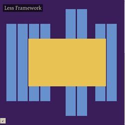
It was basically a fixed-width grid that adapted to a couple of then popular screen widths by shedding some of its columns. It also had matching typographic presets to go with it, built with a modular scale based on the golden ratio.