
Equal Height Columns with Cross-Browser CSS and No Hacks. By Matthew James Taylor on 17 October 2008 Creating equal height columns with CSS is not as easy as it may first seem.
This tutorial highlights the display problems that occur with multiple column layouts, and then shows a simple solution that works in all common web browsers. The method shown here is 100% CSS hack-free, image-free and JavaScript-free so it can even be used on the most strictly coded websites. For those who want some action immediately check out my demo pages: 2 column, 3 column, 4 column and 5 column. Also see my Perfect multi-column CSS liquid layouts - these use the same equal height column CSS principles as discussed below.
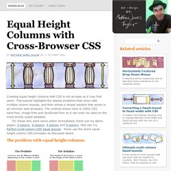
The problem with equal height columns In the example above we have three columns each with a different amount of content. Separating the column content from it's background colour The first step to solving the equal height problem is to break it into smaller pieces that can be solved separately. Three column HTML div structure Three column CSS. How a Simple Layout Can Be Mixed ‘n’ Matched with Patterns, Photos and Backgrounds. It's pretty amazing how much colour and background can change the look and feel of a website.
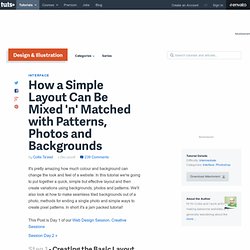
In this tutorial we're going to put together a quick, simple but effective layout and then create variations using backgrounds, photos and patterns. We'll also look at how to make seamless tiled backgrounds out of a photo, methods for ending a single photo and simple ways to create pixel patterns. In short it's a jam packed tutorial! Step 1 - Creating the Basic Layout So our first task is to design a layout for our page. Now I should point out in reality I didn't actually draw out this set of boxes quite like this. Step 2 - Fleshing it out So that layout is our bones, now we need to flesh it out with some dummy content and a colour scheme. As you can see I haven't done anything really amazing here, just placed the elements on the page fairly neatly and evenly. Note that these are just rough guides and I actually just work by eye until things look right.
Step 3 - Polishing and Adding Some Style. Using CSS Text-Shadow to Create Cool Text Effects. The CSS3 text-shadow property has been around for some time now and is commonly used to recreate Photoshop’s Drop Shadow type shading to add subtle shadows which help add depth, dimension and to lift an element from the page.

This isn’t all the text-shadow property is capable of though, by getting creative and playing around with the colours, offset and blurring we can create some clever and pretty cool text effects! Check out the six text effects of vintage/retro, inset, anaglyphic, fire and board game in the demo, then copy the code snippets below to use the effects in your own designs. Needless to say you’ll need a text-shadow supporting browser (Safari, Chrome, Firefox) to see them in all their glory. View the demo The text shadow CSS property is used to add shading to any text related HTML element. Text-shadow: 5px 5px 0px #eee, 7px 7px 0px #707070; How it works: View the demo The neon text effect is made up of 8 levels of shading.
View the demo text-shadow: 0px 2px 3px #666;