
Typographie. A blog on typography. 26 Symbols. RM Regular. Home — Typofonderie. Design Inspiration / Bench.li. Typesites. Betatype. Font.is. Ralf Herrmann: Wayfinding & Typography. Font Bureau Blog. David Berlow’s Custer RE is the latest addition to our Reading Edge (RE) series.
This typeface is the tenth RE family and is available today at Webtype. Learn more about it on the Webtype Blog. More ... In honor of Mike Parker, we present a tribute to honor his work and share stories from colleagues. With contributions from David Berlow, Roger Black, Matthew Carter, Frank Romano, Cherie Cone, and more. ➝ Fontbureau.com/MikeParker More ... Today we announce Matthew Carter’s new typeface, Big Moore. More ... On Wednesday, March 26th from 5:00–7:00 there will be an opening reception at Lesley University for our exhibit, DISPLAY:TEXT, followed by a public talk from Cyrus Highsmith. More ... Type designer David Jonathan Ross. Forma is a neo-grotesk typeface by the Italian type foundry Nebiolo. Roger Black first saw Forma at the Nebiolo stand during the Drupa exhibition in 1977. More ... We’d like to thank everyone for the support in recent days.
More ... Then one day ... More ... More ... More ... Swiss Legacy, by the initiative of Art Director Xavier Encinas, is a blog focused on typography, graphic design and inspirational matters. Phinney on Fonts. The Ministry of Type. Here’s a glorious bit of design nostalgia for the New Year.
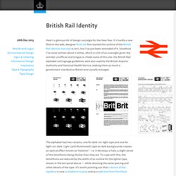
It’s hardly a new find on the web; designer Nick Job first started this archive of the British Rail identity manuals in 2011, but I’ve just been reminded of it. Somehow I’ve never written about it either, which is a bit of an oversight given the entirely-unofficial and tongue in cheek name of this site: the British Rail alphabet and signage guidelines were also used by the British Airports Authority and National Health Service, making them as much a government standard as Britain ever usually manages.
The alphabet had two variants, one for dark-on-light type and one for light-on-dark. Light (and illuminated) type on dark backgrounds creates an optical effect known as ‘halation’ - i.e. it develops a halo, a slight sense of the letterforms being thicker than they are. And that’s a real shame, for so many reasons. Pointypo– - L’actualité typographique en français. Holy Onomatopoeia, What A Bat-collection! Although its release is still almost two months away, anticipation for The Dark Knight Rises – the third act in Christopher Nolan’s re-imagination of the Batman mythos – is… errr… rising to a fever pitch.
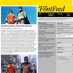
This is partly due to the incredible success of that other superhero blockbuster The Avengers which has been shattering all kinds of box office records (over 1 billion dollars!?). Nolan’s stylishly contemporary and edgy version may make us forget that Batman’s adventures on the screen started in a rather goofy way. The deliciously campy television series, in which the ludicrously straightlaced Caped Crusader battled evil in this parody of the comics, ran for three seasons from 1966 to 1968. Before going on the air, this show received the worst audience test scores in the history of ABC.
It only went on the air because so much money had already been invested in it. One characteristic of Batman was the frequent use of onomatopoeias during the fight scenes. . … and horizontal direction. Fonts, Typography, Lettering, Design. A2-TYPE. SpiekerBlog. 28 Top Typography Blogs Ranked by Top Graphic Design Blogs.