
Étapes: design & culture visuelle. Blog Marketing - Digital - Publicité. Smashing Magazine — For Professional Web Designers and Developers. Online Portfolios on Behance. Dossier pédagogique / L'identité visuelle du Centre Pompidou. Intégral Ruedi Baur Paris. NounProject. Fubiz™ BVLGARI - NEW OCTO WATCH COLLECTION. Armin hofmann. Il y a longtemps que j'ai entrepris une réflexion sur la pédagogie du design graphic et de la manière d'adapter les principes fondateurs de cette pédagogie à l'environnement numérique et interactif dans lequel les étudiants du monde entier sont plongés depuis une dizaine d'années.
C'est un débat que je souhaite entamer avec les professionnels et les enseignants parce qu'à l'heure des futurs clics d'or il est plus qu'important de baliser les fondamentaux qui régissent la qualité de la création. Je voulais par la même occasion signaler le travail assez phénoménal qu'à réalisé un enseignant de l'école supérieur d'art appliqués de Bourgogne, Thierry Chancogne dont vous pouvez télécharger à l'adresse ici, l'intégralité de son cours au format pdf. Une somme qui a le mérite de balayer très large tous les champs d'investigations connus à ce jour dans le périmètre de la pédagogie des arts appliqués, et surtout de la communication.
Concernant les lignes : Helmo, Thomas Couderc & Clément Vauchez. April greiman. Graphic Thought Facility. Swiss Federal Design Awards - Karl Gerstner. Atelier Cédric Gatillon. Adrian Frutiger. Information about the typeface designer Adrian Frutiger and his fonts.
Adrian Frutiger was born in 1928 at Unterseen near Interlaken, Switzerland. After an apprenticeship as a compositor, he continued his training in type and graphics at the Zurich School of Arts and Crafts (Kunstgewerbeschule) from 1949 to 1951, being taught by two renowned professors, Alfred Willimann and Walter Käch. Frutiger went to Paris in 1952 and worked as typeface designer and artistic manager at Deberny & Peignot. His first typeface creations were Phoebus (1953), Ondine (1954) and Meridien (1955), and through the foundry's connections with Photon/Lumitype Frutiger created some of the earliest typefaces for photocomposition. He established his international position as a typeface designer with his Univers sans-serif font, produced for metal and film in 1957. In addition to his typeface design, Frutiger has been a consultant to IBM and the Stempel typefoundry.
(Photograph reproduced courtesy of fontblog.de.) Frost* Design. Pixelcreation.fr Graphisme : expositions artistes et techniques: Wim Crouwel: a graphic odyssey. David carson design. DES SIGNES – Muchir et Desclouds - Studio de graphisme à Paris – ACTUALITÉS. Yulia Brodskaya : Yulia Brodskaya. Michel Bouvet. Lucian Bernhard. The Priester Match poster is a watershed document of modern graphic design.
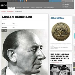
Its composition is so stark and its colors so starling that it captures the viewer's eye in an instant. Before 1906, when the poster first appeared on the streets of Berlin, persuasive simplicity was a rare thing in most advertising: posters, especially tended to be wordy and ornate. No one had yet heard of its young creator, who, thanks to this poster, was to influence the genre of advertising know as the Sachplakat, or object poster. Over the course of his career, which progressed from the turn of the century to the 1950s, Lucian Bernhard became a prolific designer not only of innovative posters but of trademarks, packaging, type, textiles, furniture, and interior design.
From his studio in New York City (he left Berlin in 1922), he developed some of the most recognizable American business advertising and trademarks, for such clients as Cat's Paw, ExLax, and Amoco. RUEDI BAUR - RUEDI ET VERA BAUR. Michal Batory. Marian Bantjes. ANTOINE+MANUEL. Bibliothèque Design. Marion Bataille.