
18 Dos and Don’ts Of Usability On The Web. Are you a web designer or do you run a website? Good, because this article is for you. If you’re designing websites for a living or running your business online, there are 18 tips in this article that you should definitely read and remember. You can have the best visual design skills on the planet, but if you build a website that works like crap and doesn’t allow the visitor to feel comfortable going from item to item and page to page, you are missing the very core of a good website design.
So in today’s article I’m going to go over some of the dos and don’ts of usability on the web. Do utilize a grid for your website structure Before you get upset and start screaming that a grid is a box for creativity, I’m not saying to ensure your entire site is boxed in. Do Not forget your search form A lot of people will go to your site and immediately look for a search box. Do make your navigation easy to find & readable Do Not make your “contact” link in your navigation bar a mailto: link O.K.
18 Dos and Don’ts Of Usability On The Web. The myth of the page fold: evidence from user testing. As web professionals, we all know that the concept of the page fold being an impenetrable barrier for users is a myth.
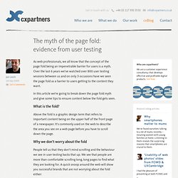
Over the last 6 years we’ve watched over 800 user testing sessions between us and on only 3 occasions have we seen the page fold as a barrier to users getting to the content they want. In this article we’re going to break down the page fold myth and give some tips to ensure content below the fold gets seen. What is the fold? Above the fold is a graphic design term that refers to important content being on the upper half of the front page of a newspaper. It’s commonly used on the web to describe the area you see on a web page before you have to scroll down the page. Why we don’t worry about the fold People tell us that they don’t mind scrolling and the behaviour we see in user testing backs that up. BBC, Play, Amazon.co.uk and the New York Times websites showing the position of the page fold Adding evidence from user testing. 11 Common Web Design Mistakes (Blunders)
There are tons of website on the Internet, and hundreds or probably thousands are created by day.
Here’s a very interesting thing to ponder – What are the elements of a good website? Image Credit: tveskov Building a website can be daunting but the real challenge lies in making it usable. The problem is most web designers forget that the website wasn’t created for themselves but to solve the users’ needs. They give creativity priority over practicality and usability.
In this article, we would like to highlight 11 web design blunders that web developers and designers make and some suggestions how these mistakes can be easily avoided. 1. The web is like an archive of information. Suggestions:Google Custom Search is a neat, simple and effective way to get started. Here’s a simple form code to display Google’s search engine on your site too. Save the Pixel. Most people who come to most sites give up without getting what they came for.
That costs web site owners billions every year. How much is your poor web page design costing YOU? What concerns me is that the reason why most sites fail is not from lack of cleverness or creativity. (In fact, it’s usually the reverse.) Designers and site owners just need to learn web design techniques that actually work. Price slashed from $27 to ONLY $19! And it’s backed by my 100% guarantee! I have been designing web sites for over 15 years, and have seen thousands of examples of what works – and what fails. Discover Web Design Techniques to Make Your Sites More Effective I would like to pass that approach on to you, so that you can apply the principles and boost your web site’s profits. “Save the Pixel” gives you a clear step-by-step guide you can apply today to make your web site more effective.
New! You don’t need to be a designer to get the benefit of this web design book. Simplicity is the Key Layout Space Ken. Advanced Common Sense.