

20 Fantastic pseudo-Flash websites. A pseudo-Flash website is one that looks, feels and acts like a Flash website but is in fact built on good old-fashioned HTML and CSS.
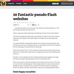
There is usually also a dash of JavaScript to bring things to life and round out the interface. The result is often beyond what we have come to expect of HTML and CSS, which is why we might assume the website is Flash-based. Right-click, though, and you will be pleasantly surprised. I am keenly interested in pseudo-Flash websites, and I talk about the topic frequently. Flash has obviously lost some of its edge (though is by no means gone), and the focus has shifted to the core technologies of the web (HTML, CSS, JavaScript).
Detecting device size & orientation in CSS. Gone are the days when we could safely assume that most our site visitors would have at least a 1024px-wide screen resolution.
iPad Peek. iPad-Specific CSS. 25 Free and Premium Mobile Website Templates and Layouts. At present smartphone has been considered as one of the main trusted platforms for web related works.
People love to do their web related jobs on their smartphones while they are not in front of their PCs. Since the latest smartphones give them the freedom of browsing internet at anytime, anywhere, people like to enjoy this service to the fullest. That is why most of the website owners also try to have the mobile version of their sites. The reason behind this is obvious and can easily be understood; they want to capture and utilize the huge market of their potential customers through this service who spend more time with mobile phones than with laptops and PCs. However, the experts claim that the introduction of iPad, iPhone or Smartphone is responsible for the craze of internet browsing through smaller devices like smartphones. Target iPhone and iPad with CSS3 Media Queries.
When designing a website, it’s always a good idea to test on as many different platforms, devices, and browsers as possible.

These days, pimping your websites for the iPhone and iPad is an important step in the design process. Especially on the iPad, sites tend to look about 20% cooler than on desktop browsers, so you definitely want to take the time to fine-tune the details. And when dealing with iDevices, it’s often necessary to deliver some custom CSS to make everything just right. Want to apply CSS styles to the iPad and iPhone? Here is the plug-n-play, copy-&-paste code that actually works. As you may have heard, I’ve been super-busy behind the scenes building an Angry-Birds fan site, of all things.
Target iPad & iPhone with separate CSS files. Tutorial: optimizing your website for mobile devices - Element Fusion. Please note: This article was created in 2009, so the screen dimensions and/or phone names might be out of date.

Since we announced our optimization of the Element Fusion website for mobile devices including the iPhone, we've had quite a few requests to share the steps that were taken to complete this task. While there are different ways to accomplish such a task, the following is a look at how we did it. NOTE: the site used in this example runs our company's own content management system for web designers, LightCMS, but the technique described here can be implemented in static websites as well as sites running on any CMS that, like LightCMS, provides you with full control over your HTML, CSS and JS.
Phone considerations For our purposes, we divided all mobile devices into three categories. The 5-Minute CSS Mobile Makeover. More people are surfing the Web via mobile device than ever before.
It’s just so convenient to have that mobile access to anything you need. Sadly, most websites have not yet considered their mobile visitors, who probably move on to the next site before trying to make sense of a jumbled mess. 10 tips for designing mobile websites. 10 tips for web designers in 2010 - the year of the mobile. 1.
Design with a fluid layout, min-width: 320px There are two factors that make this a necessity. First, mobile device screens are so small that you really need to utilise all of the available space. Second, there are a lot of different screen resolutions out there. Gridless - An awesome boilerplate for responsive, cross-browser websites. Seven Guidelines For Designing High-Performance Mobile User Experiences - Smashing Magazine. Advertisement A positive first impression is essential to relationships.

People look for trust and integrity, and they expect subsequent encounters to reflect and reinforce their first impression. The same principles apply to brands and their products. Design plays an important role in building lasting relationships with end users and, thus, in supporting the brand’s promise. Media Queries for Standard Devices. If you think responsive's simple, I feel bad for you son.
We got 99 viewports, but the iPhone's just one. —Josh Brewer, March 10, 2010 A major component of responsive design is creating the right experience for the right device. With a gazillion different devices on the market, this can be a tall task. Mobile Apps. Media queries & Drupal. This article is pretty old now and may or may not be accurate, please get in contact if you are looking for some help with your Drupal media queries Media queries are getting more and more popular in web design to allow your web site to change depending on the screen resolution, or screen orientation.

It is very simple to add media queries to your Drupal theme. To define a CSS file in your Drupal theme's info file you would usually write declarations such as: stylesheets[all][] = style.css or stylesheets[screen][] = style.css etc. Create An HTML/CSS Mobile Web App Using Sencha Touch - Smashing Magazine. Advertisement The world of mobile app development is quickly becoming a crowded and complicated space, especially for those outside of the development niche.