

Mobile WordPress Theming: Day 1. In my last article introducing Sencha Touch, we discussed approaching mobile users through web apps instead of native apps and the distinct advantages and disadvantages of this approach.
090903-IS-mobile.png (PNG Image, 1024x1479 pixels) 10 Great Tools to Create a Mobile Version of Your Site. 84% of Americans currently own a mobile phone.

Sadly, there are no figures showing how many of these devices are ageing bricks without internet capabilities, but you can bet that, within a few years, the majority of mobile phone users will be able to browse the internet, wherever they are. Right now, most websites are completely unsuitable for mobile viewing, taking 60 or more seconds to load and looking jumbled and confused as they’re squashed onto smaller screens. Mobile Web Design: Tips and Best Practices. Feb 09 2010 Last year, more than 63 million people in the United States accessed the Internet from a mobile device.
A Quick Look at Mobile Web Designs. If there’s anything web designers learned from the past year, it’s that mobile web usage will continue to soar.
Thanks to smartphones and social networking sites like Twitter and Facebook that promote on-the-go interaction with web applications, the amount of people using mobile devices to access the web has grown exponentially. There are over 4.5 billion mobile phones in usage today and it’s estimated that by the end of this year, over 1 billion users will be accessing the web via a mobile device. While these numbers are overwhelming, the mobile web experience is yet to live up to its full potential as compared to the traditional web experience. How To: Create Or Convert Website Into Mobile Format. Now a days more and more people are using smart phones to access the internet, because of this growing demand web developers and designers must focus on mobile format websites too.
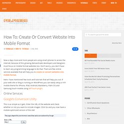
Don’t worry, you don’t have to learn any programming language to do that. There are few online services available that will help you to create or convert websites into mobile format. Here i have mentioned few tools and tutorials that will help you out. If your web site or blog is running on WordPress you can easily setup a rich mobile theme for iPhone, iPad, Android, Blackberry, Palm OS and Samsung touch mobile using WPTouch plugin. Online Services Google’s Conversion Utility This is as simple as it gets. MobiSiteGalore. The Future of Web Content – HTML5, Flash & Mobile Apps. Editor’s note: This is a guest post written by Jeremy Allaire, founder and CEO of Brightcove.

Prior to Brightcove, Jeremy founded Allaire Corporation which was subsequently acquired by Macromedia due to the success of their web development tool ColdFusion. At Macromedia, Jeremy helped create the Macromedia MX (Flash) platform. You can see a recent interview of Jeremy here. As one of the guys who helped build the Flash Platform, we asked him to weigh in on the recent HTML5 v. Flash debate. The recent introduction of the new Apple iPad has stirred the discussion over the future of web content and application runtime formats, and shone light onto the political and business battles emerging between Apple, Adobe and Google.
State of the Mobile Web December 2009: Opera Mini is now 4 years old, has 46.3 million users. In November 2005 Opera Mini went public in a limited trial offered to only Sweden and Norway.
A few months later, January 2006, it would be released globally, and this month Opera is celebrating 4 years of having their wickedly awesome Opera Mini browser available around the world. Best Practices To Develop Perfect Websites for iPhone and Mobile Devices – woorkup.com. Mobile Website Showcase. The most popular mobile phone browser in the world. 7 usability guidelines for websites on mobile devices. Mobile Internet is continuing to grow very quickly.
HOW TO: Convert Videos for Your iPhone (or Any Mobile Device) Video on devices like the iPod, iTouch and iPhone look great because of their MPEG-4 H.264 format.
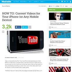
The good news is that there are tons of videos that you can purchase from the iTunes store, but the bad news is that you'll go broke in a hurry downloading everything you want. Sure, some of the videos aren't much ($1.99 each), but the numbers add up really quickly. Thankfully, there are a slew of sites and software packages that will allow you to convert just about any video format to the H.264 mp4 format that Apple devices require. Kyte. Web on the Move. Quick menu: W3C Mobile Web Initiative | Site navigation Combining the power of the Web with the strengths of mobiles devices.
W3C’s mission includes ensuring that the Web be available on as many kind of devices as possible. With the surge of powerful mobile devices in the past few years, the role of the Web as a platform for content, applications and services on these devices is increasingly important. W3C accompanies this growth with its ongoing work in the following areas: Latest news For Developers. Opera Browser. CSS tutorial - Media types. CSS provides an easy way to target browsers on different types of devices, or different uses. For example, the design you produce for a normal desktop browser may not be suitable for a handheld device, or a printer. These are known as media types. There are several media types, and most browsers will generally concentrate on just one or two, depending on what they are designed to be used for.
Opera is by far the most versatile, and supports six different media types. All major browsers use screen media as their default, and will apply screen media when viewing a Web page normally. In theory, a browser should only apply one media type at any time. Most of the normal styles are available to all media types, but there are some styles that only make sense in some media types. If your design does not work well in other modes, you should consider adding different styles for different media types. By default, stylesheets apply to all media types. Special notes for handhelds.