
Floats. 20+ Examples of Fantastic Fixed-Position Navigation. A site with fixed-position navigation is one that never allows the user to lose site of the directory links as they scroll.
This simple trick makes for a site that is incredibly easy to navigate and is ideally suited for specific types of content. Below we’ll take a look at both the most common and the most unique uses of fixed navigation in web design. Blogs One of the most common places you’ll find fixed navigation is on blogs, particularly Tumblr blogs. The reason this format works so well for blogs is that they are notoriously long and therefore involve a lot of scrolling.
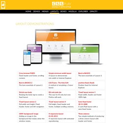
Brian Casel In this site, both the links at the top and the navigation at the left stay with you as you scroll, making it really easy to access anything you need from any point in the site.The navigation on the left doesn’t take you to a different part of the site but rather filters the content so you can see only blog posts, quotes, videos, etc. David Appleyard Doug Neiner Jaype Mark Jardine Right Hand Navigation Sisu. CSS Layouts Listing. Cross browser FIXEDFixed header and footer, scrolling content.
Simple minimum width layoutA layout to demonstrate min-width in Internet Explorer. Back to BASICSThe bare essentials of Layout 3. Back to BASICS 2The bare essentials of Layout 2. CSS Frame - The Holy GrillA method of emulating a 'frame' layout. position:fixed; (fixed)Position fixed for Internet Explorer. Shrink your bodyResizing the body tag to create a fixed layout.
IE6 only web siteThis was for IE only, but now Firefox will work. 'Fixed' layout version 1Fixed width, header and footer 100% high. 'Fixed' layout version 2Full width and height. 'Fixed' layout version 4Full height, fixed header and footer, multiple scrolling columns. Semi-fixed footer28-11-2008A semi-fluid layout with a semi-fixed footer. 100% 'background' imageAdding an image in the background that resizes when the window resizes. A responsive layout01-05-2013A reponsive layout with animated repositioning. 'Fixed' layout version 3Full width and height. Information. Choosing The Best CSS Framework: A Complete Guide. There are plenty of reasons to use a CSS Framework to build your websites.
They can speed up development, make your sites more aesthetically pleasing, and they can help eliminate all those nasty cross-browser compatibility issues (though not all of them do this, or do it well). But it can also be a steep learning curve to figure out which framework you should use (or if you should use one at all) and then how to use it. Which framework you choose is really a personal decision. There is no one “best” framework on the market at the moment. Different frameworks are better for different types of designs, and for different designers. There are really two things to keep in mind when choosing a framework. 960 Grid System. Step by step CSS float tutorial. Floatutorial takes you through the basics of floating elements such as images, drop caps, next and back buttons, image galleries, inline lists and multi-column layouts.
General info Tutorial 1. Floating an image to the right Float an image to the right of a block of text and apply a border to the image. Tutorial 2. Float an image and caption to the right of a block of text and apply borders using Descendant Selectors. Tutorial 3. Float a series of images down the right side of the page, with content flowing beside them. Tutorial 4. Float a series of thumbnail images and captions to achieve an image gallery. Tutorial 5. Float a simple list into rollover "back" and next "buttons". Tutorial 6. Float a simple list, converting it into a horizontal navigation bar. Tutorial 7. Float a scaleable drop cap to the left, resize it and adjust line-heights to suit your needs.
Tutorial 8. Float a left nav to achieve a two column layout with header and footer.