

Photofont WebReady, rich typography for the Web. Photofont Software Photofont WebReady November 24, 2008 — Photofont WebReady 1.0 for Mac and Windows released: Use any* font on your website!
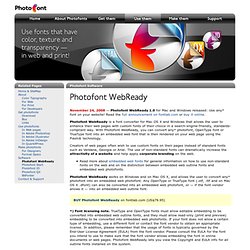
Read the full announcement on fontlab.com or buy it online. Photofont WebReady is a font converter for Mac OS X and Windows that allows the user to enhance their web pages with custom fonts of their choice in a search-engine-friendly, standards-compliant way. Build, Share, Download Fonts. WhatTheFont!
The Grid System. Typetester – Compare fonts for the screen. Handpicked free fonts for graphic designers with commercial-use licenses. A Tribute to Wordle. Wordalizer is a word cloud builder for InDesign CS4.
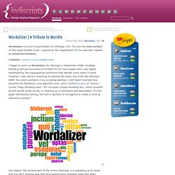
Try now the beta version of this experimental script —inpired by the magnificent Wordle web tool created by Jonathan Feinberg. • Update: version 1.25 available now! I began to work on Wordalizer for InDesign in September 2008! Jonathan Feinberg had just launched its brilliant Wordle Java applet and I was highly impressed by the typographical perfection that Wordle could reach in word clouding.
I was naively dreaming to operate the same way from the InDesign DOM! Yes indeed! While using similar techniques (quadtree spatial indexing and hierarchical bounding boxes), Wordalizer for InDesign cannot compete with Wordle in terms of performance. The screenshot above illustrates the main interface dialog. Here is the “Weighted Word List” edition window (when enabled): And now the resulting word cloud (based on Márquez' “One Hundred Years of Solitude”):
Choosing the Right Font: A Practical Guide to Typography on the Web. Typography is an huge field.
People devote years of their lives to this ancient craft, and yet there's always something new to learn. In this article, I'll be reviewing the major points that you should consider when selecting a typeface for a website. Republished Tutorial Every few weeks, we revisit some of our reader's favorite posts from throughout the history of the site. This tutorial was first published in October of 2010. Practical Typography When you design for the web, you have to accept that the content will change. What I'm going to be focusing on today is practical typography. The Typographic Scale. A list of numbers that make it easier to set type.
13 Signs You're A Bad Graphic Designer. Posted on 06'07 Dec Posted on December 6, 2007 along with 90 JUST™ Creative Comments Yes, this is a controversial topic, however I hope to raise awareness of some mistakes you may be making in your graphic design pieces that are making you look like an amateur, but please keep in mind that none of these are hard and fast rules, this is only a general guide of things you should be aware of.
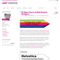
Please forgive me for the graphic and bad grammar / spelling in the picture above as I’m sure you can see it is a joke :) (rainbow gradients, comic sans, bevel emboss, 13 not 15, bad grammar, off centered type – yuk) Anyway, I have compiled 15 tell tale signs that you may still be considered a (don’t quote me) bad graphic designer. Some of these have been taken from Robin Williams great book “The Non-Designers Type Book” that I recommended in the top 5 typography resources of all time. 1.
Do you use Helvetica in everything? 2. You Don’t Really Strike Me as an Arial: Selecting Font and Color for Your Words. Font, Color, Size – these are not decisions that should be taken lightly if you are interested in the full spectrum of meaning, innuendo, and even subliminal messages of your words on your website or blog.
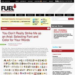
First and foremost, however, if readers can’t see your words properly the message you are sending is not being received at all, so the over-riding principle of font, color, and size selection must always be readability. Beyond that primary goal, it’s a worthwhile exercise to analyze the psychological meanings we send based on the font, color, and size of our copy and think about styling our words with our intended message in mind.
Font My copywriter friend writes résumés for people on the side. Whenever we’re out she loves to watch people at the bar and determine what font their résumé should use. HOW Magazine. I suspect that at the start of your day, the first thing you do is reach for your phone.
You might even do this before you get out of bed. From the moment your eyes open, the input begins. Email, Facebook, Twitter, texting, newsfeed—all pouring in like an electronic fire-hose aimed at your brain. We were eager to see what other international magazines designers turn to for inspiration. From Amsterdam to Berlin, learn about 5 publications you should have on your radar. You read about Nicole Melville and her Gay Gatsby passion project in the May issue of HOW, but in this extended interview, we learn more about Melville. Karen Larson, principle and creative director at LMstudio, offers an unofficial Creative Guide to Detroit, from creative businesses to must-visit cafés.
Most people don’t think of the Middle East as a creative wonderland, but they should. 3 Studios Demonstrate How Setting Aside Time to Play Can Benefit Morale, Productivity and the Bottom Line.