
Density Design. Francesca Castelli portfolio site. Welcome. NodeBox is a node-based software application for generative design.
It's built from the ground up by designers to be easy-to-use, efficient, and fast. Visualize Your Data Because of its unique approach, NodeBox is ideal for rapid data visualization. Looking 4 data visualization: analytics. Chart selection 1.
ChartChooser from Juice Analytics2. Charts suggestions from Andrew Abela3. Graph Selection Matrix from Perceptual Edge4. Datavisualization.ch Selected Tools. Live Chart Editor. JavaScript Charts and Maps. JavaScript Charts. Features Powerful data-viz Advanced serial charts We made it easy to display complex data visualizations. Tableau : une data visualisation sobre et personnalisable : 6 outils gratuits de data visualisation. Infographics & data visualization gallery. Data vizualisation – les 10 meilleurs outils gratuits. La data vizualisation ou l’art de représenter des données chiffrées de façon visuelle a connu un essor important ces dernières années, avec notamment l’omniprésence de graphiques, de #timelines, d’infographies, de cartographies et de cartes #interactives sur le web mais aussi dans les media.
De nombreux outils en ligne existent et certains proposent des offres gratuites. Voici notre sélection des 10 meilleurs outils gratuits pour créer votre #infographie : 1. Visual.ly Visual.ly est certainement un des outils les plus connus, il vous permet de créer en moins de 10 secondes une présentation visuelle de votre activité sur #Facebook et/ou #Twitter grâce à 8 templates différents. 2.Re.vu Re.vu est un outil destiné à créer votre cv de manière originale et visuelle avec des graphiques, des courbes et des représentations colorées. 3.
Vizualize.me est également un service de création de cv gratuit sous un format plus graphique (sans image de fond). Create infographics & online charts. Looking 4 data visualization: Tools. Chart selection 1.
ChartChooser from Juice Analytics2. Charts suggestions from Andrew Abela3. Graph Selection Matrix from Perceptual Edge4. Periodic table of visualization from Visual Literacy 5. Color chooser and Font Selection1. 4. 5. 7. 8. colrd - Create and share color inspiration with the world. Cartodb pour associer des données à une carte : 6 outils gratuits de data visualisation. Polar chart. Blog - Visage. No matter what city you live in, parking signs can be a freaking nightmare.
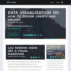
But in Los Angeles, they are nothing short of maddening. Luckily, LA City Council’s Transportation Committee voted to simplify the signs last week. Why are we so excited? Not only will the simplification make life easier for anyone with a car in LA, the proposed revamp gives signs a full visual makeover. (Image credit: Park Safe LA). The new signs will be created by a local graphic artist and tested over the next 45 days. Kudos to the city council for embracing a more creative—and effective—way to communicate. Raw. Looking 4 data visualization: Tools. .
RAW est une nouvelle application web ouverte et gratuite qui permet de créer aisément des dataviz basées sur le framework D3.js de Mike Bostock (Data Designer au New York Times). . Développé par l'institut de recherche italienne Density Design, l'outil permet de générer sans aucune ligne de code des visualisations avancées de type Treemap, Dendogram, Fineo Diagram. Les 20 meilleurs outils de datavisualisation au banc d’essai. Data, digital methods and mapping social complexity: Visualizing social and semantic dynamics in the social sciences. CorTexT. INTERSECTION – How Enterprise Design Bridges the Gap Between Business, Technology and People « The INTERSECTION book website. Density Design.