
Comment le chômage s'est répandu en France depuis 10 ans. - Cette série de cartes représente le chômage par trimestre depuis le 1er janvier 2004.
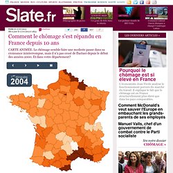
Plus la couleur est foncée, plus le taux de chômage y est élevé. - Même s'il semble se stabiliser sur le dernier mois, pas de quoi s'enthousiasmer: le chômage atteint des records. Une hausse ininterrompue depuis le dernier trimestre de 2008 qui atteint son apogée à l'été 2013, avec un taux record de 10,8% de la population active pour le 1er trimestre 2013 (la Dares ou l'Insee ne disposent pas chiffres détaillés plus récents). Half of All Active Twitter Users Live in Five Countries [CHART] Twitter users are all over the world, but half of the social network's active users — those who tweet at least once a month — live in just five countries: the U.S., Japan, Indonesia, the UK and Brazil.
![Half of All Active Twitter Users Live in Five Countries [CHART]](http://cdn.pearltrees.com/s/pic/th/active-twitter-users-countries-70724160)
Using data from PeerReach, online statistics portal Statista created the chart, below, which shows the 13 countries with the highest shares of monthly active tweeters. PeerReach defines monthly active Twitter users as those who tweet, whereas Twitter defines them as those who log in to the service. Roughly 40% of Twitter's monthly active users actually don’t tweet, and only log in. Which Countries Make the News?
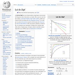
Source: Oxford Internet Institute; Information Geographies It's often said that the media neglects parts of the world, or that a few countries and stories disproportionately dominate headlines.
Now, thanks to the efforts of researchers at the Oxford Internet Institute, we can see how media around the world prioritizes its attention. Which Countries Make the News? Loi de Zipf. Un article de Wikipédia, l'encyclopédie libre.
A mysterious law that predicts the size of the world's biggest cities. I'm sorry to burst the author's bubble, but Los Angeles isn't half the size of New York.
Because California is one of those states where little bits of an urban area can easily split off and become separate cities (and because a lot of city boundaries were drawn long before LA grew to its modern size), the City of Los Angeles is just a small part of the urban area. According to Wikipedia, the New York urban area is about 20.5m (with the city proper about 8.5m), and the Los Angeles urban area is about 15m. Other measures similarly put LA at about 2/3 to 3/4 the size of NY. Nouveau portail ONRN : renseignez-vous sur les risques naturels et leurs effets. L’observatoire national des risques naturels a ouvert, à l’occasion des assises nationales des risques naturels des 2 et 3 décembre 2013, une nouvelle version de son portail internet.
Il permet aux internautes d’en savoir plus sur les effets des risques naturels et sur les moyens de s’en protéger. Créé le 3 mai 2012, l’observatoire national des risques naturels (ONRN) vise à renforcer le lien entre les acteurs de l’assurance et de la prévention des risques naturels. Cette nouvelle version du portail de l’ONRN permet au grand public ainsi qu’aux professionnels de trouver des réponses à plusieurs questions pratiques : Suis-je exposé à un risque ? Comment protéger mon habitation ? Que faire après une catastrophe ? Earth wind map. Fox News vs Huffington Post States. Source: Forbes America may be evenly divided between red states and blue states, but the Huffington Post is handily beating Fox News for where most Americans get their online news according to a joint study by Bitly and Forbes.

The Huffington Post draws the most web traffic among online news sources in 22 states. Meanwhile, regional powerhouses like the New York Times, Washington Post, and Chicago Tribune serve as the last stand against HuffPo’s national dominance. Fox News wins out in Mississippi, Alabama, South Caroline, Nevada, and Alaska. Just how big is the Huffington Post? Source: Poynter To get occasional notifications when we write blog posts, sign up for our email list. What can you actually learn from those dialect maps? [1309.2900] Mining for Spatially-Near Communities in Geo-Located Social Networks. TraceMedia - Terra Incognita.
Introduction Terra Incognita visualises how Wikipedia has evolved over the last decade, mapping the geographic articles for over 50 languages.
The maps highlight cultural biases, unexpected areas of focus, the overlaps between languages, and regions that are unique to a language. There are two versions of the project, one based on Google Maps that is better for browsing Wikipedia articles at the level of countries and regions, the other based on Kartograph that shows how the articles are structured using a variety of world map projections. Before starting the application be aware that the larger Wikipedia languages are over 10MB to download, and the maps will perform better for selections of no more than 300 thousand articles. The application is designed for desktop, and will work with IE9 or above, Chrome, Firefox and Safari.
Wikipedia’s Evolution The best way to see this is to choose one particular country or continent, and up to eight languages of interest. Language Overlaps Russian. Information Geographies.