
Atlas of the Historical Geography of the United States. A spectacular historical atlas refashioned for the 21st century Here you will find one of the greatest historical atlases: Charles O.
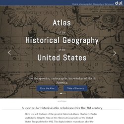
Paullin and John K. What can you actually learn from those dialect maps? Map Warper: Home. Map Warper: Home. Open Access Maps at NYPL. The Lionel Pincus & Princess Firyal Map Division is very proud to announce the release of more than 20,000 cartographic works as high resolution downloads.
We believe these maps have no known US copyright restrictions.* To the extent that some jurisdictions grant NYPL an additional copyright in the digital reproductions of these maps, NYPL is distributing these images under a Creative Commons CC0 1.0 Universal Public Domain Dedication. The maps can be viewed through the New York Public Library’s Digital Collections page, and downloaded (!) , through the Map Warper. First, create an account, then click a map title and go. Interactive Maps Show How English Words Translate Across Europe. Global Forest Watch. Sig Mines France. Reading digital sources: a case study in ship's logs. Digitization makes the most traditional forms of humanistic scholarship more necessary, not less.
But the differences mean that we need to reinvent, not reaffirm, the way that historians do history. This month, I've posted several different essays about ship's logs. Earth wind map. What can you actually learn from those dialect maps? Atlas of the Historical Geography of the United States. TraceMedia - Terra Incognita. Introduction Terra Incognita visualises how Wikipedia has evolved over the last decade, mapping the geographic articles for over 50 languages.
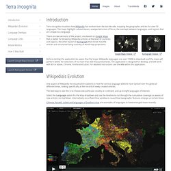
The maps highlight cultural biases, unexpected areas of focus, the overlaps between languages, and regions that are unique to a language. There are two versions of the project, one based on Google Maps that is better for browsing Wikipedia articles at the level of countries and regions, the other based on Kartograph that shows how the articles are structured using a variety of world map projections.
Before starting the application be aware that the larger Wikipedia languages are over 10MB to download, and the maps will perform better for selections of no more than 300 thousand articles. The application is designed for desktop, and will work with IE9 or above, Chrome, Firefox and Safari. Wikipedia’s Evolution The best way to see this is to choose one particular country or continent, and up to eight languages of interest. Language Overlaps Russian.
Submarine Cable Map 2013. Tornado Tracks. Got this data from NOAA via the spectacular Data.gov.
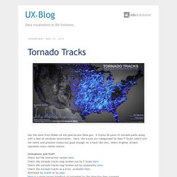
It tracks 56 years of tornado paths along with a host of attribute information. Here, the tracks are categorized by their F-Scale (which isn't the latest and greatest means but good enough for a hack like me), where brighter strokes represent more violent storms. Animations and Stuff Check out the interactive version here. Check this tornado tracks map broken out by F-Scale here. Check this tornado tracks map broken out by seasonality here. Earth Engine. Earth Engine Access Develop, access and run algorithms on the full Earth Engine data archive, all using Google's parallel processing platform.
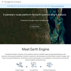
Access to Earth Engine is currently available as a limited release to a small group of partners. If you are interested in developing on the Earth Engine platform, let us know. Google Earth Engine brings together the world's satellite imagery — trillions of scientific measurements dating back almost 40 years — and makes it available online with tools for scientists, independent researchers, and nations to mine this massive warehouse of data to detect changes, map trends and quantify differences on the Earth's surface. Applications include: detecting deforestation, classifying land cover, estimating forest biomass and carbon, and mapping the world’s roadless areas.
New! Explore different views into this global timelapse built from global, annual composites of Landsat satellite images. Google Earth enters fourth dimension, highlights humanity’s heavy hand. Roughly four years ago, Google engineers started working with the US Geological Survey to create what it's now calling Google Earth Engine.
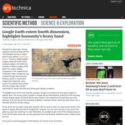
Thanks to NASA satellite imagery obtained as part of the Landsat program, the USGS has decades of historic images of the Earth from space, totaling somewhere in the neighborhood of 900TB of data. Google has now combed through these pictures, finding a series of consecutive images that collectively cover much of the planet's land surface. All of the images were chosen specifically for being cloud-free and having good lighting conditions. Wind Map. An invisible, ancient source of energy surrounds us—energy that powered the first explorations of the world, and that may be a key to the future.
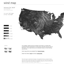
This map shows you the delicate tracery of wind flowing over the US. The wind map is a personal art project, not associated with any company. We've done our best to make this as accurate as possible, but can't make any guarantees about the correctness of the data or our software. Please do not use the map or its data to fly a plane, sail a boat, or fight wildfires :-) US rivers in the contiguous 48. Mississippi. Wildfires Smoke Crosses the Atlantic. Intense wildfires in Quebec sent smoke billowing out of Canada at the end of June 2013.
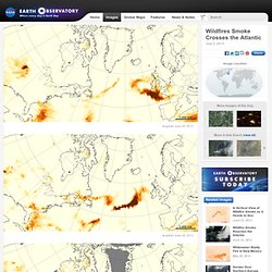
The fires produced towering pyrocumulus clouds that injected smoke high into the atmosphere. Upper-level winds then dispersed it across the Atlantic Ocean. Wildfire smoke is a combination of gases and aerosols—tiny solid and liquid particles suspended in air—so remote-sensing instruments that detect aerosols can find smoke. The maps above are made from data collected by the Ozone Mapper Profiler Suite (OMPS) on the Suomi National Polar-orbiting Partnership (Suomi-NPP) satellite.
They show relative aerosol concentrations, with lower concentrations appearing in yellow and higher concentrations appearing in dark orange-brown. On June 23, 2013, OMPS detected a plume dense with smoky aerosols over the North Atlantic Ocean, east of Newfoundland. The ambiguity explains why remote sensing scientists rarely use just one sensor to analyze smoke transport events like this.
Instrument(s): Suomi NPP - OMPS. US rivers in the contiguous 48. US rivers in the contiguous 48 states, assembled.