
Sass: Syntactically Awesome Style Sheets. AOS - Animate on scroll library. CSS3 Keyframes Animation Generator. .css. Animate.css v4 brought some breaking changes, please refer to the migration guide before updating from v3.x and under.
Animate.css is a library of ready-to-use, cross-browser animations for use in your web projects. Great for emphasis, home pages, sliders, and attention-guiding hints. Edit this on Github Installation and usage Installing Install with npm: $ npm install animate.css --save with yarn: $ yarn add animate.css or add it directly to your webpage using a CDN: Basic usage After installing Animate.css, add the class animate__animated to an element, along with any of the animation names (don't forget the animate__ prefix!) <h1 class="animate__animated animate__bounce">An animated element</h1> That's it!
Animations can improve the UX of an interface, but keep in mind that they can also get in the way of your users! Using @keyframes Example: Be aware that some animations are dependent on the animation-timing property set on the animation's class. (.17,.67,.83,.67) ✿ cubic-bezier.com. The Shapes of CSS. CSS is capable of making all sorts of shapes.
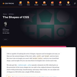
Squares and rectangles are easy, as they are the natural shapes of the web. Add a width and height and you have the exact size rectangle you need. Add border-radius and you can round that shape, and enough of it you can turn those rectangles into circles and ovals. We also get the ::before and ::after pseudo-elements in CSS, which give us the potential of two more shapes we can add to the original element. By getting clever with positioning, transforming, and many other tricks, we can make lots of shapes in CSS with only a single HTML element. These days, you’re best bet for drawing shapes is either SVG or using a clip-path in CSS, which is SVG-like (and can reference SVG). Triangle Bottom Left Shape Triangle Bottom Right Shape Cut Diamond Shape via Alexander Futekov. CSS3 Patterns Gallery. Browser support The patterns themselves should work on Firefox 3.6+, Chrome, Safari 5.1, Opera 11.10+ and IE10+.
However, implementation limitations might cause some of them to not be displayed correctly even on those browsers (for example at the time of writing, Gecko is quite buggy with radial gradients). Also, this gallery won’t work in Firefox 3.6 and IE10, even though they support gradients, due to a JavaScript limitation. Submission guidelines If you have a new pattern to submit, please send a pull request. Does it present a new technique? Learn to Build a Masonry Gallery Layout Using Pure CSS.
Defining the grid columns and rows gave us access to the grid (column and row) tracks that we can now use to span the cell however we want.
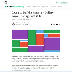
You can visualize it better with the CSS Grid inspector. You can turn it on using this Mozilla document. As you can see, the grid column tracks span from 1 to 17, giving us a total of 16 columns. Similarly, the grid row tracks span from 1 to 15 giving us 14 rows. Let’s layout our first grid cell. Now, we want our cell to span five columns wide and five columns high. Let’s look at the grid-column property first. The first property defines the column track we want our cell to start spanning from and the second value defines the end.
The cell now spans five columns wide and five columns high. Similarly, we can layout the rest of our cells. For the sake of brevity, I am including the code I wrote to build the masonry gallery I showed in the beginning. This is how the layout looks now. You can find the repo for this project on GitHub. That’s all, folks. CSS3 Flexbox Layout module. Vous connaissez certainement le modèle de boîte classique en CSS et ses dispositions de type “block” ou “inline”, sachez que Flexbox CSS3 a été conçu pour étendre ce périmètre en introduisant un nouveau modèle de boîte distinct, que l’on appellera “le Modèle de boîte flexible”.
En février 2016 est sorti mon livre entièrement dédié à Flexbox. Il se nomme "CSS3 Flexbox : plongez dans les CSS modernes" et je vous recommande bien évidemment sa lecture afin de comprendre tous les rouages de ce positionnement révolutionnaire, et d'en maîtriser tous les aspects. Au sein de ce schéma, on ne raisonne plus en “block” ou “inline”, ni même en float ou autres types de boîtes “classiques” CSS, mais en “Modèle de boîte flexible”, dont les quatre possibilités principales sont : Note : ce tutoriel a été initialement rédigé en octobre 2010.
Il a subi une refonte intégrale en décembre 2014 pour se mettre à jour. Ultimate CSS Gradient Generator - ColorZilla.com.