
Loomis's Scheme for Tonal Organization. Illustrator Andrew Loomis developed a practical scheme for organizing the tonal values of a picture.
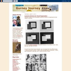
In his book Creative Illustration he presents squares of four different tones: white, light gray, dark gray, and black.If you let one of those tones dominate, you can arrange them four different ways: 1. Grays and black on white, 2. Black, white, and dark gray on light gray, 3. Black, white, light gray on dark gray, and 4. Nearly any sort of picture can fit one of these plans. For example, this sketch of kids and sleds on snow fits the second plan. Understanding Digital Colors. When used correctly, color can change the mood of the image, or impact the story.

It can also draw the viewers eyes to a focal element. In the image below, digital colors are used effectively to focus your attention on the tube. And the controlled color palette also helps keep the image calm. Created by Cornelius Dämmrich Color is used effectively in this image to keep the mood playful and light: Courtesy of Anders Ehrenborg and Bill Presing Saturation and Value A lot of people think Colors are all about harmonious relationships. At 20% saturation, red turns into a fleshy pink. And at 20% value, red becomes a dark muddy brown. “Yeah, but why is this important?” Example of an overly saturated scene By forcing strong saturated colors on the viewer, you give them no where for their eyes to rest.
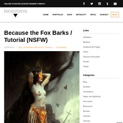
Corrected scene Not to say that saturation is bad though. Maxfield Parrish – Salzkarawane am toten meer (from ArtRenewal.org) The striking red mountains catch your eye immediately. ZOOTOPIA - MATTHIAS LECHNER art direction-production design. Because the Fox Barks / Tutorial (NSFW) Because the Fox Barks / Allegory of DeathBastien Lecouffe Deharmewww.roman-noir.com Thanks to Laureline.
Soundtrack —> Current93 Prints available —> CLICK HERE Hey guys, Here is a tutorial + video on a personal digital piece I just finished. I started this piece during an online « LevelUp! Step 01 / Anatomy sketch References. Think With Forms, Not Lines: Take Your Drawing to the Next Level. Why Painting Value/Tone Is More Important than Color. Value Does the Work, Color Gets the Credit Color is the most attractive quality of a painting but, believe it or not, value is more important than color to the design and success of a painting.
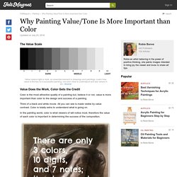
Think of a black and white movie. All you can see is made visible by value contrast. Color is totally extra to understand what is going on. In the painting world, color is what viewers of will notice most, therefore the value of each color is important in determining the success of the composition. What Is Value in a Painting? When we describe a color as "light" or "dark", we are discussing its value or "brightness". Using the Value Scale to Find Color Tone The easiest way to remember this dimension of color is to visualize the "gray scale," which runs from black to white and contains all of the possible monochromatic grays.
You will have a better view of values if you squint your eyes, squeezing them as in bright sunlight. Dota 2 Workshop - Character Art Guide - Dota 2 - Workshop. Designing first-class items for Dota 2 requires more than just ability and a great idea.
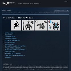
The aesthetics of Dota 2 are built from a set of principles that help keep each hero immediately and uniquely identifiable from above during gameplay. We’re going to go over exactly what these principles are, how we used them to design the heroes and how you can apply them to custom items. Be aware that the principles on this page are important general design concepts that apply to the readability and quality execution of all items, including inventive items that thoughtfully differ from the default colors and silhouettes.
New insights have been added to this updated guide so please have another look even if you've read previous versions. A hero’s silhouette must be clearly identifiable at first glance. “Value” is the range of lightness and darkness within a subject regardless of color and saturation. Note how dark and light areas on the heroes below are handled to preserve detail and form.