
Design. Reference. Layout. Tips. The definitive guide to using negative margins. Advertisement Since the recommendation of CSS2 back in 1998, the use of tables has slowly faded into the background and into the history books.
Because of this, CSS layouts have since then been synonymous with coding elegance. Out of all the CSS concepts designers have ever used, an award probably needs to be given to the use of Negative Margins as being the most least talked about method of positioning. It’s like an online taboo—everyone’s doing it, yet no one wants to talk about it. 1. We all use margins in our CSS, but when it comes to negative margins, our relationship somehow manages to take a turn for the worse. A negative margin looks like this: Negative margins are usually applied in small doses but as you’ll see later on, it’s capable of so much more.
They are extremely valid CSSI’m not kidding on this one. 2. Negative margins are very powerful when used correctly. Negative Margins on Static Elements A static element is an element with no float applied. 3. Smashing 3D text effects. Adaptable view - how do they do it? Adaptable view is a user interface design pattern which you can use to allow users to manually change visual appearance of content in order to fit their needs.
This is usually done by switching styles (in web sites and applications). This way you provide your users with more control over the appearance of content which improves user experience. Adaptable view can be used to enable users to increase/decrease font size, change background color, darken background for higher contrast, switch between different site versions or to change the layout of the site or any part of it. To learn more about this pattern check out Adaptable View design pattern on UI Patterns. You will find a strange implementation of this pattern where complete header is being hidden – including the logo.
In this tutorial, I will focus on explaining how to manually change the layout and show you two great examples and “how did they do it”. Example on Smashing Magazine Now we need to add some simple functionality. Web design secrets: Learn the secrets of web design. Part 1 | part 2 | part 3 There are many good and bad things you can do in web design; the following is a list of some of those options and how you should deal with them. 1.
No page counters: Page counters do nothing except make you look like an amateur, mess with your design and tell people information about your site you probably don’t want them to know! If you want to know how many people are hitting your site, just ask your host for server stats. Any host worth it’s salt should be able to provide you with detailed stats that make page counters look stupid. 2. Let’s discuss an important point about online content/text versus print. This important fact tells us that we should keep what we want to say on the web short and sweet. 3. Free screen color picker from Color Schemer. [pc]FREEv1.1ColorSchemer ColorPix ColorPix is a useful little color picker that grabs the pixel under your mouse and transforms it into a number of different color formats.
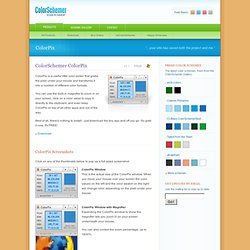
You can use the built-in magnifier to zoom in on your screen, click on a color value to copy it directly to the clipboard, and even keep ColorPix on top of all other apps and out of the way. Best of all, there's nothing to install - just download the tiny app and off you go. So grab it now, it's FREE! ColorPix Screenshots Click on any of the thumbnails below to pop up a full sized screenshot: ColorPix Window This is the actual size of the ColorPix window. ColorPix Window with Magnifier Expanding the ColorPix window to show the magnifier lets you zoom in on your screen underneath your mouse. You can also control the zoom percentage, up to 1600%.