
- Online Multiplayer Buzzer. GameNightBuzzer.com Home Page. Search. Tuto outil PAGES ENT NG. Comment creer un cours avec pages. Among Us Avatar Maker. Créer votre questionnaire. Coloriage magique panda. Coloriages magiques.

Ardour - the digital audio workstation. Oregon’s Haunted Spots - Travel Oregon. DANE Guyane. Découvrir et utiliser les parcours proposés par Pix Orga. L’espace Pix Orga permet à chaque établissement de créer des campagnes de positionnement qui seront proposées aux élèves.

Ces campagnes s’appuient sur les parcours mis à disposition par Pix et sont accessibles uniquement aux élèves, par conséquent, les enseignants ne peuvent pas les tester et découvrir leur contenu. C’est pourquoi, nous vous proposons ci-dessous un tableau (basé sur la documentation Pix) qui contient un lien vous permettant de tester tous les parcours proposés par l’espace Pix Orga avant de les proposer aux élèves.
Si vous avez des interrogations sur la création de parcours sur l’espace Pix Orga de votre établissement, vous trouverez des réponses dans l’article "Gérer et utiliser la plateforme Pix Orga de son établissement". Virtual Dice & Coin Flip. Ecology - ClipArt Best. We use cookies to personalise content and ads and to analyse our traffic.
We also share information about your use of our site with our advertising and analytics partners who may combine it with other information you’ve provided to them or they’ve collected from your use of their services. Learn more Close Popularity 891 views 36 downloads Clipart details. Meet the Former Cook Who Draws His Every Meal. A marbled slice of tonkotsu pork rests on a bed of yellow noodles, nestled next to three shiny green sheets of nori, some boiled spinach, and a few shreds of kikurage, or wood-ear mushroom.
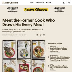
A pair of disposable chopsticks raises a tangle of noodles above the red bowl, as if headed to a waiting mouth just off the edge of the page. A description of the meal is printed next to the drawing, along with the price, date, and source: Family Mart, a Japanese convenience store. Itsuo Kobayashi draws what he eats every single day. While his drawings are individually compelling, each discrete element rendered in loving detail, his body of work as a whole gives an intimate window into everyday Japanese food: not the haute cuisine that is lauded by international chefs, celebrated on foodie sites, and shown off by the Japanese government. Get Your Copy of the 2020-21 Practical Ed Tech Handbook. Lesson Plan for Taste of India – Raddish Kids. Kindle Cloud Reader. Data Visualisation & Storytelling.
How to make a line chart race visualization. The world has gone crazy for bar chart race visualizations.
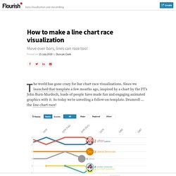
Since we launched that template a few months ago, inspired by a chart by the FT’s John Burn-Murdoch, loads of people have made fun and engaging animated graphics with it. So today we’re unveiling a follow-on template. Drumroll … the line chart race! The line chart race builds on our long-standing “Horserace” template, but adds a cool new feature: instead of the axes being fixed, you can now turn on the “zoomed” view to keep the dots representing the competitors in the centre while the axes animate in the background. This adds the same kind of dynamism that makes bar chart races so popular – and it also helps when displaying a long time series on a narrow mobile screen. As the second example below shows, you can even set the y-axis to be dynamic as well, so the vertical scale updates as the race moves along, much like the value axis in a bar chart race. Logo Design and Name Generator.
100 Years Of Indian Saree. Over 60 New York Times Graphs for Students to Analyze. Note: Register for our free June 11 webinar about teaching with graphs, or watch a previously recorded on-demand webinar here.
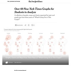
For the last three years, we have collaborated with the American Statistical Association (A.S.A.) to produce “What’s Going On in This Graph?” This weekly feature invites students to analyze and interpret graphs previously published in The New York Times, first by noticing and wondering, and then by creating a catchy headline and considering what impact this data might have on them and their communities. Scroll through the dozens of graphs in the slide show above or explore each graph further in the collection below.
This curated list is organized by topic and graph type — ranging from science to sports, and from bar graphs to bubble charts. How NOT to Wear a Mask. April 8, 2020 Wearing a face mask takes some getting used to.

To get the most benefit, you need to avoid these common mistakes. Almost overnight, masks in a variety of colors, styles and materials have appeared on the faces of people around us. While it’s good news that many people are doing their part to slow the spread of coronavirus, the bad news is that many people are wearing their masks wrong. “Wearing a mask takes some getting used to, for sure,” said Dr. One of the biggest mistakes people make is that they fidget with their masks, and pull them under their noses or completely off their faces to rest under their chins. Will Teachers be replaced by AI & Robots?