
CSS3 Image Styles. When applying CSS3 inset box-shadow or border-radius directly to the image element, the browser doesn't render the CSS style perfectly.

However, if the image is applied as background-image, you can add any style to it and have it rendered properly. Darcy Clarke and I put a quick tutorial together on how to use jQuery to make perfect rounded corner images dynamically. Today I'm going to revisit the topic and show you how much more you can do with the background-image CSS trick. I will show you how to use box-shadow, border-radius and transition to create various image styles. View Demo Image Styles Problem (see demo) Take a look at the demo and note that there is border-radius and inset box-shadow applied in the first row of images. Workaround To get the border-radius and inset box-shadow working, the workaround is to apply the actual image as background-image.
Dynamic Way To make it dynamic, you can use to jQuery to wrap the background image dynamically for every image element. Output. Tabs with Round Out Borders. Rounded corners are now trivially easy to achieve via border-radius.
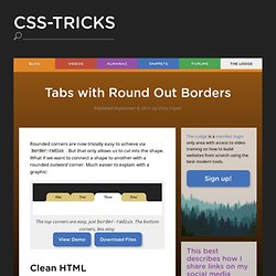
But that only allows us to cut into the shape. What if we want to connect a shape to another with a rounded outward corner. Much easier to explain with a graphic: Clean HTML Of course, on the web, just about anything visual is possible. <ul class="tabs group"><li class="active"><a href="#one">One</a></li><li><a href="#two">Two</a></li><li><a href="#three">Three</a></li><li><a href="#three">Four</a></li></ul> A class of active indicates which tab reflects the current page. How this is going down The reason this is tricky is that we need a shape to stick out of the tab element. Let's visualize this step by step, without looking out any code just yet. 1) Natural State 2) Float 3) Same Size 4) Just one 5) Circles We'll use two of our four available pseudo elements to place circles on the bottom left and bottom right of the tab. 6) Squares 7) Colorize the tab and content 8) Colorize the pseudo elements.
Beautiful Horizontally Centered Menus/Tabs/List. No CSS hacks. Full cross-browser. By Matthew James Taylor on 26 July 2008 A lot of people want centered menus on their website but for the CSS novice this task seems impossible.
If you do a search online you will find a few centering methods but most of these rely on CSS hacks, JavaScript or non-standard CSS rules that are not supported by all browsers (display:inline-block; is an example). In this post I'm going to show you my secret method of achieving centered tabs that does not use any CSS hacks and will work in all the common web browsers. It is also compatible with my perfect liquid layouts. Let's start with a basic example then I'll explain how it works. Centered Menu Basic Example Below you should see four horizontally centered tabs in this column of text, the second tab is set as active. Avoiding common HTML5 mistakes. Between curating sites for the HTML5 gallery and answering readers’ questions here at HTML5 Doctor, I see a host of HTML5 sites and their underlying markup.
In this post, I’ll show you some of the mistakes and poor markup practices I often see and explain how to avoid them. Don’t use section as a wrapper for styling One of the most common problems I see in people’s markup is the arbitrary replacement of <div>s with HTML5 sectioning elements — specifically, replacing wrapper <div>s (used for styling) with <section>s. In XHTML or HTML4, I would see something like this: HTML EMAIL BOILERPLATE v 0.4 updated 5/12.
Les Media Queries CSS3 - Alsacréations. La spécification CSS3 Media Queries définit les techniques pour l'application de feuilles de styles en fonction des périphériques de consultation utilisés pour du HTML.
On nomme également cette pratique Responsive Web Design, pour dénoter qu'il s'agit d'adapter dynamiquement le design à l'aide de CSS. Ces bonnes pratiques permettent d'exploiter encore plus les avantages de la séparation du contenu et de la présentation : l'intérêt est de pouvoir satisfaire des contraintes de dimensions, de résolutions et d'autres critères variés pour améliorer l'apparence graphique et la lisibilité (voire l'utilisabilité) d'un site web. Les plateformes exotiques sont concernées en premier lieu : navigateurs mobiles et tablettes, écrans à faibles résolutions, impression, tv, synthèses vocales, plages braille, etc. Approche historique Avec CSS2 et HTML4, il était déjà possible de spécifier un média de destination pour l'application d'une ou plusieurs feuilles de style.
<! Screen Écrans handheld print Impression. Creative Design. Demo: Pure CSS folded-corner effect. Code Beautifier:CSS Formatteur et Optimiseur basé sur CSSTidy.