
Le typoscope. Responsive typography in web design. Responsive web design, also abbreviated as RWD, is a well-known concept on the internet nowadays.
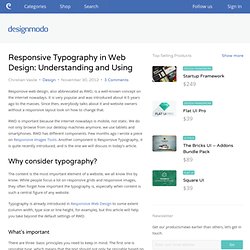
It is very popular and was introduced about 4-5 years ago to the masses. Since then, everybody talks about it and website owners without a responsive layout look on how to change that. RWD is important because the internet nowadays is mobile, not static. We do not only browse from our desktop machines anymore, we use tablets and smartphones. RWD has different components. Why consider typography? The content is the most important element of a website, we all know this by know. Typography is already introduced in Responsive Web Design to some extent (column width, type size or line height, for example), but this article will help you take beyond the default settings of RWD. What’s important There are three basic principles you need to keep in mind.
But before looking at these, the choice usually is down to serif or sans serif fonts. Use alternatives Still media queries… Understanding REM DoneDone. Typographie : deux ou trois choses. Arial vs helvetica. Seconds Out, Round One Every typeface, like every one of us, has its distinguishing features.
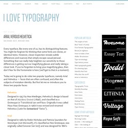
You might be forgiven for thinking that some fonts are clones, or identical twins. However, closer inspection reveals subtle differences and nuances that simply escape casual perusal. Something that can really help heighten our sensitivity to those differences is getting out our magnifying glasses and really taking a closer look. If you’ve forgotten to bring your magnifying glass, then don’t fear for the Fontometer is here (we’ll get to that in a moment). Today we’re going to de-robe two popular typefaces, namely Arial and Helvetica — faces that are often confused, and often the subjects of mistaken identity. HelveticaDesigned in 1957 by Max Miedinger, Helvetica’s design is based on that of Akzidenz Grotesk (1896), and classified as a Grotesque or Transitional san serif face.
I’ve read in several places that Arial is closer in appearance to Univers than Helvetica. Arial vs helvetica. Typography is a fine art form.
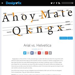
To the untrained eye, it seems like there are about 40 unique fonts with identical copies abound that make up the hundreds of fonts in existence. However, typographers are a keen type and there are small differentiating features that when combined, result in a finely-crafted and unique font. As commoners, we may not be able to pinpoint the specific differences between two fonts, but we can often sense that there’s a difference, even if it’s minute.
We may even be drawn to one over another, and are not quite sure why. One of the most common mix-ups is between Arial and Helvetica. Helvetica was originally created in 1957 by Max Miedinger and Eduard Hoffmann of the Haas type foundry based in Switzerland. Helvetica blew up in the ‘60s and ‘70s as it became the favorite font of designers, for its modern, clean, and commercial appeal. Arial was created in 1982 by Robin Nicholas and Patricia Saunders of Monotype (a type foundry). Different strokes. Helvetica vs arial. Kern type. Shape type.