
Studio Philippe Apeloig. It’s Not Just About the Money, It’s Not Just About the Art - AIGA/NY. Make a typography. Swissted. LETTERLOVE v1: Type as Voice, Type as Culture by Christian Schwartz - The List - The List. Letterlove v1: Type as Voice, Type as Culture by Christian Schwartz If typography is language made visible, typefaces are the multitude of voices that give tone and personality to written text.
Expand your knowledge of typography and its relevance in design, culture & business with Relay Room’s inaugural edition of Letterlove. In this one-night only seminar, discover applied typography and type design across the mediums with Christian Schwartz, internationally acclaimed type designer and partner at New York & London-based Commercial Type. He shares the design processes and diverse cultural impact of 10 years of work done for clients large and small, including publications likeThe Guardian, Vanity Fair and T, the New York Times style magazine, corporate identities such as telecom Sprint and the National Trust, a heritage organization in the UK, and how they help their clients keep a consistent voice as they move into digital media. About Christian Schwartz. Christian Schwartz - Farnham Display by Bobby Bailey on Prezi. Ten years of Commercial Type. It’s not just about the money, it’s not just about the art.
For the past ten years Paul Barnes and Christian Schwartz have been running one of the most exciting and influential type foundries, Commercial Type, with offices in New York and London. They have managed to create both popular and critically acclaimed typefaces for a diverse range of organisations, from the Guardian Newspaper, Vanity Fair magazine, to shirt numbers for Puma at the FIFA 2010 World Cup. Christian Schwartz on Type Design. Christian Schwartz Typefaces, or fonts, are powerful tools that color the voice of our written words.
Almost everyone uses fonts. Average PC users choose from the selection pre-installed fonts on their computers to add expressiveness to a greeting card or presentation. Graphic designers select from small libraries of purchased commercial fonts to create websites, brochures and company identities. Redesigning Vanity Fair: Chris Dixon & Christian Schwartz - The Type Directors Club. Chris Dixon arrived at Vanity Fair in 2011 from New York magazine.
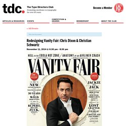
He began reworking the typography, page design, illustrations, infographics, and photography to evolve the iconic publication section by section. In 2012, he started his collaboration with Christian Schwartz and Paul Barnes of Commercial Type on a six-month process to redesign Vanity Fair’s logo and create a new custom display typeface, a fresh interpretation of Didot that debuted in 2013. Chris Dixon has spent the last 15 years designing at a wide variety of publications and companies, including Adbusters Magazine, the Financial Times, the New York Times Magazine, Ogilvy & Mather, as well as eight years at New York magazine where he helped execute of the most highly-regarded magazine redesigns in recent years. As the Design Director at Vanity Fair since 2011, he has carefully evolved its overall look with a more contemporary and refined design.
Register Online. Christian Schwartz Workshop. Dates: March 17–18, 2014Time: 10:00–19:00 Place: Gestalten Space, Sophie-Gips-Höfe, Sophienstraße 21, 10178 Berlin Language: English SOLD OUT.
This workshop is at full capacity. Meet the Speaker: Christian Schwartz. Typefaces are an important part of our work.

The fonts we use can drastically influence the direction of our designs. But rarely do we have to design our own. Designer Christian Schwartz, however, has made a rather successful career of it. After graduating from Carnegie Melon University, Schwartz worked for design firms such as MetaDesign Berlin and The Font Bureau, eventually going on to co-found Orange Italic in 2001 and starting his own Schwartzco in 2006.
His work has garnered a multitude of awards, having been honored by the Cooper-Hewitt National Design Museum, the New York Type Director’s Club, AIGA, and the International Society of Typographic Designers. Commercial Type (@commercialtype) Why did I start a type foundry? By Christian Schwartz Why would anyone in his or her right mind start a type foundry now?
Well, to begin with, it’s often said that it’s a good idea to start a business in a recession. However, the type marketplace has gotten very crowded—there are more foundries and distributors of type in all sizes right now than at any previous time. Even the pre-machine setting peak of typefounding in the 19th century had a smaller number of foundries by many orders of magnitude. Commercial Type » Catalog » Guardian Collection. DesignThinkers - Christian Schwartz. Christian Schwartz (A - T) About us | Blog | Latest fonts | Popular fonts | Fontset | Tools | Free fonts | Feedback | Contact us | Terms Fonts by Appearance Fonts by Name Fonts by Similarity Fonts by Picture.
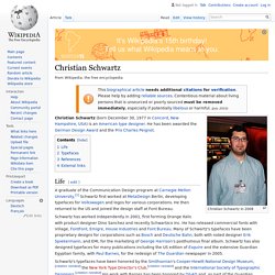
Christian Schwartz. Christian Schwartz in 2008 Christian Schwartz (born December 30, 1977 in Concord, New Hampshire, USA) is an American type designer.
He has been awarded the German Design Award and the Prix Charles Peignot. Life[edit] Stag Sans by Christian Schwartz in Typography. Schwartzco Inc. Schwartzco is the studio of Christian Schwartz (b. 1977), a type designer and typography consultant based in New York City and a partner in the typefoundry Commercial Type with London-based designer Paul Barnes.
A graduate of the Communication Design program at Carnegie Mellon University, Schwartz first worked at MetaDesign Berlin, developing typefaces for Volkswagen and logos for a number of corporations. He then returned to the US and joined the design staff at The Font Bureau, Inc., working for a wide range of corporate and publication clients. Schwartz set out on his own in 2001, first forming Orange Italic with product designer Dino Sanchez and recently Schwartzco Inc.. He has released fonts with Village, FontFont and with digital type pioneers Emigre. MyFonts: Creative Characters interview with Christian Schwartz, October 2007. Photo of Christian Schwartz by Christine Tran When we asked you, our readers, to tell us whom you would like us to interview for Creative Characters, one name that kept coming up was Christian Schwartz’s.
Although he’s not even 30, Christian Schwartz is among the most prolific type designers in the USA, having published fonts with about half a dozen foundries. He has also created successful corporate type systems, such as the superfamily made for the German railways, for which he and Erik Spiekerman received the Federal German Design Prize 2007. And that’s not his only award this year... Plenty of Newest fonts, try and rent fonts on Fontstand. Commercial Type.