
- StumbleUpon. Country_europe_G2_drag-drop.swf from sheppardsoftware.com. Antique Maps, Old maps, Vintage Maps, Antique Atlases, Old Atlases - StumbleUpon. Geosense: an online world geography game. The incredible diagrams that show how human technology has taken over the... By Rob Waugh Updated: 11:57 GMT, 21 October 2011 These silvery threads stretching around the dark globe create a dramatic spider's web showing the patterns of our global sprawl.

The stunning images are the result of 13 years of devotion by Canadian anthropologist Felix Pharand who uses them to show how human technologies such as data cables, aeroplanes and roads are colonising the surface of our planet. Using an ordinary home PC, Pharand input data from agencies such as the Geospatial Intelligence Agency and Atmospheric Administration to create accurate illustrations of how humans have 'domesticated' our planet - superimposing the data on images of the earth's cities lit up at night.
Pharand claims three per cent of the planet's land surface is under tarmac - an area the size of India. Global map showing major road and rail networks over land, along with transmission line and underwater cable data superimposed over satellite images of cities illuminated at night. Mapping the origins of a masterpiece. John Speed’s Theatre of the Empire of Great Britaine is one of the world’s great cartographic treasures.
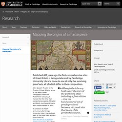
Published in 1611/12, it marked the first time that comprehensive plans of English and Welsh counties and towns were made available in print. To celebrate its 400th anniversary, Cambridge University Library has digitised each of the proof maps and put them online at www.lib.cam.ac.uk/deptserv/maps/speed.html. The Library is also selling copies of the 60 plus images that make up Speed’s masterpiece. Inset into the corner of each county map is a plan of its county town and each spare inch of space is used to illustrate famous battles, local coats of arms, as well as Roman and pre-historic sites.
The atlas, bought by the University Library in 1968, is now considered priceless. A slice of Tudor and Jacobean life in miniature, its influence was so great that it was used by armies on both sides of the English Civil War. British_isles_802.jpg from utexas.edu. Interactive - National Geographic Magazine - StumbleUpon. The World of Seven Billion The map shows population density; the brightest points are the highest densities.
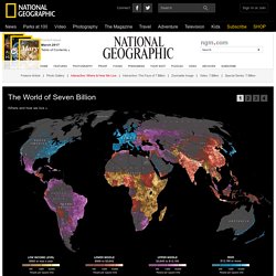
Each country is colored according to its average annual gross national income per capita, using categories established by the World Bank (see key below). Some nations— like economic powerhouses China and India—have an especially wide range of incomes. But as the two most populous countries, both are lower middle class when income is averaged per capita. Unusual and Marvelous Maps. "QUANTUM SHOT" #585Link - article by Simon Rose and Avi Abrams Hideous monsters devouring ships?
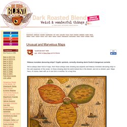
Cryptic symbols, correctly showing storm fronts & dangerous currents We’ve always been fond of maps, from those antique ones showing sea serpents and hideous monsters devouring ships in the vast expanses of the ocean, to those showing what the world looked like in the distant, and not so distant, past. Maps have, of course, been with us in one form or another, for a long time. Jerusalem is in the center - from "Itinerarium Sacrae Scipturae", by Heinrich Bunting, 1545-1606 Here’s a world map according to Posidonius, from around 150-130 B.C Ptolemy's version of the world, printed ten years before Christopher Columbus' first voyage - image via. British Isles Type Map in Sheer Slate.
Rethinking Schools - Just For Fun - Map Game - StumbleUpon. Busuanga Island Travel Guide - Philippines Interactive Map - iGuide. Flags of Every Country. Wikimapia - Lets describe the whole world! House Street City Country.
Europe_15th_colbeck.jpg from utexas.edu. US Population Animation. Flash Earth - Zoom into satellite and aerial imagery of the Earth in Flash. Tripline. MapCrunch - Random Google Street View. Los Angeles - Real-time local buzz. World Maps. iMap - This is where I get my weather!