
Grid Calculator by Nicolaj Kirkgaard Nielsen. Multi-Device Layout Patterns. Through fluid grids and media query adjustments, responsive design enables Web page layouts to adapt to a variety of screen sizes.
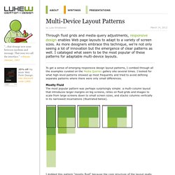
As more designers embrace this technique, we're not only seeing a lot of innovation but the emergence of clear patterns as well. I cataloged what seem to be the most popular of these patterns for adaptable multi-device layouts. To get a sense of emerging responsive design layout patterns, I combed through all the examples curated on the Media Queries gallery site several times. I looked for what high-level patterns showed up most frequently and tried to avoid defining separate patterns where there were only small differences. Mostly Fluid. Bildschirm / Browser Auflösung & Testing Online Web Apps.