
How to extract a unique distinct list from a column in excel. Table of Contents Overview Unique distinct values are all cell values but duplicate values are removed.
Thanks to Eero, who contributed the original array formula! Example sheet - How to remove duplicate values Column A contains names, some cells have duplicate values. Excel Array Formulas. Without Array Formula | With Array Formula | F9 Key This chapter helps you understand array formulas in Excel.
Single cell array formulas perform multiple calculations in one cell. Without Array Formula Without using an array formula, we would execute the following steps to find the greatest progress. 1. 2. With Array Formula We don't need to store the range in column D. 1. 2. 3. Tutorial: How to Decide Which Excel Lookup Formula to Use. Tagged as: hlookup, index match, lookups, vlookup The Complete Guide to Excel Lookup Formulas One of the most common tasks in Excel is the process of looking up specific values within a data set.

In a simple database, this process would be completed by writing a “query” for a specified “table.” For Excel, you complete this task by using a “formula,” with specific syntax rules, and reference a “data range.” If your intent is to someday become an Excel power user, you will need a solid understanding of all the lookup formulas available to you. VLOOKUP – Vlookup is the oldest and most often used lookup formula in Excel.
Click here for a tutorial on VLOOKUP HLOOKUP – The Horizontal Lookup is essentially a Vlookup transposed; instead of trying to find your lookup values vertically in columns, you are now looking horizontally through rows. Kutools - Combines More Than 120 Advanced Functions and Tools for Microsoft Excel. 6 Best charts to show % progress against goal. Posted on March 10th, 2014 in Charts and Graphs , Learn Excel - 29 comments Back when I was working as a project lead, everyday my project manager would ask me the same question.
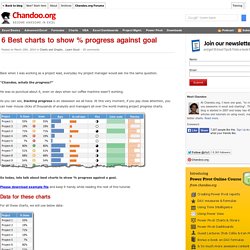
“Chandoo, whats the progress?” He was so punctual about it, even on days when our coffee machine wasn’t working. As you can see, tracking progress is an obsession we all have. At this very moment, if you pay close attention, you can hear mouse clicks of thousands of analysts and managers all over the world making project progress charts. So today, lets talk about best charts to show % progress against a goal. Please download example file and keep it handy while reading the rest of this tutorial.
Data for these charts For all these charts, we will use below data: Chart #1: Conditional Formatting Icons + % values This is my all time favorite. All you have to do is, Select the % completion dataGo to Home > Conditional Formatting > Icon setsSelect 3 traffic lightsEdit the rule as shown below: Done! Progress Bar Chart - Beat Excel! Would you like to show progress on a KPI by putting a nice progress bar into your report?
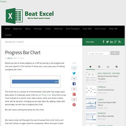
In this tutorial I’ll show you a very easy way of making a progress bar chart. This chart too is a version of a thermometer chart with two single value data series. It is basically same chart as self filling chart. Only this is a bar chart instead of a column chart. Idea is basic, while one series is static, other will be dynamic, changing as we input data.
We will need a setting like below for this chart. We need a total cell that gets the sum of values from a list. Total% is equal to total/target (formatted as percentage), target% is equal to 1 (formatted as percentage). Now select total% cells and insert a bar chart. Click on the total series and format it: fill: solid(blue)add white and bold label (inside end) Click on the target series and format it: fill: no fillborder: thick blue)Set series overlap to 100%. Budget vs. Actual Data in Charts - 14 Charting Ideas for Excel Users. Posted on April 5th, 2009 in All Time Hits , Charts and Graphs , Featured - 66 comments update: This poll is closed now, however, feel free to share your opinions and ideas.
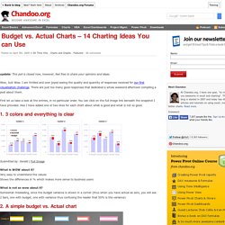
Wow, Just Wow. I am thrilled and over joyed seeing the quality and quantity of responses received for our first visualization challenge. There are just too many good responses that dedicated a whole weekend afternoon compiling a post about them. First let us take a look at the entries, in no particular order. 1. 3 colors and everything is clear Submitted by: Gerald | Full Image. Budget vs Actual Dashboard. Managing a business?
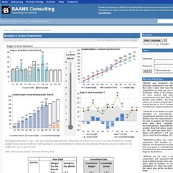
If yes , then you certainly appreciate the PDCA(Plan Do Check Act ) cycle. You have Planned the monthly budget values and as month by month passes by you are interested to Check and also analyse the actual values in relation to the budget. So how do you do this? Well, that is pretty simple. Take the following data. Based on the Base Data prepare the Cumulative Data using the following formula and plot a line chart E2 = B2 E3 = E2+B3 and so on F2 = C2 F3 = IF(COUNTA(C3)<> 0,F2+C3,”") and so on.
SUBSTITUTE Function.