
Vivid Maps. Mapping changes to the World's urban population between 1950 - 2030. For the first time in history more than half the world’s population live in cities.
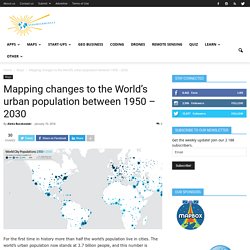
The world’s urban population now stands at 3.7 billion people, and this number is expected to double by 2050. In 1950 only 30% of the world’s population was living in cities. Today the number reached as much as 54%. A really cool map by urban geographer Duncan Smith is trying to capture this change. The map shows the population size of cities around the world for 1950, 1990 and 2015. When you move mouse over particular city you’ll get a detailed information its dynamics. While the dynamics of several other World’s largest cities are different. Data comes from the UN World Urban Propospects – a report where UN tracked the populations of major cities from 1950 to 2014 as well as predicted how these populations would change up to the year 2030.
The global urbanisation is a fact and it has profound implications for a wide range of issues including food, water, and energy consumption. One thing is sure. Windyty, wind map & forecast. Watch the Growth of Walmart and Sam's Club Across America. It’s About Time : Visualizing temporal data to reveal patterns and stories: Visualizing temporal data to reveal patterns and stories. "Observe due measure, for right timing is in all things the most important factor.

"-Hesiod Most of us don’t spend much time thinking about time, but there are instances when we should. Consider Eos, goddess of the dawn in Greek myth, who fell in love with a man named Tithonus. She implored Zeus, ruler of the gods, to grant her human lover immortality. Her wish was granted, but over the years, a flaw in her request became tragically apparent: Eos had neglected to ask for eternal youth along with eternal life. This ancient cast of characters offer lessons that are still relevant today: based on their respective vantage points, individuals can have blind spots about something as seemingly familiar as time.
Visualizations can help extend our ability to recognize important features about time that we might have otherwise overlooked. Licensed under Creative Commons Attribution-Share Alike 3.0 via Wikimedia Commons Part 1: Show Time - Approaches to Visualizing Temporal Data tweet this 1. A. Homicide Monitor. Animated interactive of the history of the Atlantic slave trade. Source: slavevoyages.org For the full interactive version, use a larger device.

Interactive by Andrew Kahn. Background image by Tim Jones. Usually, when we say “American slavery” or the “American slave trade,” we mean the American colonies or, later, the United States. But as we discussed in Episode 2 of Slate’s History of American Slavery Academy, relative to the entire slave trade, North America was a bit player. This interactive, designed and built by Slate’s Andrew Kahn, gives you a sense of the scale of the trans-Atlantic slave trade across time, as well as the flow of transport and eventual destinations. History of American Slavery, Ep 2: The Atlantic slave trade during its heyday and the remarkable life of Olaudah Equiano.
There are a few trends worth noting. In the 1700s, however, Spanish transport diminishes and is replaced (and exceeded) by British, French, Dutch, and—by the end of the century—American activity. Enroll now in a different kind of summer school. Flights interactive: see the planes in the sky right now. Norse Attack Map. How Missing Jet’s Debris Could Have Floated to Réunion. Time zones: About time.
Project Linework. Sonia Fernandes Silva. Visualizing Empires decline – revisited. This animated map shows how religion... - Business Insider. Business Insider. A Week of Check-ins on the Path to One Billion. Wind Map. An invisible, ancient source of energy surrounds us—energy that powered the first explorations of the world, and that may be a key to the future.

This map shows you the delicate tracery of wind flowing over the US. The wind map is a personal art project, not associated with any company. We've done our best to make this as accurate as possible, but can't make any guarantees about the correctness of the data or our software. Please do not use the map or its data to fly a plane, sail a boat, or fight wildfires :-) If the map is missing or seems slow, we recommend the latest Chrome browser. Surface wind data comes from the National Digital Forecast Database. If you're looking for a weather map, or just want more detail on the weather today, see these more traditional maps of temperature and wind. Videographic: Migration. A Time-Lapse Map of Every Nuclear Explosion Since 1945 - 3 Times Faster.
Map Making - A History of Cartography, Geological Survey & State Highway Maps 1940s.