
Best Mobile Designers In The World. The future isn’t bright for specialist mobile web developers. The decision to optimise a site for mobile or build a full mobile site that works on all handsets has always been a tricky one for marketers.

Mobile specialists have tended to opt for creating a ‘full’ mobile site that works on all handsets but with times changing, could the days of the 'mobile only' web developers be numbered? I’m not a massive fan of the “X vs.Y” school of thought. We see it all the time in mobile with “web vs. apps” and “iOS vs.
Android” stories. It’s a fairly lazy, yet effective, way of generating tweets and comments. The 'web developers vs. mobile web developers' debate Anyone acquainted with mobile will know that up until quite recently, most of the big web agencies ignored mobile as a communications channel. They subsequently built some excellent platforms, serving 'best possible' web pages on thousands of devices from lowly feature phones through to high end smartphones. What about those people who still have feature phones?
Mobile Web Design: Tips and Best Practices. Feb 09 2010 Last year, more than 63 million people in the United States accessed the Internet from a mobile device.

It’s forecast that by 2013 there will be more than 1.7 billion mobile Internet users worldwide. With those kinds of numbers, it’s imperative that web designers and developers learn optimal development and design practices for mobile devices. For the most part you won’t need to learn any new technologies for mobile site design. But you will need to look at site design in a new way, one that is decidedly more restrictive than design for standard browsers. You may want to check out the following related article as well: Mobile Web Design Trends for 2009 Familiarize Yourself with the Hardware and Software Available Cell phone and mobile device platforms vary greatly when it comes to operating system, screen size, resolution, and user interface. The future is mobile, but is your site ready?
The adoption rate of smartphones and tablets has soared in the last 12 months.

This trend has ushered in a whole new generation of users that are turning to the web on their mobiles to acquire information that helps them make decisions on the move. So how is your company catering for them? The majority of websites just aren’t probably optimised for this mobile onslaught. And that really is a problem, because the mobile workforce consumes information in a very different way than people sitting at their desks staring at a computer screen. Mobile apps, while popular at present, don’t seem to represent a short or long-term solution and it’s been suggested as many as 72% of mobile web users don’t download applications at all. Be strategic Like any website, the cornerstone of success for mobile sites is a definite and clear focus on how your mobile strategy will meet overall business objectives. For many companies, this focus will begin with a consideration of the mobile visitor. A User-Centered Approach To Web Design For Mobile Devices - Smashing Magazine.
Advertisement For the past few years, we’ve heard pundits declaring each year as “year of the mobile Web”; each year trying to sound more convincing than the previous.

Whether 2011 will be the real “year of the mobile” remains to be seen, but what is indisputable is the fact that the mobile usage of the Web is growing and evolving. As it evolves, so does the mobile user experience, driven by advances in mobile device technology — from better browsers on basic mobile phones (or feature phones — remember the Motorola RAZR?) To the increased adoption of smartphones and tablets. Adobe’s New HTML5 Tool Is Web-Designer Duct Tape. Nobody likes Flash.

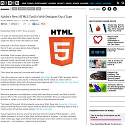
In 2011, this is an axiom. For years, we tolerated Flash because it worked; it could do things that HTML either couldn’t do at all, couldn’t do well, or couldn’t be made to do easily. Flash gave us YouTube. It gave us Homestar Runner. It gave us casual gaming beyond flipping cards and sweeping mines. And Adobe, Flash’s maker, gave us powerful, easy-to-learn GUI development tools that helped generalist coders make the web a more dynamic place — even if it was also “a hot mess” of broken back buttons and skewed UI paradigms, as IBM design researcher Andrew Sempere says. Then, about five years ago, the mobile web broke Flash. This is the context you need in order to understand Adobe Edge, the new HTML5 animation tool the company released to public preview on Monday. 5 Simple Tips For Better Business Websites.
This post originally appeared on the American Express OPEN Forum, where Mashable regularly contributes articles about leveraging social media and technology in small business.

There is one rule that typically holds true for all small businesses — they care about their customers. To a small company, customers aren't just another cog in the mechanism, they're the lifeblood of the business. Many small business rely on the support and repeated business of a loyal user base. So as a small business owner, naturally, you want to take care of your customers.
Here are a few tips for how "going the extra mile" can be applied to your web site. 1. With mobile device usage skyrocketing, a mobile-friendly web site is practically essential. As an added bonus, mobile sites can often be more accessible to those with visual impairments, or who may have difficulties using a mouse, but find touch displays easier to manipulate. 2.