
30+ High-Quality Free PSD Website Templates to Download. Learn how to earn $125 or more per hour as a freelancer - Click Here Looking for hosting?.

We recommend MediaTemple for web hosting. Use Code MTLOVESDESIGN for 20% off When it comes to designing a website Photoshop is an excellent tool for it, No design Software gives you quite so much control as Adobe Photoshop in designing a website. Most Designers share their Creative design stuffs to others for free. so that others can learn from their works, At sometimes these collection will become marvelous time saver. and a learning source for beginner web designers Here I’ve listed 30+ Quality PSD web templates to Download, hope you like the download list, Also be aware about license terms and agreements before You put them in use. 1.) 2.) 3.) 4.) 5.) 6.) 7.) 8.) 9.) 10.) 11.) 12.)
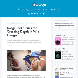
Image Techniques for Creating Depth in Web Design. Creative manipulation of images, from layering to composition to special effects, can add depth to web projects.

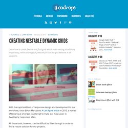
We live in a three-dimensional world, something that designers are trying to recreate in web design every day. The element of depth can add a greater touch of reality to certain design projects. Creating it can be easier than you think. The key to simulating reality on the 2D screen is by creating depth using images. This can be accomplished in a variety of ways, from the photography itself, to layering of images, manipulation and the use of special effects. Creating Nestable Dynamic Grids. Learn how to create flexible and fluid grids which make nesting at arbitrary depths easy, while allowing full freedom for how the grid behaves in all viewports.

With the rapid addition of responsive design and development to our workflows, since Ethan Marcotte’s A List Apart article in 2010, a myriad of tools have emerged to attempt to make our lives easier in developing responsive sites. All these tools, however, can be difficult to filter through in order to find a robust solution for our projects. In this article I will outline methods I have developed for creating flexible and fluid grids which allow for nesting at arbitrary depths, while allowing full freedom for how the grid behaves in all viewports.
This is all possible with a big help from the excellent grid generator Gridpak, put together by the folks over at Erskine. What We’ll Be Able To Do Once we’re done here, we’ll have a grid which can do some of the following: and can be used to manage our layouts in the real world like so: Expanding Overlay Effect. Responsive Multi-Level Menu - Demo 2. Responsive Retina-Friendly Menu. Blueprint: Horizontal Slide Out Menu. Fullscreen Layout with Page Transitions.