
Background-size. The background-size property in CSS is one of the most useful — and most complex — of the background properties.
There are many variations and different syntaxes you can use for this property, all of which have different use cases. Here’s a basic example: That's an example of the two-value syntax for background size. There are four different syntaxes you can use with this property: the keyword syntax, the one-value syntax, the two-value syntax, and the multiple background syntax. Keywords In addition to the default value (auto), there are two keywords you can use with background-size: cover and contain cover tells the browser to make sure the image always covers the entire container, even if it has to stretch the image or cut a little bit off one of the edges. contain, on the other hand, says to always show the whole image, even if that leaves a little space to the sides or bottom.
One Value Two Values Multiple Images Keep background image stacking order in mind when using multiple images. Demo. Hero image with text and image. Holy Grail Layout — Solved by Flexbox — Cleaner, hack-free CSS. At its core, the Holy Grail Layout is a page with a header, footer, and three columns.
The center column contains the main content, and the left and right columns contain supplemental content like ads or navigation. Most CSS solutions to this problem aim to meet a few goals: They should have a fluid center with fixed-width sidebars.The center column (main content) should appear first in the HTML source.All columns should be the same height, regardless of which column is actually the tallest.They should require minimal markup.The footer should “stick” to the bottom of the page when content is sparse. Unfortunately, because of the nature of these goals and the original limitations of CSS, none of the classic solutions to this problem were ever able to satisfy all of them. With Flexbox, a complete solution is finally possible. Fighting the Space Between Inline Block Elements. By Chris Coyier On I've seen this come up a couple of times lately on Twitter and then an interesting Dabblet so I figured it would be an important thing to document.
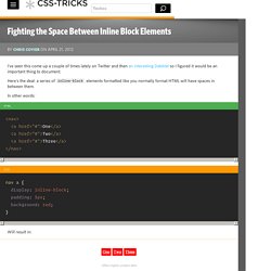
Here's the deal: a series of inline-block elements formatted like you normally format HTML will have spaces in between them. In other words: <nav><a href="#">One</a><a href="#">Two</a><a href="#">Three</a></nav> Will result in: We often want the elements to butt up against each other. This isn't a "bug" (I don't think). Here's some ways to fight the gap and get inline-block elements sitting directly next to each other. #Remove the spaces The reason you get the spaces is because, well, you have spaces between the elements (a line break and a few tabs counts as a space, just to be clear). <ul><li> one</li><li> two</li><li> three</li></ul> or <ul><li>one</li ><li>two</li ><li>three</li></ul> or with comments... <ul><li>one</li><! They're all pretty funky, but it does the trick.
#Negative margin #Skip the closing tag Another weirdness! #See. In Search of the Holy Grail. I’m sorry.

Really. I didn’t name it. I don’t mean to overstate its importance or trivialize the other and rather weightier Holy Grails. Article Continues Below But the name’s out there, and we all know what it means. Three columns. Many articles have been written about the grail, and several good templates exist. A recent project has brought my personal grail quest to an end. Background-size. Hero image with text and image.