
Typography can make or break your design: a process for choosing type. Identify your purpose Before you do anything else, first identify the purpose of your design. What information do you want to convey? What is the medium for your design? Good design aligns its typography with its purpose. This is because typography is key to setting mood, tone, and style in your designs. For example, if you are designing a greeting card that’s illustration heavy, choose a font that fits the style of your illustration. If you’re designing an image-driven landing page, choose a simple font that doesn’t detract from your images. Identify your audience After determining the purpose of your design, identify your audience. After clarifying the purpose of your design, identify your audience.
For example, some fonts are more appropriate for children. Other fonts are more appropriate for seniors. When choosing type, take into account your audience and their needs. Look for inspiration Look at the work of other designers. Font Inspiration Pairing Inspiration Determine font sizes. Beautiful web type — the best typefaces from the Google web fonts directory. Lucius Annaeus Seneca60 AD Among the numerous faults of those who pass their lives recklessly and without due reflexion, my good friend Liberalis, I should say that there is hardly any one so hurtful to society as this, that we neither know how to bestow or how to receive a benefit.
It follows from this that benefits are badly invested, and become bad debts: in these cases it is too late to complain of their not being returned, for they were thrown away when we bestowed them. Nor need we wonder that while the greatest vices are common, none is more common than ingratitude: for this I see is brought about by various causes. The first of these is, that we do not choose worthy persons upon whom to bestow our bounty, but although when we are about to lend money we first make a careful enquiry into the means and habits of life of our debtor, and avoid sowing seed in a worn-out or unfruitful soil, yet without any discrimination we scatter our benefits at random rather than bestow them.
Google Web Fonts Typographic Project. Fonts. A More Modern Scale for Web Typography. « Back to Blog on Wednesday 15th of January 2014 In RWD, the proportions and rhythm of your body, headers & measure deserve as much attention as margins, floats & media queries.
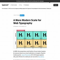
Jason Pamental of H+W Design explains why, plus throws in a scale you can use and a live demo. I’m a big believer in responsive web design. It’s the only way I know to provide the best experience across the increasingly fragmented landscape of devices and capabilities that is the new normal on the web today. I find that really jarring, because in my experience, it’s not just the absolute sizes of your type and spacings that must change as screen sizes shrink; the proportions between them must change as well. A step out of scale For many of us, once we calculate a balanced and readable typographic scale and rhythm for our initial design, we turn our attention to tweaking floats and widths in the layout for other breakpoints. What often gets missed is proportion. A more modern measured scale Show / Hide the CSS.
PXtoEM.com: PX to EM conversion made simple. Bootstrap 3 Responsive Grid Illustratror Templates (AI) by Carlos Silva - Dribbble. A More Modern Scale for Web Typography. Fonts. Google Web Fonts Typographic Project.