The Creation of a CSS3 Clickable, Rotating Menu. The Elements Of Navigation. Posted at Smashing Magazine by Petter Silfver This article is about the tiniest of details that goes into creating the main centerpiece of your digital product—the construction of the elements of your navigation. This is the most important aid you can possibly give to your users as they are constantly seeking a reason to walk out on you. Words, words, words The first thing I do when I start to sketch out the information architecture of a digital product based on the requirements at hand is to blatantly label stuff. This is nothing unique — I simply need to formulate a label (most of the time accompanied by a short description) of all the possible information entities I discover to be able to reveal taxonomy and relationships between them.
"Locate store" is your label of something that enables the users to find physical stores in a mobile application. User-testing labels So what is the easiest way of doing a sanity check of the way you express the information space? What is what. Menu List Design. Posted at Web Designer Wall This is a quick CSS tutorial to show you how to create a menu list using either the CSS border style or a background image. The trick is to apply a bottom border to the <li> element, then use the absolute position property to shift the nested elements down to cover the border. It is very flexible — you can easily change the layout by altering the border or background image. It even works when the browser's font size is being scaled (increased or decreased). View Demo Take a look at the HTML code and the diagram. They will help you understand how the CSS work. The key points are:Specify the li element to position:relative and apply a bottom border style.Use position:absolute with negative bottom value to shift the strong and em element below the border.Remember: use relative value (em) to control the padding space.
You can easily change the style by editing the CSS border and padding for the li element. You can also use a background image. View Demo. Create an Advanced CSS Menu Using the Hover and Position Properties. Posted at NoobCube by Jarod Taylor Starting with a photoshop file and finishing with semantic HTML and CSS, we'll be creating an advanced CSS navigation menu using its :hover and position properties. The finished product will render properly in all major browsers including Firefox, Safari, IE7/IE8, Opera, and Google Chrome. Due to IE6 and its lack of support for the :hover property (other than on anchor elements), we'll have to implement a little javascript to gain its support.
Nonetheless, let's get started! Introduction This tutorial uses techniques that were also covered in last week's tutorial, CSS Background Image Sprites: A Beginner’s Guide. Before we get started, I want to give credit to Chris Spooner for his Hand Drawn Doodle Icon Set we'll be using in this tutorial. Getting the images ready I'm using Photoshop CS4 in this tutorial, but you can pretty much use any version of photoshop to achieve the same results. Navigation Menu Background Navigation Menu Buttons Navigation Menu Icons. Advanced CSS Menu. Posted at Web Designer Wall This tutorial I will show you how to slice up the menu design (step by step) and put them together with CSS.
Most of you probably know how to code a horizontal or vertical CSS list menu. Now let's take it to the next level — code an advanced (un-typical) list menu utilizing the CSS position property. Overview Here are the required graphics to assemble the menu (you can download from the zip). Main Background Open the Photoshop file. Button Graphics Turn off the background Layer Group and leave only the menu text layers visible. Create a new file and take note of the file dimension (w x h), in my case the "home" graphic is 144 x 58px. Here is how the hover effect will work. Repeat this step for the other buttons. HTML Source When you are done with the graphics, let's start coding. Reset the menu to no padding, no margin and no list-style.
Specify the span element to display: none (so they will be invisible by default). Advanced CSS Menu Trick. Posted at Design + Strategy by Ross Johnson CSS really opens the doors to a lot of powerful and rich opportunities. It is funny how such minor things can create a whole new look, feel, and effect of a site. The beauty of CSS really is that it gives you power, but not too much power. It is not a tool like flash that really invites you to run away and take things too far. We are now coming to a point where the browsers are supporting a lot of new features, giving us more opportunities to take advantage of previously unused pseudo elements.
The first step – CSS roll overs The first step of the game is building some CSS roll overs. Image Examples Button sliced, fixed and hover states The CSS The HTML Then when we want to change the state of the button we simply adjust the background position to be -200px (or the size of the button itself) pulling the different state of the button into view. IE7, Safari, Firefox, all support the :hover pseudo selectors so let’s take advantage of that. View Demo. How to Create a CSS Menu Using Image Sprites. Posted at Line25 by Chris Spooner Follow these steps to build your own modern navigation bar design, starting with the initial steps in Photoshop to flesh out the design, then moving on to constructing the HTML and styling with the CSS image sprite technique. However, if all that sounds too strenuous, there’s also a handy download of the source files especially for you! Start work in Adobe Photoshop and create a new document at your desired size. Grab the Rounded Rectangle shape tool and draw a long, thin bar onto the canvas on its own layer.
Double click the layer to open the layer style options. Add a Gradient Overlay spanning from a dark to light tone. Head down to the Stroke options and add a thin outline stroke with a mid grey colour. The bar so far has a soft bevelled appearance, and is ready for being filled with menu options. Use the Text Tool to type out a range of menu options. Double click the text layer, then add a darker Gradient Overlay. View Demo. CSS Dock Menu. Posted at n.design studio If you are a big Mac fan, you will love this CSS dock menu. It is using Jquery library and Fisheye component from Interface and some of my icons. It comes with two dock position: top and bottom. This CSS dock menu is perfect to add on to my iTheme. If you like the HiGloss icons used in the demos, you can get them as stock icons at IconDock.
Download the CSS dock menu zip package. In between the HTML head tag, add the following code: The first part is the Javascript, second part is CSS stylesheet and last part is the PNG hack for IE 6. Don’t forget to add the following code to anywhere within the body tag: To add menu item to the top dock (note: span tag is after the img tag): To add menu item to the bottom dock (note: span tag is before the img tag): View Demo. Create a Slick Menu using CSS3. Posted at Insi Designs In this article I am trying to mimic the navigation menu in Dragon Interactive website using only CSS (no images, no JavaScript). Note: This is an experimental example using the new features of CSS3. The effects can be seen in Latest Webkit Browser only. Gradients works in Firefox 3.6 but not the fade-in and fade-out transition. Let's create the html used: <div class="wrapper"><div class="container"><ul class="menu" rel="sam1"><li class="active"><a href="#">Home</a></li><li><a href="#">About</a></li><li ><a href="#">Blog</a></li><li><a href="#">Services</a></li><li><a href="#">Portfolio</a></li><li><a href="#">Contacts</a></li><li><a href="#">Twitter @insic</a></li></ul></div></div> Now the CSS.
The CSS code for the menu item: View Demo. Blur Menu with CSS3 Transitions. Posted at Codrops by Mary Lou There are so many great things we can do with the additional properties and possibilities that CSS3 brings along. Today I want to show you how to experiment with text shadows and with transitions in order to achieve a blur effect that we'll apply to a menu on hovering over the elements.
The main idea is to blur the other items while enhancing the one we are currently hovering. The images in the demos are by fabulous Mark Sebastian and they are licensed under the Attribution-ShareAlike 2.0 Generic (CC BY-SA 2.0) License. Please note that this will only work properly in modern browsers and unfortunately Internet Explorer does not belong to that category yet since it does not support transitions (and many other suggested CSS3 properties that others do support).
The Markup Let's create the HTML structure for our menu first. The CSS In almost all of our examples we'll have the same style for the ul and for the list elements. Example 1 Example 2 Example 3 Example 4. Slide Down Box Menu with JQuery and CSS3. Posted at Codrops by Mary Lou In this tutorial we will create a unique sliding box navigation. The idea is to make a box with the menu item slide out, while a thumbnail pops up.
We will also include a submenu box with further links for some of the menu items. The submenu will slide to the left ... We will be using the jQuery Easing Plugin and some beautiful photos by tibchris. The Markup For the HTML structure we will be using an unordered list where each menu item will contain the main link item and a div element for the submenu: If there is no submenu, the div can simply be left out. The CSS We will start by styling the unordered list: Generally, we want to remove any default text-decoration and outline for all the link elements in our menu: Our list items will be floating left and have the position relative since we will want to use absolute positioning for the elements inside.
We are using a background image that creates a glass like effect with a semi-transparent gradient. Proof of concept ‘stacking’ responsive menu. Posted at Neil Carpenter I read a lengthy thread/discussion on Google+ the other day about the state of the web applications, specifically in relation to native apps on mobile devices. I had always taken it as a given that the open web would prevail over proprietary and device-specific technologies and that it was just a matter of time before the web catches up, but this article kind of worried me, with plenty of well-respected members of the web community voicing concern of the lack of urgency in implementing features to bring the web on a par with native applications, and that in fact it may never catch up. Anyway, this made me sad. So, I wanted to see how easy it would be to recreate a native app interaction – specifically the "browser tab" menu from Chrome for iOS.
I like the Chrome app, it has a slick interface with nice transitions and makes the most of a gesture-based OS. Note: Resize the demo window to see the stacking menu in action View Demo. Simple scalable CSS based breadcrumbs. Posted at Veerle's Blog by Veerle Pieters A few days ago I was implementing breadcrumbs in a website I’m working on. Not that I sincerely believe every site needs this, but on some occasions and to some users breadcrumbs are practical.
Anyhow, it gave me the idea to write an article about it because it’s been a while since I last wrote about anything CSS-related. The one I’ll share with you is a very simple one. The one I implemented in the project I'm working on looks a bit similar, but was more complex to code. All items have links, except the page you're on. First we reset the basic list styling behavior: hide the typical round bullets that appear by default and remove the indentation by setting the margin and padding to zero. I've given the list an ID called #crumbs. All crumbs need to appear on 1 horizontal line so we give each li element float:left. We want to have the entire arrow area clickble. It is a rather big image, but that's because we want it to be scalable. View Demo. Exceptional CSS Navigation Techniques. This Blog Wednesday, October 10, 2012 Exceptional CSS navigation techniques Posted at Six Revisions by Kawsar Ali The Menu menu This another great CSS menu Stu Nicholls that’s unique – hovering over a menu item reveals a submenu.
If you want get started with this menu just simple view the source code. Pure CSS hover menu In this CSS technique, you’ll learn to create a vertically-oriented CSS hover menu that reveals a submenu when a menu item is hovered on.View Demo Matte CSS Menu Matte is a simple CSS menu with rounded corners using two small images only from 13styles. CSS Blur Menu This CSS technique shows you a method from creating a menu that blurs sibling menu items when you hover over an item.View Demo CSS Navigation with Glowing Icons This beautiful CSS menu technique can be created by following along this extensive step-by-step tutorial.View Demo CSS Sliding Door using only 1 image This slick CSS menu is based on the Sliding Doors technique but only uses one image.View Demo Woody CSS Menu.
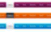
CSS Ribbon Menu. Posted by Jack Moore This uses CSS3 transitions and CSS2 pseudo-elements to create an animated navigation ribbon with minimal markup. Browser Support IE8 and IE9 do not support CSS3 transitions, so the hover state will not be animated for those browsers. Otherwise it looks and functions the same, which I think is a very acceptable fallback. IE7 lacks support the :before and :after pseudo-elements, so the ribbon will not have the forked ends or display folds while hovering. The forked ends and folds are created with CSS pseudo-elements, allowing for very clean HTML. Forked ends Here the :before and :after pseudo-elements are used to create empty elements with a thick border.
Links The links and the forked ends are all floated left so that they fit flush against each other. Animated Folds A nifty trick for vertically centering text inside of an element is to set the line-height to be the desired height of the element and remove any vertical padding. View Demo.