

An Analysis of Responsive Websites – What’s Hot and What’s Not. Let's face it folks, everyone in the web design world is chirping away about responsive websites these days. People definitely carry strong views about it and whether you like it or not, you cannot deny the fact that responsive web design has gone mainstream and will continue to progress and expand in the future. Every client on the web these days are looking for a website that will function just as good on mobile devices as it does on desktop browsers. And come to think of it, the need of today's modern technological era is to have one working design that is compatible across multiple platforms and devices that includes Netbooks, Blackberry's, iPhones, iPads, Kindle readers and other smartphones and tablets.
It's inevitable that over the next few years, new gadgets and devices will be unleashed in the market, all having their own respective screen sizes and resolutions. It seems almost impossible or at least impractical to have a different website version for each of these devices. 1. Mobile Web Problems and How to Avoid Them. Two years ago Jen Simmons (@jensimmons) and I made a site called WTF Mobile Web, a Tumblr which highlights the frustrations mobile web users regularly experience.
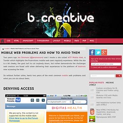
While the site is a bit cheeky, the goal isn't to cut anybody down, but rather demonstrate the challenges web creators are faced with when delivering their experiences to the plethora of desknots now accessing the Web. So without further adieu, here's two years of the most common mobile web problems and what you can do about them. Denying Access. CSS3 for Responsive Web Design (full day workshop) Responsive Icon Grid. 10 Basic tips about responsive design. 30 Useful Responsive Web Design Tutorials. This list is not meant to be an exhaustive one but it will get you started on understanding the basics of designing an adaptive website that will cater to all sorts of screen sizes.

We'll start off with introductory tutorials in "Breaking the Ice", something like an RWD: 101 class you should attend to get the hang of the concept before we move on to "Start Building" exercises. Lastly we'll end with a "Do More" section in which we'll feature tutorials that play with horizontal layouts, "elastic" videos, drop-down menus and slide-to-top accordion navigations, thumbnails and the sticky issue with tables.
But First... Coding A Responsive Resume In HTML5/CSS3. Almost everybody in the business section has created a resume at some point.
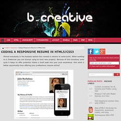
When working as a freelancer you are always vying to land new projects. Because of this transitory work cycle it helps to offer potential clients a brief peek into your past experience. And what a better opportunity than offering your professional resume online? In this tutorial I want to demonstrate how we can build a responsive single-page resume layout. I'll be coding everything in HTML5/CSS3 to work properly at various screen resolutions. Building The Document I'm starting the webpage with an HTML5 doctype and standard meta elements. The meta viewport tag is crucial for getting the responsive technique to work on smartphones. I have also setup a small IE conditional which includes some open source scripts for legacy browsers. Main Content Blocks The whole document is wrapped in a div with many various block sections inside. As you resize the page these block elements fall beneath each other gracefully.
Separate Mobile Website Vs. Responsive Website. Posted at Smashing Magazine by Brad Frost The US presidential race is heading into full swing, which means we'll soon see the candidates intensely debate the country's hot-button issues.
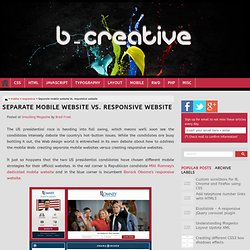
While the candidates are busy battling it out, the Web design world is entrenched in its own debate about how to address the mobile Web: creating separate mobile websites versus creating responsive websites. Ιt just so happens that the two US presidential candidates have chosen different mobile strategies for their official websites. In the red corner is Republican candidate Mitt Romney's dedicated mobile website and in the blue corner is incumbent Barack Obama's responsive website.
CSS :target for Off-Screen Designs. Posted at CSS-Tricks by Matty Collins I recently saw a presentation by Ryan Seddon on things you can do with checkboxes. It got me thinking about a similar pseudo selector based on the URL, :target and how it could be used for hiding and revealing elements for extra space (namely on smaller screens). I set myself the task of recreating the iOS Message app without using JavaScript by taking full advantage of awesome CSS3 selectors and transitions.
Simple example The following code examples show how we could hide a login box and navigation, exposing them when needed. By starting the navigation and login offscreen first, we can then reveal them on :target. The auxNav shows that we don't need to hide the ID itself, but can hide any decendants of it. The "App" Each message ("screen") has an ID and is positioned off screen.
A hidden "delete" button slides in when the edit button is selected. Advantages No JavaScript! Disadvantages / Issues Related links View Demo. Plunk - A handy tool for testing mobile web pages and apps. Standards for Web Applications on Mobile: current state and roadmap (August 2012) Latest version This version Previous version Web technologies have become powerful enough that they are used to build full-featured applications; this has been true for many years in the desktop and laptop computer realm, but is increasingly so on mobile devices as well.
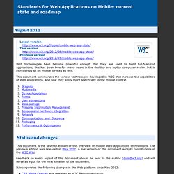
This document summarizes the various technologies developed in W3C that increase the capabilities of Web applications, and how they apply more specifically to the mobile context. Building a Responsive, Mobile-First Navigation Menu. This tutorial will demonstrate how to develop a rather complex responsive navigation menu using the “ Mobile-First Approach “. The aim is to present mobile users with a pseudo-native, touch-conducive and interactive interface that enables them to navigate the website with ease. Tablet users will be presented with an appropriately-sized navigation whilst desktop users will be presented with a glorious drop-down navigation menu. The whole point of the practice of web design is to present appropriate user interfaces that feel native to the users’ environment. Expandable Mobile Search Form. Previously I wrote a tutorial on mobile navigation, today I'm going to share a CSS tutorial on how to make an expandable search form that is suitable for mobile and responsive designs.

This trick uses native CSS properties — no Javascript or extra markups required. Mobile Computing with iPhone and Android. Creating Mobile-Optimized Websites Using WordPress. The Mobile User Experience. One of the biggest challenges that many 2D barcode implementations run into is that the user experience isn’t designed in a manner that maintains engagement with the audience.
For that reason, we thought the best way to help improve the less-than optimal experiences we occasionally see in the wild is to offer some guidance on the topic. So as you’ve probably guessed by now, this week we will be diving into the topic of mobile user experience. To give you an idea of just how critical it is to get it right when it comes to mobile optimization consider this: 50% of mobile web users are unlikely to return to a site that they had trouble accessing from their phone That means that your hopes for repeat engagement are cut by more than half if you leave a bad taste in the mouth of your mobile audience.