
Page Transitions with CSS3. In the last few years, we've seen a lot of single page websites lying around the internet, most of them using JavaScript for some transitions effect.
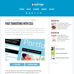
Well, now I'm gonna teach you how you can have your own, but instead I'll be using CSS Transitions and the :target property to do all the magic. View demo Download source In the last few years, we’ve seen a lot of single page websites lying around the internet, most of them using JavaScript for some transitions effect.
Well, now I’m gonna teach you how you can have your own, but instead I’ll be using CSS Transitions and the :target property to do all the magic. The Dribbble shots used in the demos are by Matt Kaufenberg. Markup The HTML will contain five main divisions: a header and the four content sections. In the header we will have the main heading and the navigation: Now, the main idea is to use the pseudo-class :target in order to add a transition to the current section. First we will give style to our header and the navigation. Creative Link Effects.
A Collection of Separator Styles. A collection of separator styles for horizontally dividing sections on a website.
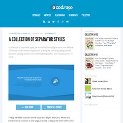
The dividers are created using several techniques, including styling pseudo-elements, using gradients and inserting SVG graphics with responsiveness in mind. View demo Download source Today we’d like to share some separator styles with you. When you have several sections in one page, it’s nice to separate them with some kind of line or background. There are so many possibilities and we want to show you just some of them that could look nicely for some flat design. SVG is used in the cases where we cannot simply use a pseudo-element that is nicely responsive, like the half circle shape. And now, dig in, scroll and get inspired! An example for a separator style using pseudo-elements is the following double diagonal representing a flat shadow: Another example is the inclined zig zag pattern (up and down) made with a linear gradient: …or the folded corner that uses diagonal gradients to simulate the triangles: Tutorials.
Sphères en CSS3. Nous pourrions aborder la réalisation de sphères en CSS de deux manières différentes.
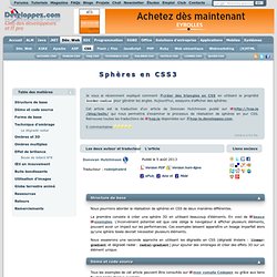
La première consiste à créer une sphère 3D en utilisant beaucoup d'éléments. En voici de beaux exemples. L'inconvénient potentiel est que cela oblige le navigateur à afficher plusieurs éléments, pouvant avoir un impact sur les performances. Ces exemples laissent apparaître un lissage imparfait alors qu'une sphère lissée devrait nécessiter plusieurs éléments. Nous essaierons une seconde approche en utilisant les dégradés en CSS (dégradé linéaire : linear-gradient et dégradé radial : radial-gradient) pour ajouter des ombrages et créer des effets 3D sur un élément unique. Tous les exemples de cet article peuvent être consultés sur mon compte Codepen ou grâce aux liens fournis après chaque exemple. Avant de rentrer dans le vif du sujet, nous allons créer une forme initiale de sphère dont le code HTML est : Français. SPIP-Contrib - Réfugiez-vous dans SPIP-Contrib.
Tutoriaux SPIP – Paris-Beyrouth. SPIP pour débuter. ResponsiveSlides.js · Responsive jQuery Slider & Slideshow. Les fondamentaux du Responsive Web Design. I.

Introduction▲ Prenons deux exemples simples. Le premier pourrait être ces vitres qui s'opacifient en fonction de la luminosité extérieure. Ou encore ces murs-miroirs où plus nous nous approchons, plus ils nous semblent se déformer. Bref, ce que cherchent les architectes dans ce mouvement, c'est de dépasser/s'abstraire des contraintes inhérentes liées aux différents supports. Le « Responsive Web Design » est né, car nous sommes de plus en plus confrontés aux mêmes problèmes que les architectes : s'adapter aux supports. Voyez plutôt : autrefois, nous n'avions qu'un ou deux navigateurs et les tailles d'écrans variaient peu.
Et tout cela, c'est ce que nous avons maintenant.