
16 pal. History Long ago there were computers with built in color palettes.
The older BBC Micro for example, had only 8 colors, whilst the NES could pick colors from a 64 color palette (though the sprites could only use 4 or 3). Generally, these kind of built in palettes seem to have been designed by an engineer and not an artist. Computers were made to display text in readable (fully saturated) colors, but some systems ended up being used a lot for gaming instead. The C64 is a bit of an exception with its more muted 16 color palette, which I heard was carefully designed. But, the C64 palette still bothered me a bit, so back in 2007 I decided to do my own 16 color palette.
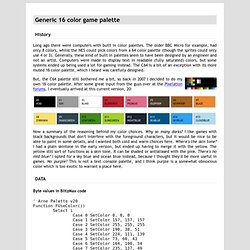
Now a summary of the reasoning behind my color choices. Byte values in BlitzMax code Names Adobe Color Table 16pal_v20.act - It is 772 bytes because 256 colors * 3 RGB bytes = 768 + three bytes ending the file, 16, 255, 255, where 16 is the amount of colors actually used (the rest are zeroed). Finishing thoughts AndroidArts.com. Holy Background Pixels Batman! I was just playing Air Fortress and noticed how inefficient it is with its tiles (Yeah, it's probably an old mapper, but I looked at the tile tables and there was a lot space left for fun).
So, I came to think of Batman 1 for the NES, and I ended up writing down some notes. The Video Game Atlas has the delicious level maps. The game backgrounds on the NES seems to be limited to 4 palettes with 4 colors each, with one color being shadow black in the case of Batman. The highlights in Batman are often gray (resulting in a cold look) or saturated (giving a chrome-ish look). Shadow black amoebas consume large parts of the background, and even the walkable tiles use a lot of black. A top left light source is common. There are also a lot of vertical elements in the background which break against the floor.
Dithering is used, in particular between the dark color and the black. Pixel Art Tutorial WIP. This page is maybe 26.2% done!
Lots of placeholder blurbs! Pixel Art Tutorial Preramble "GHERKING" was found lurking on one of my old Amiga floppy disks. It was done in Deluxe Paint III sometime in the late 80's or early 90's (note dragon-mullet). I don't think I quite understood the nature of pixels until I got ahold of Deluxe Paint in the late 80's. The first thing I pixeled was probably a hammer from the Super Mario Bros manual (which for some reason had line art pixel drawings in it).
I spent a lot of time working on projects in Deluxe Paint, mostly experimenting with my own techniques because no one else around me was doing pixel art. I work in Photoshop nowadays, even though it's in some ways inferior to Deluxe Paint. So you want to be a pixel artist? - Photoshop tutorials and Pixelart tutorials, smiles and pixelart. Part 1: The Almighty Grass Tile Ah yes, the grass tile...Generally the first tile anyone does, because hey, if you're making an RPG, and you plan to have it take place on a world, you're probably going to need grass.
It's a good way to warm up and get into drawing the tiles, so let's start with it. Let's cover some different methods of making grass. You've probably seen these, if you've checked out a lot of games: These aren't all the methods, of course, but these are some popular ones. So then we come to the more "complex" grass tiles...The ones that have tons of dots in them. Another method is to simply paintstakingly draw in the blades, going from shade to shade. Now you can use whatever method you like, and there are a lot of different ones...Just remember that grass shouldn't look totally flat, and using the same tile and just changing the shades looks horrible: Do not, I repeat do NOT do this. Contents: Designing a retro pixel-art tile-set. Hello and welcome back to my blog!
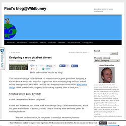
This time something a little different – I commissioned a guest post about designing a tile-set from a studio who specialise in pixel-art. After searching long and hard to find exactly the right style I was after I settled on a company from Poland called Blackmoon design. Check out their site, its pretty cool looking. Anyway, here is their post: Creating tiles in game boy style Czarek Luczynski and Robert Podgorski. Czarek and Robert are part of the BlackMoon Design ( which is a game studio based in Poznan, Poland. “We seek the inspiration for our games in nostalgic memories from our childhood – where Nintendo and C64 roamed the earth.
Introduction Before starting, let’s define the characteristics of gameboy style: Palette – 4 shades of green/gray.Big, clear pixels – We should work on smaller image, and enlarge it 2 times without use of the antialiasing to have clearly visible pixels on modern HD screens. Creating the rocks tiles Ok.