
VisualJournalism. Print or online? One masterpiece and one screw-up – VisualJournalism. THE NEW YORK TIMES just ran an interesting article titled ‘It’s All Connected: A Spectator’s Guide to the Euro Crisis’ and the intro ending with ‘The graphic here helps you see the intertwined complexities.’
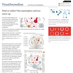
They also ran an interactive visualization online with the same title, but with the intro ending in ‘Here is a visual guide to the crisis’. Pretty much the same stuff – except that I challenge you to understand and gain insight from the online-version: See it here: Before reading the print-version. See it here: The printed version has a lot of text, which leads you through the story and educates you along the way on a highly complex system. The online version shows you the data and tells you some accompanying facts – but doesn’t tell you the story. Big differences in the looks too: The print-version is elegant with a good colour and easy focus on the worrisome countries.
In an effort to make the interactive version more useful, it has been split into six smaller sub-stories. 75+ Tools for Visualizing your Data, CSS, Flash, jQuery, PHP. Most people would agree that the old adage “A picture is worth a thousand words” is also true for web based solutions.
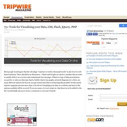
There should be no discussion – Charts and Graphs are ideal to visualize data in order to quickly deliver an overview and communicate key messages. Whatever type of data presentation you prefer or suits you data (pie charts, bubble charts, bar graphs, network diagrams etc.), there are many different options but how do you get started and what is technologically possible? In this article tripwire magazine present more than 75 Tools for Visualizing your data on a website and most of the options available will be covered. If you are aware of a tool, script etc. that deserves to be added to the list I would kindly ask you to leave a comment to everyone’s benefit. Advertisement Introduction Images says more than a thousands words. The article has been organised into the following sections. How to visualize you data using JavaScript-based solutions.
Junar · Discovering Data. The Overview Project » About. Overview is an open-source tool to help journalists find stories in large numbers of documents, by automatically sorting them according to topic and providing a fast visualization and reading interface.

Whether from government transparency initiatives, leaks or Freedom of Information requests, journalists are drowning in more documents than they can ever hope to read. Overview does at least three things really well. Find what you don’t even know to look for.Find broad trends or patterns across many documents.Make exhaustive manual reading faster, when all else fails. Search is a wonderful tool when you know what you’re trying to find — and Overview includes advanced search features. It’s less useful when you start with a hunch or an anonymous tip.
In other cases you’re interested in broad patterns. But even when you really do have to read every document manually, Overview is a huge help. You can upload your documents directly as PDF files. Ruby Programming Language. Refine, reuse and request data. Grassroots Mapping. DataMarket - Find and Understand Data — DataMarket.