background preloader

Print & Communication

Facebook Twitter

Deep book, flat subject - Imprint. Cyrus Highsmith, senior designer at the Boston-based Font Bureau, has written a short book on the basics of typography that, despite its odd approach—or maybe because of it—promises to become a standard text in introductory typography courses. The book, to be formally released next month during TypeCon 2012, in Milwaukee, is called Inside Paragraphs: Typographic Fundamentals, an accurate yet prosaic title that belies its charms. It is a simple book with a simple premise, which means that it is actually a very deep book.

In roughly 100 spreads, Highsmith explains the fundamentals of typography by focusing exclusively on one thing: white space. He does this on two concurrent levels. Highsmith discusses the choice of the right point size for text. Highsmith is almost as well-known for his illustrated sketchbooks as for the many outstanding typefaces he has designed for Font Bureau (among them Benton Sans, Quiosco, Prensa, and Zócalo). "How Typography Works," by Fernand Baudin. Ha. 100 Principles for Designing Logos and Building Brands | Brand Identity Essentials. 10 Unexpectedly Hijacked Billboards - Oddee.com (funny billboards) Strippers vs. Church... tough choice! Jet Airways, one of the leading Airways in India announced to their customers that they have changed. Kingfisher Airlines, on top of it whipped them by saying "We made them change. " This is a picture of a billboard in Southern California.

To the left of the picture there is a billboard posted by Audi promoting their new car. Their tag line? Take that, fast food. One need comes after the other, I guess. Another badly placed McDonald's ad. A beer is always worth it... unless you're a teen that is. Oh well... In 2009, President Obama took a trip to China and was photographed sporting a Weatherproof jacket. Christianity Discipline vs. 12 Funniest Billboard Graffitis. Addictive ads, 1894-1954. 14 Sep 2010 Here is a collection of Japanese advertisements for drinks and smokes (1894-1954). Hero Cigarettes, 1894 Tokio Beer, 1896-1906 Chūyū Cigarettes, 1900 Peacock Cigarettes, 1902 Kabuto Beer, 1911 Dai Nippon Brewery Company, 1912 Kembang Beer (Sakura Beer export label), 1912-1916 Sakura Beer, 1924 Umegatani sake, 1926 Sakura Beer, 1928-1932 Cascade Beer, 1929 Yebisu Beer, 1930 Minori Cigarettes, 1930 "Tobacco Profits for National Defense" Week, 1930 // Hibiki Cigarettes, 1932 Urara Cigarettes, 1932 Kirin Beer, 1933 Zuigan sake, 1934 Takara shōchū, 1935-1938 Gekkeikan sake, 1935-1938 "Defense for country, tobacco for society" (South Kyoto Tobacco Sellers' Union), 1937 Sakura Beer, 1938 Kirin Beer, 1939 Anti-black market poster (violators face 3 years in prison, 50,000 yen fine), 1948 Message from Japan Monopoly Corporation, 1954 [Sources: Tabako Omoshiro Catalog Zukan (Kodansha, 1987) and Meiji/Taisho/Showa O-Sake No Hōkoku Graffiti (Kokusho, 2006)]

Logo & Branding: Vibo & BP&O Logo, Branding, Packaging & Opinion by Richard Baird. Towards the end of 2011, Spanish high street travel agent Vibo (formally Viajes Iberia) began to roll out its new visual identity developed by international design consultancy Saffron as part of a new strategy to differentiate itself from an increasingly generic market place. 
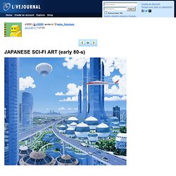
Following this rebrand, Saffron has published some of the signage and printed collaterals that make up the visual identity system (alongside a new logo-type) that offers an imaginative alternative to conventional destination photography.

“Spain’s tourism industry is over-saturated with travel agencies and their promotions. A total lack of differentiation makes it hard for customers to find an offer that suits them. Everyone sells the same products, tells the same story – all with the same approach and (lack of engaging) attitude. Most Spanish travel agencies have been in the business for a long time – and it shows. They still operate in the same way they did before internet bookings turned the industry upside down. Retro_futurism: JAPANESE SCI-FI ART (early 80-s) Sumio Tsunoda, book jacket, early 80s Peter (Pater) Sato, poster for an exhibition of original works, 1980 Nayoyuki Kato, book cover illustration, 1980 Nayoyuki Kato, cover illustration for SF festival booklet, 1980 Noboru Nonaka, book cover illustration, 1983 Shiro Nishiguchi, magazine illus., 1983-84 Jinsei Choh, ca. 80s Tatsushi Morimoto, ca. 80s Mitsuo Ishida, book illustration Ichiro Tsuruta, ca. 1985 Shusei Nagaoka, Androla in Labyrinth, 1984 "Chronological table of space," illustration by Ichimatsu Meguro for "Newton," 80s Masaki Hisatani, early 70s Naoki Yasuda, ca. 80s Shuji Tanase, 1983, black space Takuro Kamiya, ca. 80s Kazuaki Iwasaki, ca. 80s Sadao Naito, late 70s "Blood maintaining life by conveying various substances," illustration by Kazuho Itoh for "Newton," 80s Kazumasa Nagai Shusei Nagoaka, Conceive, 1976 Ryoichi Hochisu, ca. 1985 Natsuo Noma, exhibition poster, early 80s.

10 movie poster cliches (with plenty of examples) The Science of Word Recognition. About fonts > ClearType The Science of Word Recognition or how I learned to stop worrying and love the bouma Kevin LarsonAdvanced Reading Technology, Microsoft CorporationJuly 2004 Introduction Evidence from the last 20 years of work in cognitive psychology indicate that we use the letters within a word to recognize a word. This paper is written from the perspective of a reading psychologist. The goal of this paper is to review the history of why psychologists moved from a word shape model of word recognition to a letter recognition model, and to help others to come to the same conclusion.

I will start by describing three major categories of word recognition models: the word shape model, and serial and parallel models of letter recognition. Model #1: Word Shape The word recognition model that says words are recognized as complete units is the oldest model in the psychological literature, and is likely much older than the psychological literature. Characters Model #2: Serial Letter Recognition. THE SEETHING GENIUS OF &GET YOUR WAR ON& ANGER + CLIP ART = CATHARSIS | October 13th 2008 Ever since October 2001, America's "War on Terror" has had a venomous critic in David Rees. 
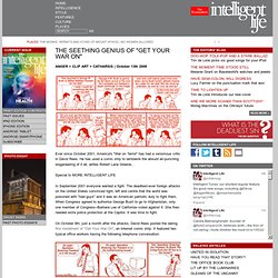
He has used a comic strip to lambaste the absurd air-punching sloganeering of it all, writes Robert Lane Greene... Special to MORE INTELLIGENT LIFE In September 2001 everyone wanted a fight. The deadliest-ever foreign attacks on the United States convinced right, left and centre that the world was poisoned with "bad guys" and it was an American patriotic duty to fight them.

On October 9th, just a month after the attacks, David Rees posted the daring first instalment of "Get Your War On", an internet comic strip. It was an inauspicious start. But the two characters go on: In those early, angry days of the so-called "War on Terror", Rees took aim at what he knew to be absurd: the air-punching sloganeering that inaugurated America's long and complicated struggle against international Islamist violence.

February 10th 2003: December 20th 2005: Japanese graphic design from the 1920s-30s. In the 1920s and 1930s, Japan embraced new forms of graphic design as waves of social change swept across the nation. This collection of 50 posters, magazine covers and advertisements offer a glimpse at some of the prevailing tendencies in a society transformed by the growth of modern industry and technology, the popularity of Western art and culture, and the emergence of leftist political thought. "Buy Domestic! " poster, 1930 [+] Cover of "Nippon" magazine issue #1, Oct 1934 [+] "Fuji Weekly" cover, Oct 1930 [+] Poster for Japan's first national census, 1920 [+] // "Health for body and country" poster, c. 1930 [+] Grand Nagoya Festival poster by Kenkichi Sugimoto, 1933 [+] Kyoto Grand Exposition to Commemorate the Showa Imperial Coronation, 1928 [+] Poster design by Shujiro Shimomura, 1928 [+] "NAPF" (Nippona Artista Proleta Federacio) magazine cover, Feb 1931 [+] "NAPF" (Nippona Artista Proleta Federacio) magazine covers: Sep 1931 // Oct 1931 "May 1" movie poster by Hiromu Hara, 1928-1929 [+]

Secrets of the New Yorker cover - Imprint. Françoise Mouly, the New Yorker’s art editor since 1993, doesn’t have normal relationships with the artists who draw the magazine’s covers. “Think of me as your priest,” she told one of them. Mouly, who co-founded the avant-garde comics anthology RAW with her husband, Art Spiegelman, asks the artists she works with—Barry Blitt, Christoph Niemann, Ana Juan, R.

Crumb—not to hold back anything in their cover sketches. If that means the occasional pedophilia gag or Holocaust joke finds its way to her desk, she’s fine with that. Until recently, you would have had to visit Mouly’s office on the 20th floor of the Condé Nast building to see the rejected covers she keeps pinned to a wall. What’s the process of deciding on a cover every week? I’ve been the art editor for about 19 years, so I’ve been responsible for about 950 different published covers, and the process has been different for each one.

When I started, I didn’t know much about the New Yorker. It depends. Logistics. Frustro: The Impossible Typeface. Hungarian designer Martzi Hegedűs has created a single typeface, titled Frustro, on the sole premise of making it impossible. Based on the illusion of the Penrose triangle (which is by definition, an impossible object whose creator deemed it “impossibility in its purest form”) the type appears to be facing two different directions simultaneously. His diagram explaining the structure of the Frustro “R” is the highlight of his display– it neatly puts together top left and bottom right corners of two 3D renderings of the letter, making it clear how he imagined each letter as an extension of the Penrose triangle. Fascinating– I only wish this was available for download, it looks like a typographer’s dream (or perhaps) nightmare come true.

[Via Jon Lee.] Art (emoji list) Linear format equations and Math AutoCorrect in Word 2010 - Word - Microsoft Office. To insert an equation using the keyboard, press ALT+=, and then type the equation. 
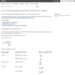
You can insert equation symbols outside a math region by using Math AutoCorrect. For more information, see Use Math AutoCorrect rules outside of math regions check box. In this article Type equations in linear format You can type most equations quickly by using Math AutoCorrect codes. \eqarray(x+1&=2@1+2+3+y&=z@3/x&=6)<space> which resolves to this: Here are some other examples: Note When an example is followed by two consecutive spaces, the first space resolves the typed text into the equation, and the second space builds it up.

Microsoft Office uses the linear format described in Unicode Technical Note 28 to build up and display mathematical expressions. Math AutoCorrect symbols Type one of the following codes followed by a delimiting term. Important The codes are case-sensitive. Note For information on inserting a symbol that is not in the chart above, see Insert a symbol or special character.

A disagreeably facetious type glossary - StumbleUpon. Brusselssprout Curatorial Magazine 2011. Purpose - BBCx365. The purpose of this project is to promote the awareness of global current events with the American public. ”American citizens know little about current events in general and even less about overseas events” according to The Washington Post in 2006. The article further explains that the reasons for the “unwillingness of American citizens to live up to their civic responsibilities” are due to the supply and content of our news. In the article titled “Mind the Gap,” an explanation is given as such: “Driven by market pressures, news organizations across the globe are turning to more entertainment-centered forms of reporting, making it more difficult for lazy citizens to encounter substantive political information as a matter of course. An important consequence of the shift to “soft news” has been the scaling back of international bureaus and staff.”

Heavily “domesticated” news programming creates fewer opportunities for people to learn about overseas events. Travel Corporation India Honeymoon Packages: Australia. Yet Another Colorization Tutorial. 26 Beautiful Free Retro Fonts. 5 Best Logo Maker and Logo Creator Tools. Company logo is an important part of any business. It’s often the first thing your customer sees on your business card and your website. Company logo is the face of your brand. To create a logo, you can either spend some money to hire a graphic designer to create for you or you can use online logo generator do it yourself. To DIY, you can check out these 5 great free or affordable and user friendly online logo maker tools: 1) LogoGarden.com » 2) Logaster.com » 3) LogoSnap.com » 4) LogoMaker.com » 5) LogoYes.com »

Blow - On the Cutting Edge Exhibition. Visual News - The Cure For Eyeball Boredom. Screenmedia Daily - Digital Signage, Place-based Digital Out-of-Home Media, Proximity, Mobile and Convergent Technologies. 100 Free Fonts You Should Have in Your Library. Fonts have already been among the essential materials used by designers. Whether it is a web design project or a logo design – font is the element, capable of attracting people’s attention, rendering the key idea, and communicating the necessary message. That is why, thousands of free fonts reside today in multiple online font repositories. Below we are introducing a collection of 100 free fonts, which represent vividly only some of the most significant trends in typography, however all of these fonts feature really unique and fresh designs.

Clean fonts contain the samples of free fonts of the sans serif family with classic proportions, distinct lines, and clean backgrounds. Fancy fonts introduce multiple decorative elements, used in typography – from curly fonts to eroded and distorted ones. 1. Delicious-Roman DiavloBook-Regular HattoriHanzo-LightItalic LT Oksana Bold Champagne & Limousines Vegur-Regular Caviar Dreams Bold Ageone Aldo SemiBold Zrnic Zero Threes Yanone Kaffeesatz Regular Mabella 2. 17 Funniest and Mostly Useless Flyers.