
Patterns. Sankey Diagram. Source: Department of Energy & Climate Change, Tom Counsell.
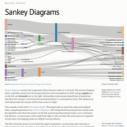
Sankey diagrams visualize the magnitude of flow between nodes in a network. This intricate diagram shows a possible scenario for UK energy production and consumption in 2050: energy supplies are on the left, and demands are on the right. Intermediate nodes group related forms of production and show how energy is converted and transmitted before it is consumed (or lost!). The thickness of each link encodes the amount of flow from source to target.
This example is built with D3’s Sankey plugin. Template Monster. UI-Patterns.com.