
Farnsworth-Munsell 100 HueColor Vision Test. The Farnsworth-Munsell 100 hue test is one of the most famous color vision tests available.
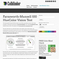
It belongs to the group of hue discrimination, also called arrangement tests. Another famous test in this group is the Farnsworth D15 arrangement test. The aim of the test is to order the shown color plates in the correct order—any misplacement can point to some sort of color vision deficiency. You’ll find the detailed instructions in the test itself. So relax, take you some time and Start the Farnsworth-Munsell 100 hue color vision test now. Be aware that online color blindness tests are just pointing you in a possible direction for type and severity of your color vision deficiency.
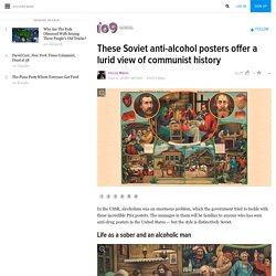
Le blog de FatMat. Quick Search. Illustration, Painting, Commissions. These Soviet anti-alcohol posters offer a lurid view of communist history. Ah, the good ol' Samowar!
Flagged Dear Miklos, excellent job with "futuristic" communist architecture. I am so pleased with such representation - whole wrong, twisted non-normal, soul of socialistic regimes turns out in such projects, even more than in housing or social welfare objects, ugliest and impossible to describe part our architectural heritage. MÉTHODE DE GRAPHISME : Julia coffre. Réfléxion ironique sous forme d’anti-manuel de graphisme.
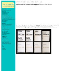
Mémoire de DNSEP. Juin 2010 12,5 x 19,5 cm, 96 p., impression laser sur papier "natur", couverture : gaufrage et impression monotype sur papier chiffon. ‘T’ Shirts by Masashi Kawamura. *notcot in wearable , 15:50 Masashi Kawamura has found a beautiful way to mix typography and couture with the ‘T’ Shirt line.
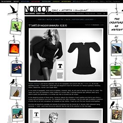
As his site describes so well - ‘T’ shirts are T shirts that was designed to have the silhouette of 5 famous typefaces; Helvetica, Caslon, Baskerville, Courier, and Cooper Black. In the world of typography, terms such as typeface, character, body, etc are used to describe the form of a letter. The reason why they use expressions closely related to a human body, is perhaps because each different letter has a distinct quality and personality, in a similar way that us humans are all unique.
In the designing process of these shirts, I aimed to capture the character of each typeface and tried to give them a unique look and presence once worn. Independent Lens . HELVETICA .What Font Are You? 075-JA-theoricien. Hommage à l’oeuvre de Jean Alessandrini, écrivain, typographe et illustrateur.
Pour l'occasion de cet hommage j'ai logotypé Design et Typo avec le caractère Mirago dessiné par Jean Alessandrini pour l'Atelier Phototypo d'Albert Hollenstein.
Voici quelques mois j'avais écrit un article dans étapes sur la bio et l'œuvre de Jean Alessandrini. C'était autant par honnêteté et passion de critique graphique que par amitié pour Jean qui reste à mon sens un des pionniers du lettrage dans la France d'après-guerre. Me voilà donc transformé en agent d'illustrateur bénévole tant j'aimerais que les éditeurs se souviennent, que les agences de pub redécouvrent le talent de Jean.
En hommage à son œuvre j'ai réalisé une galerie la plus complète de ses travaux graphiques. Les métiers d'Alessandrini? Fabricant de mots-images n'en n'est pas le moindre, mais ce serait réduire son talent à celui d'un «bricoleur» alors qu'il est à juste titre considéré comme l'un des théoriciens les plus brillants de la typographie (par Maximilien Vox lui-même). Biographie. Lewis Hine VS Leonard da Vinci. Blog About Infographics and Data Visualization - Cool Infographics. Here are 44 Simple Daily Activities To Enjoy Your Work created by OfficeVibe to help keep the motivation high and add some fun back in your work day!
You might think it’s a truism, but most people tend to forget this crucial fact:You should always make the effort to build good habits that will make you healthier, happier, and more productive over time.Also, when it comes to new habits, it’s important to remember that these are things to do for long term changes.This infographic will give you an overview of 44 habits to improve your productivity, your health and the overall quality of your workdays. A fun infographic for Friday! There is some fantastic information included in here. The topic choice will also have a long Online Lifespan, and has the potential to be relevant to readers for years. The design is visually very busy. The font choices in the text boxes seems too small, and clicking the image on the infographic landing page doesn’t open up a larger version. Download Free true type fonts - µfonts. A History of Western Typefaces [INFOGRAPHIC] The Fontography Series is supported by join.me, the easiest way to have an online meeting. join.me lets you instantly share your screen with anyone, for free.
![A History of Western Typefaces [INFOGRAPHIC]](http://cdn.pearltrees.com/s/pic/th/history-typefaces-infographic-19728045)
Use it to collaborate, demo, show off — the possibilities are endless. Try it today. You see approximately 490,000 words every day — and that's just on the web. If the designers behind those websites are any good, they put a lot of thought into the typefaces they use on each page.