

Retro is Reborn: A Look at the Color Trend. What’s old is new again.
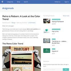
That’s the way most trends seem to work anyway. Retro color palettes are a great example of how an old look is being reborn in web design. Retro color styles are popping up in a variety of uses but commonly we are seeing more mod, flat, art deco-style colors being used in projects. From oranges to yellowish-browns to off-white to blues, retro color is definitely making a comeback. The Retro Color Trend Retro colors are those that are often less saturated and have a more flat feel than other hues. Retro can be popular because the design style, easily creates a feel and sense of era. The retro trend is also complemented by other distinct characteristics, such as the use of circles and starbursts (or other geometric shapes), textures and curved or dramatic lettering. Characteristics of Retro Schemes. Signification des couleurs en E-marketing et en Ergonomie Web.
.
Sur la demande de plusieurs clients et stagiaires, les consultants-rédacteurs de Trinity Advise se sont mobilisés pour vous proposer un dossier complet sur les codes couleurs web et la signification des couleurs pour Internet. Vecteurs de cohérence graphique, les couleurs dictent de nombreux comportements à l’inconscient de l’internaute. Elle génèrent des réactions et des émotions que nous ne savons pas concrètement évaluer et chiffrer en e-marketing, sauf avec les nouveaux outils de test d’ergonomie web (eye tracking, mouse tracking, neuromarketing). Paravelinc.com by Trent Walton. Pink brown aqua wedd. Color Explorer. Color Scheme Designer 3. #ff1700 hexadecimal color. Le Kit du parfait Webdesigner #1 - webdesign. Votre navigateur ne prend pas en charge Javascript, vous ne pourrez profiter de toutes les fonctionnalités de ce site web.
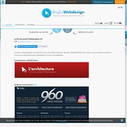
Magazine Webdesign, Inspiration et tutoriels 9222Membres2043Articles9519Commentaires0Devenez fan8431Suivez-nous ! A la uneCatégoriesDossiers+ Le Kit du parfait Webdesigner #1 par Fabien Berthouxle 28/05/2010 Couleurs, Typographies, Architecture d'un site, Effets de styles, Boutons, Dégradés Web 2.0, Icônes, vous trouverez toutes les ressources nécessaires pour développer et créer vos webdesign. L'architecture ( WireFrame ) Grille de construction Créer son architecture en ligne Pencil Pidoco Protoshare Iplotz Mockflow Balsamiq Jgraph Hotgloo A connaître Wireframes.linowski Aller plus loin : Des WireFrame à imprimer 35 ressources de WireFrame 50 packs UI et Webdesign gratuits La Couleur Colorschemedesigner 0to255 Imageshack Colourlovers Kuler Colormunki Ilotresor Colorblender Colorotate Comment bien choisir ses couleurs pour céer une charte graphique 17 outils pour trouver ses couleurs La Typographie.
ColorMunki Design. Your free online color matching toolbox. ColorMunki Design. ColoRotate: Colors come to life in 3D. How to Select The Perfect Color for Your Website. The Internet is an almost inexhaustible source of applications and sites and given the current trend the future will bring a steady growth both in numbers but also in importance.
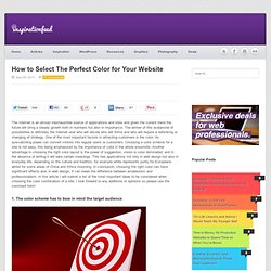
The winner of this avalanche of possibilities is definitely the Internet user who will decide who will thrive and who will require a rethinking or changing of strategy. One of the most important factors in attracting customers is the color; its eye-catching power can convert visitors into regular users or customers. Choosing a color scheme for a site is not easy, this being emphasized by the importance of color in the whole ensemble. Another advantage in choosing the right color layout is the power of suggestion, vision is color dominated, and in the absence of writing it will take certain meanings.
This has applications not only in web design but also in everyday life, depending on the culture and tradition, for example white represents purity for Europeans whilst for some areas of China and Africa mourning. Top 100 Tasty Palettes from Colourlovers. We tend to think of color as a constant as an example if we see a green color our brain might automatically associate it with an apple.
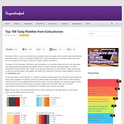
As Georgia O’Keeffe said, “Color interpretation is a complex process the taps into our sensations and moods, as well as our eyes, neurons, and brains.” The quest to find the perfect colors and color combinations is a common thread that runs from those who have painted great masterpieces and graphic artists to interior designers and landscapers. As French impressionist Claude Monet said, “Colour is my day-long obsession, joy and torment.” Today we are here to help you find that perfect color palette. We based this collection on the most viewed palettes of all time on Colourlovers.com In their own words, COLOURlovers is a creative community where people from around the world create and share colors, palettes and patterns, discuss the latest trends and explore colorful articles.