
Wp-content/uploads/2014/05/DataVizChecklist_May2014.pdf. Great Tools - Barry Nazar. Visual Business Intelligence. We typically think of quantitative scales as linear, with equal quantities from one labeled value to the next.
For example, a quantitative scale ranging from 0 to 1000 might be subdivided into equal intervals of 100 each. Linear scales seem natural to us. If we took a car trip of 1000 miles, we might imagine that distance as subdivided into ten 100 mile segments. It isn’t likely that we would imagine it subdivided into four logarithmic segments consisting of 1, 9, 90, and 900 mile intervals. Similarly, we think of time’s passage—also quantitative—in terms of days, weeks, months, years, decades, centuries, or millennia; intervals that are equal (or in the case of months, roughly equal) in duration. Data visualization · Search Results.
Hi, I am Miranda Yates, Director of Program Evaluation and Planning (PEP) at Good Shepherd Services (GSS), a youth and family development, multi-service agency in New York City.
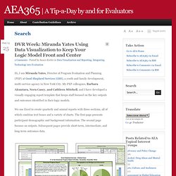
My PEP colleagues, Barbara Alcantara, Nora Casey, and Cathleen Mitchell, and I have developed a visually engaging report template that keeps staff focused on the key outputs and outcomes identified in their logic models. We use Excel to create quarterly and annual reports with three sections, all of which combine text boxes and a variety of charts. The first page presents participant demographic and background information. The second page focuses on outputs. Subsequent pages provide short-term, intermediate, and long-term outcomes data. For more details on how we develop logic models and create reports staff can use, see the slides from our recent webinar. Hot Tips: Rad Resources: The PEP Team are big fans of Andy Kirk’s Visualising Data blog. Excel Hello! Hot Tip – Include These Required Report Components: No tags 1. Debunking myths about the “third world” Jara Dean-Coffey on Visual Facilitation and Graphic Recorders. Visualization. My name is John LaVelle.
One of the things that I have struggled with is describing what evaluation is and why it’s important. Following up on that, many people ask about how evaluation is related to research. Rad resource: Eva the Evaluator by Roger Miranda and Birgit Stadler. This is a delightful and inexpensive book about a little girl named Eva and her father the evaluator. Eva isn’t exactly sure what he father does, and so the book is about her father explaining evaluation in easily understandable terms, and Eva imagining herself engaged in the scenarios he described. Hot Tip: Visualize the relationship like an hourglass. Why visual thinking is essential in running a business » VizThink. Visualization Techniq... Over 100 Incredible Infographic Tools and Resources (Categorized) This post is #6 in DailyTekk’s famous Top 100 series which explores the best startups, gadgets, apps, websites and services in a given category.

Total items listed: 112. Time to compile: 8+ hours. Follow @DailyTekk on Twitter to make sure you don’t miss a week! Update: Be sure to check out our latest post on infographics: Infographics Are Everywhere – Here’s How to Make Yours Go Viral. I love a good infographic! There’s more to this article! Tips, tricks and resources to make your own gorgeous infographics.
Infographics (or Information Graphics) are graphic visual representations of data or information, presented in a way to make it easier to consume information.
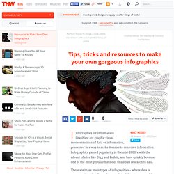
Infographics gained popularity in the mid-2000′s with the advent of sites like Digg and Reddit, and have quickly become one of the most popular methods to display researched data. There are three main types of infographics – where data is presented in a timeline, where statistical data is presented in graphs or with icons, or where data is presented on a map. In order to create an infographic which will be widely shared, think about your typography, colours, and layout. Make it easy for people to understand the information that’s being provided. Sometimes it’s best to keep things simple. You can also get very creative with how you display your information, and do something completely unconventional.
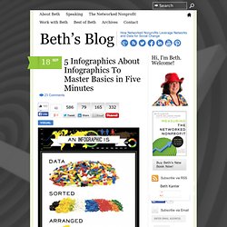
Infographics are among the most popular modern methods of sharing information with an audience. Where to get visual statistics. 5 Infographics About Infographics To Master Basics in Five Minutes. Source: Hot Button Studio In my forthcoming book, “Measuring the Networked Nonprofit,” co-authored with KD Paine, my favorite chapter was about the sense-making process of measurement – called “Measurement and the Aha!
Moment—Using your data to tell stories, make decisions, and change the world.” There’s where I discovered a new passion – data visualization techniques for sense-making. The process of translating your spreadsheet into an infographic can help lead you to insights and the product, the infographic itself, is a good way to report your results as this example of a quarterly dashboard report from DoSomething.Org illustrates. It can also make using data fun! Here’s 5 infographics that will help you get up to speed about using visualization processes to generate insights from data.