
Device Art Generator. 7 ways to design with developers in mind. Sure, just about any design is possible as a website—but it doesn’t mean it’s necessarily the best design for the medium.
Especially because responsive design is no longer a luxury, but a necessity, designs for the web need to be thought about as fluid canvasses that both look good and react at all different screen sizes. “Responsive design is no longer a luxury, but a necessity.”
Ressources. Tutos. Blog Design, Blog architecture, decoration design, mobilier, graphisme - Orgone Design : le blog du design contemporain. Tengbom Architects est une des agences d’architecture les plus influentes en Suède, et plus généralement en Scandinavie.
Tengbom ne pèse pas moins de 550 salariés répartis sur une douzaine de bureaux en Suède, en Finlande, mais également au Cambodge. The Responsive Designer’s Workflow. Ui Parade – User interface design inspiration & design tools. Tendances graphiques. Personal Brand Institute. David OReilly. Description MOUNTAIN is a mountain simulator.
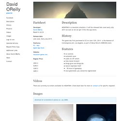
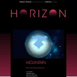
It will be released late June/early July 2014 (as soon as we can get it thru the app store). History This game was first previewed at E3 on June 12th, 2014 - a the Museum of Contemporary Art, Los Angeles, as part of Venus Patrol's HORIZON event. Features. Venus Patrol in partnership with MOCAtv present: HORIZON. No controls automatic save audio on/off switch time moves forward things grow and things die nature expresses itself ~ 50 hours of gameplay once generated, you cannot be regenerated Developed by: David OReilly + Damien Di Fede Platforms: Windows, Mac, iOS.
MOUNTAIN. iOS UI Animations. Why We Need Storytellers at the Heart of Product Development. There's an interesting question on Quora right now: If you had to pick between an amazing product designer or an amazing engineer to build a new company around, which would you pick and why?
This question reflects a painful problem that is common at both small startups and large corporate organizations. Far too often, teams focus on execution before defining the product opportunity and unique value proposition. The result is a familiar set of symptoms including scope creep, missed deadlines, overspent budgets, frustrated teams and, ultimately, confused users. The root cause of these symptoms is the fact that execution focuses on the how and what of a product. A product is more than an idea, it's more than a website, and it's more than a transaction or list of functionalities. Creattica: Your source for design inspiration. 99U - Insights on making ideas happen. E & interactivité blog de design par Geoffrey Dorne » Manga et papier à musique sont-ils compatibles ? Static.googleusercontent.com/media/www.google.com/fr//intl/ALL_ALL/think/multiscreen/pdf/multi-screen-moblie-whitepaper_research-studies.
30 Examples of Illustration Styles in Web Design. Illustration can turn an average website into something really unique, something which identifies and communicates the brand message, and something with the power to seduce us.
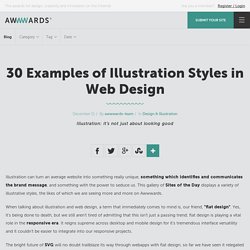
This gallery of Sites of the Day displays a variety of illustrative styles, the likes of which we are seeing more and more on Awwwards. When talking about illustration and web design, a term that immediately comes to mind is, our friend, "flat design". Yes, it's being done to death, but we still aren't tired of admitting that this isn't just a passing trend; flat design is playing a vital role in the responsive era.
Ecrans tactiles : mort aux mythes. Soyuz Coffee Roasting. Designing For TV - Google TV. Overview You should make at least a few modifications to sites designed for use on a computer-based browser in order to make a site usable on a 10-foot UI.
The responsive web will be 99.9% typography. I’ve read Oliver Reichenstein’s essay “The web is 95% typography” on the state of the web as it was back when he wrote it in 2006 several times and over the last year or two, I’ve been working on responsive sites for our clients at Offroadcode as well as spending a lot of time and effort following and keeping up to date as best I can with trends and techniques and I’m being drawn towards what feels an inevitable conclusion for web design.
Device Fatigue. X: Hey Brad, what kind of phone/tablet/e-reader/laptop/net-book/doodad should I get?
Me: I don’t know.X: C’mon, you do this stuff for a living! Surely you know all about the latest gizmos, right? Me: I honestly have no idea.X: Thanks for nothing, asshole. Keeping up with the device landscape is a full-time job. Next Utopia - Schedule. 9 Rules For Running A Productive Design Critique. Research Areas. Flat UI and Forms. This article is about two important four-letter words that start with “F”: “flat” and “form.”
Article Continues Below Though some decry flat user interfaces as pure fashion, or the obvious response to skeuomorphic trends, many designers have embraced the flat approach because the reduction in visual styling (such as gradients, drop shadows, and borders) creates interfaces that seem simpler and cleaner. The problem is that most flat UIs are built with a focus on the provision of content, with transactional components (i.e., forms) receiving very little attention.
What happens when flat and forms collide? User experiences can, and often do, suffer. Augmenter notre intelligence émotionnelle. Quel futur pour les “mindgames” Du Graphe social au Graphe de l’humeur. Que ce soit Bitly avec Feelings, un système de signets permettant d’intégrer une appréciation simple et visuelle sur ceux-ci, Facebook avec le développement de la catégorisation des statuts, nombreux sont les systèmes (Path, Line, MessageMe pour n’en citer que quelques-uns de ceux qu’évoquaient Jenna Wortham pour le New York Times…) et les applications qui vous proposent d’associer de l’expressivité à ce que vous partagez, a minima via les fameuses émoticônes. Image : La catégorisation des statuts sur Facebook. Natasha Dow Schull academic website Science, Technology, and Society MIT. MyFocus. Digital & Physical Work Distractions-CONTROLLED by CanFocus. So you know the drill...you've hunkered down at 2pm to get this critical email/report/contract done by 5pm...and its somehow 415pm and EVERYONE and EVERYTHING has been distracting your attention away from it.
There are fewer and fewer barriers to the invasion of your physical space and time by colleagues. Google Visual Assets Guidelines - Part 2 on Behance. Google’s brand is shaped in many ways; one of which is through maintaining the visual coherence of our visual assets. In January 2012, expanding on the new iconography style started by Creative Lab, we began creating this solid, yet flexible, set of guidelines that have been helping Google’s designers and vendors to produce high quality work that helps strengthen Google’s identity. What you see here is a visual summary of the guidelines, divided into two Behance projects: BOX DEMO - .work. Info: While collaborating with the geniuses at Bot & Dolly in beautiful San Francisco, Munkowitz was tasked to Design Direct a truly unique piece called BOX.. The piece was originally supposed to function as a Technology Demo, but Munkowitz and the team quickly realized it's visual potential and transformed it into a Design and Performance Piece… The resulting short film is a one-of-a-kind visual and technological achievement due to the very special combination of talent and gear behind the doors of the B&D facility...
The piece was essentially grounded on the principles of Stage Magic, invoking five of the basic categorizations of Illusionary.. Jayse Hansen/The Avengers - VFX Inspiration + Iron Man HUD Tutorials. The Avengers is ™ & © 2012 Marvel and Subs. With the recent release of The Avengers on Blu-ray, now seems like a good time to revisit the amazing screen graphics & HUD design of Jayse Hansen. In case you didn’t know, Jayse along with Cantina Creative were responsible for the amazing glass screen interface designs seen on the Helicarrier in The Avengers, plus the futuristic Iron Man HUD (Heads Up Display) and several other FUIs (Fake User Interfaces). Jayse’s previous work includes organic visualizations for Rise of the Planet of the Apes and the Ark screen user interfaces in the disaster movie 2012.
For The Avengers, Jayse began his designs surprisingly on paper, filling three notebooks, rather than just designing straight from the computer. He did extensive research for the designs, getting ideas from real life aircraft carrier and combat aviation screens. To find out more about Jayse’s work on The Avengers in detail, check out the following links:- Olly Moss. HUD and UI graphics in ‘Oblivion’ + titles by Rich Young. OBLIVION GFX - .work. Info: The mighty Joseph Kosinski invited Munkowitz to the GFX party once again, this time for his spring blockbuster feature film JOE-BLIVION… Predictably, the list of graphic assets to be created was obscene, so munko assembled and led another super team of GFX mercenaries and descended into the lovely confines of Crater Lake Productions to generate the aforementioned fuckload of graphic content… Working with Joseph always brings out the best in Munk and Company, and this time around was certainly no exception… OBLIVION © Universal Pictures, Inc.
All Rights Reserved. The team also designed all of the Machinery HUDs and various Gauges in the film, be it the Drone Machine Vision, Jack's Gun HUD, all the Scav equipment and some of Jack's smaller vehicles... The interfaces again stressed functionality over excess, keeping the Greeble under control and communicating key story points throughout the film.. GENERATIVE DESIGN. New Generative Identity for MIT Media Lab - AnotherDesignBlog. Untitled. 50 Awesome Websites with Extraordinary Geometry Elements. Beautiful Type.
Www.dontclick.it. Architecture de l'information du site web liberation. Why is Simple so Difficult? By Oliver Reichenstein Simple websites are easy to use, easy to understand, nice to look at. In practice, websites are either unusable or ugly and in general filled with too many complicated words. The 100% Easy-2-Read Standard. Qu’est-ce que la créativité ? Un pixel n’est pas un pixel. Hacker le visuel. Browser sketch sheets for Web Designers.
Pi's Epic Journey - LIFE OF PI on Digital HD. Fontello - icon fonts generator. Des icônes et des interfaces. Showcase Of Modern Navigation Design Trends. 10 Cloud-Based UX Design Tools to try in 2013. Flat Design: An In-Depth Look. Flat design casts a long shadow. My Own Corks. Figs - Design d'interaction & Design numérique.
Design Principles. Humanitarian Design Bureau : Accueil. Murmur. From sound to light, by talking to walls. Glitch-Art. Cinemacity. I'm Boycotting "Intuitive" Interfaces. Forget Google Glass. These Are the Interfaces of the Future. Spicynodes : Home. Redesigning the Save symbol. Let's do this. User Experience and Experience Design. Microsoft Word - hassenzahl-ihm08.doc - hassenzahl-ihm08.pdf. Contrast Ratio: Easily calculate color contrast ratios. Passing WCAG was never this easy! International Standards. « Arrêtez de dessiner des poissons morts » Contrast-A: Find Accessible Color Combinations. Anthropology of Television.
Anatomy of Intuition. Redesigning Google: how Larry Page engineered a beautiful revolution. Digital Arts and Interaction Community 2012. « A Dive In Music », une expérience graphique et sonore en HTML5, Javascript, WebGL, Sound API, CORS. Benjamin Pawle Portfolio. CreativeApplications.Net. 'Sona' by Ruslan Gaynutdinov - A game of sound networks (ECAL) Navigate My Mind. The Maccabees (in the dark) - Live performance recording with 10 Kinect cameras (@jamesalliban) Light Form - Interactive landscape by Mathieu Rivier (ECAL) #touchscreen #openframeworks. MIT Media Lab’s Generative Logo Has 40,000 Permutations - MetaMythic.