
Educa en facebook. Vizualize.me Beta: Turning Your LinkedIn Resume in Infographics. There seems to be a commercial market emerging around the idea of automizing the creation of infographics.
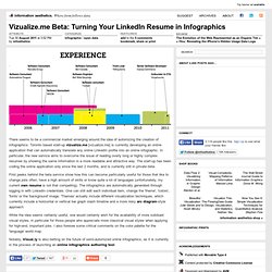
Toronto based start-up vizualize.me [vizualize.me] is currently developing an online application that can automatically translate any online LinkedIn profile into an online infographic. In particular, the new service aims to overcome the issue of reading overly long or highly complex resumes by showing the same information in a more readable and attractive way. The start-up has been coding the online application only since the last 2 months, and is currently still in private beta. First peeks behind the beta service show how this can become particularly useful for those that like to change jobs often, have a high amount of skills or know quite a lot of languages (unfortunately, my current own resume is not that compelling). Inside the Mind of a Community Manager. Here's How Twitter Got Big. What does Twitter think of Gaddafi's death? How British do you feel? Visualised. Visualising data online and in a newspaper is like the difference between speaking Spanish and conversing in French; there have the same roots and are ostensibly similar - but in practice are completely different.
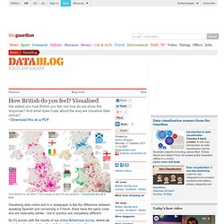
So it's proven with the results of our online Britishness survey, where we asked readers to rate how they felt about their nationality. The results provide a fascinating insight into how different parts of the UK really feel about the nation as a whole. Online, it works just like a Google map - where you can zoom in and see how people feel in each place, ranked by the maps of each country. Taking on Facebook, Google’s Social Network Allows Data Exporting. The Sexperience 1000. Welcome to The Sexperience 1000, an interactive journey through the sexual experiences and preferences of one thousand British individuals.
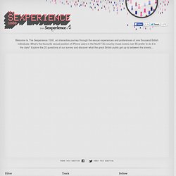
What’s the favourite sexual position of iPhone users in the North? Do country music lovers over 55 prefer to do it in the dark? Explore the 20 questions of our survey and discover what the great British public get up to between the sheets… Emotional cartography. Bio Mapping / Emotion Mapping by Christian Nold.