
Why the Ok Button is No Longer Okay. By anthony on 02/23/11 at 6:20 pm When the graphical user interface first emerged, designers designed their dialog boxes with a mechanical and binary approach.
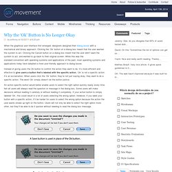
Clicking the ‘Ok’ button on a dialog box meant that the user wanted the system to act. Clicking the Cancel button on a dialog box meant that the user didn’t want the system to act, and wanted to go back to their original screen. While this was the standard convention with operating systems and applications of the past, most operating systems and applications today have adopted a more user-friendly approach to dialog boxes. Instead of giving users the Ok button to confirm the action they want to do, it’s more efficient and effective to give users a button that’s labeled with the specific action.
An action specific button would better enable users to select the right option quickly nearly every time. A good dialog box isn’t just about asking users which action they want to do. » Experiences are Emotional Johnny Holland. As Experience Design broadens to take on the challenge of delivering experiences that are clearly related and consistent regardless of context or channel – the aim of customer experience initiatives in many large organizations – we run the risk of failing in our attempts if we persist in adopting terminology relevant only to a single context, and focused only on a small portion of the experience itself.
As Experience Designers we are running the risk of failing in our attempts to enable experiences that are clearly related and consistent regardless of context or channel. Our persistent use of terminology relevant only to a single context, and focused only on a small portion of the experience itself, hampers the efforts of customer experience initiatives in many large organizations. Experiences are a combination of the actions we take; what we perceive through our various senses; and our emotional response to both.
Form constrains Articulate design intent Emotive qualities Mac App Store. » Our Misguided Focus on Brand and User Experience Johnny Holland. If there is a future for designers and marketers in big business, it lies not in brand, nor in “UX”, nor in any colorful way of framing total control over a consumer, such as “brand equity”, “brand loyalty”, the “end to end customer journey”, or “experience ownership”.
It lies instead in encouraging behavioral change and explicitly shaping culture in a positive and lasting way. Brand is a phenomenon that has emerged over the last century as a method of differentiation and control, with marketing beating a drum of “brand messaging”, “consistent impressions”, and a single “brand value”. User Experience is a more recent unicorn to chase, with designers claiming to drive business success through a focus on a prescriptive customer experience.
Both groups are to fault, and both groups are perilously ignoring the huge potential at their fingertips. The curse of ‘click here’ « UX for the masses. You know it’s funny. I’m yet to see any posters inviting people to ‘read here’, buttons asking people to ‘press this’ or bottles imploring people to ‘drink this’ (Alice in Wonderland aside) , and yet I still see websites requesting their users to ‘click here’ to follow some link.
The use of ‘click here’ is one of those bad design habits, like frames, flashing text and animated logos that I thought had died out by now. Sadly it seems that the practice is still very much alive and well. Even our esteemed friends at Mozilla are doing it and they are supposed to know and thing or two about the web! Even the mighty Mozilla can fall victim to the curse of ‘click here’! So what’s wrong with using ‘click here’? What’s worng with using ‘click here’? It’s bad for usability. Don't say "click here"; not everyone will be clicking - Quality Web Tips. Don't use "click here" as link text What a link means When calling the user to action, use brief but meaningful link text that: provides some information when read out of context explains what the link offers doesn't talk about mechanics is not a verb phrase An example For instance, avoid the following sentence on your page: To download W3C's editor/browser Amaya, click here. or: To download Amaya, go to the Amaya Website and get the necessary software.
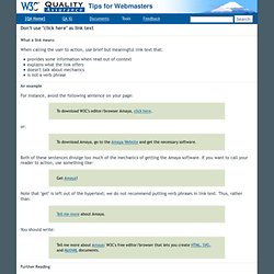
Both of these sentences divulge too much of the mechanics of getting the Amaya software. Get Amaya! Note that "get" is left out of the hypertext; we do not recommend putting verb phrases in link text. Tell me more about Amaya. You should write: Tell me more about Amaya: W3C's free editor/browser that lets you create HTML, SVG, and MathML documents. Further Reading.