
The Elements Of Navigation. Advertisement When users look for information, they have a goal and are on a mission.
Even before you started to read this article, chances are you did because you either had the implicit goal of checking what’s new on Smashing Magazine, or had the explicit goal of finding information about “Navigation Design”. After a couple of seconds of scanning this article, and maybe reading parts of the introduction, you may have started to ask yourself whether the information that you’re consuming at the moment is actually relevant to you—the user. Unfortunately (and as certain as death and taxes), if users cannot find the information they are looking for, chances are they will abandon their track, never to return. Being the compassionate human being that I am, I’ll try to explain to you what this article is about, so you can make your choice either to continue reading, or not.
Words, Words, Words “This might be a good start!” User-Testing Labels Another test is a Word Association3 game. What Is What. We need a standard show navigation icon for responsive web design. You know those responsively designed sites where — on small screens like smartphones — navigation is either hidden or set at the bottom of a layout, then revealed when you click a button?
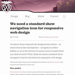
Well, I think we need a standard ‘show navigation’ icon for that button in responsive web design. I flicked through responsively designed sites featured on Media Queries and found several different icons in use. Plus symbol Macdonald Hotels have chosen a plus symbol accompanied by the word “show” (show what?) For their collapsed navigation. Using a plus symbol to reveal navigation could be confusing, as it usually indicates that you can can add something.
An event in CalendarA contact in Contacts A friend in Find My FriendsA note in NotesA URL in ReadabilityA reminder in, err, Reminders You get the idea. Grid icon YouTube’s mobile site uses a 3x3 grid icon to indicate navigation. Unordered list icon Designers understand this but do normal people? Three lines And show navigation in Path. But hey. The Case Against Vertical Navigation - Smashing Magazine. Advertisement In a recent article about unusable and superficial beer and alcohol websites, I made the claim that using left-hand vertical navigation is an out-of-date method in modern web design.
In the comments, a few people wondered why I said this. I was surprised that it got any attention at all, because it was a brief comment in the article, and didn’t constitute a substantial part of the argument I had put forth. Nonetheless, I decided to write an article describing what I feel is a solid case against using vertical navigation in modern web design. Naturally there are exceptions to every rule, and I’ll discuss those briefly at the end. It should be noted here that when I refer to “vertical navigation”, I’m talking about the top-level, primary means of navigating a website.
It Discourages Information Architecture Thora Industrial Plastics Believe it or not, I designed the Thora website in the spring of 2001. Design Should be Based on Careful Content Analysis Dan Conaway WebDesignGuys.