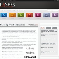

Fontly. Choosing Type Combinations Layers Magazine. One of the most challenging—but also one of the most satisfying—aspects of designing with type is choosing several typefaces that “look great together.”

But who’s to say what looks great together? Often you choose several faces and after experimenting for a while, you instinctively know that a particular combination “works.” But since we’re all so busy and under such deadlines, we need to find type solutions quickly. To do that, it helps tremendously to be able to put into words exactly why a particular combination doesn’t work and what to look for when trying to find faces that complement each other. First, follow the Holy Font Guideline #1 when choosing different typefaces for a piece: Concord or contrast, but don’t conflict. Choosing Type Combinations - Layers Magazine. 10 Great Google Font Combinations You Can Copy. The average man considers which flavor of Doritos will taste good with his Heineken.

The sophisticated man considers which cheese will pair well with his choice of wine. The designer of course considers which two fonts will look great on the same page. Today we’re going to use the Google Font API as a playground for mixing fonts and finding ideal pairings. You’ll be able to skim through and instantly grab out selections that you think are appropriate for your projects. The best part? Ask H&FJ: Four Ways to Mix Fonts.