
8 Enormous Things That Are Smaller Than Apple, Inc. [INFOGRAPHIC] Apple has been flirting with the title of "World's Most Valuable Company" for a good part of 2011.
![8 Enormous Things That Are Smaller Than Apple, Inc. [INFOGRAPHIC]](http://cdn.pearltrees.com/s/pic/th/enormous-smaller-infographic-19058314)
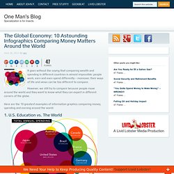
At a current market cap of about $370 billion (give or take an app), the tech giant's value is now greater than the revenues of some entire global industries. That's a hard concept for us non-billionaires to wrap our enfeebled minds around. 10 Astounding Infographics Comparing Money Matters Around the World. 47 Flares Google+ 2 Twitter 31 Facebook 4 Reddit 1 StumbleUpon 1 Pin It Share 0 LinkedIn 8 inShare8 47 Flares × It goes without the saying that comparing wealth and spending in different countries is almost impossible: people work, earn and even spend differently – moreover, their ways of life and views can be too different to compare.

However, we still try to compare because people move around the world and they want to know what they can expect in different corners of the globe. Here are the 10 greatest examples of information graphics comparing money, spending and earning around the world: 1. U.S. The most interesting finding of the stats research and the visualization: The U.S. is the clear leader in total annual spending, but ranks 9th in Science performance and 10th in Math. Note: It is unclear what was the measure used to compare the countries in their math and science performance. 2. Death and Taxes 2012. It's the government, in six square feet. Infographic: Apple Users Donate More Than PC, Android Users. Recent research conducted by Razoo about online fundraising has produced some interesting results, suggesting that Apple users donate significantly more (up to 40% more per donation) than their PC or Android using counterparts.

It’s worth noting that this could be for several reasons – it’s possible that Apple users make more money, they may actually be more generous, or it might even be that something about Mac OS X or iOS drives users to give more, but the end result is interesting regardless of the reason. Razoo has put together a nice infographic summing up their findings. Check out the infographic, and for more information, including the exact figures used, head on over to the original post at Razoo. Apple: Overview. This site requires a more recent version of Adobe Flash Player to function properly.

Go here to get Flash. Below are key drivers of Apple's value that present opportunities for upside or downside to the current Trefis price estimate for Apple: iPhone iPhone market share: Apple's iPhone market share has increased at a fast rate from around 0.3% in 2007 to 8% in 2012, as per our estimates. Going forward, we expect it to continue to increase steadily to around 15% by the end of Trefis forecast period. For additional details, select a driver above or select a division from the interactive Trefis split for Apple at the top of the page. Apple makes money primarily by selling mobile phones, computers, and portable media players to consumers worldwide.
We believe the iPhone segment is more valuable than the Macintosh and iPod segments for two primary reasons: Large mobile phone market High iPhone profit margins Tablet growth not cannibalizing Apple product sales Browser improvements to smartphones. 23% of Global Population Never Uses the Internet for Health Info [INFOGRAPHIC] Mashable's Social Good Summit is in full swing.
![23% of Global Population Never Uses the Internet for Health Info [INFOGRAPHIC]](http://cdn.pearltrees.com/s/pic/th/population-infographic-16161447)
David Armano, Edelman Digital's EVP of Global Innovation and Integration spoke Monday about how digital innovation is impacting global health. Edelman surveyed more than 15,165 people to create a global confidence index: how healthy different countries believe they are. While most values seem high, the survey shows how cultural views of health can skew responses. In India, Armano said, percentage is high because good health is measured just by access to clean water. Japan's percentage might be low, despite its record of long life-expectancy, due to the recent earthquake, tsunami and ensuing crises. But Edelman took the survey one step further, comparing these values to how people keep up their health and how they use the Internet. Have a look at Edelman's graphic below and compare it to the Digital Engagement just below it. Image courtesy of Flickr, jfcherry. Digital Capital LUMAscape. How Does The Current Tech Startup Craze Compare To The Dot.com Bubble Burst.
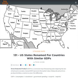
Standard & Poor's Credit Rating for each country. 131 - US States Renamed For Countries With Similar GDPs. By Frank Jacobs Gross Domestic Product (GDP) is a convenient way of measuring and comparing the size of national economies.

Annual GDP represents the market value of all goods and services produced within a country in a year. Put differently: GDP = consumption + investment + government spending + (exports – imports) Although the economies of countries like China and India are growing at an incredible rate, the US remains the nation with the highest GDP in the world – and by far: US GDP is projected to be $13,22 trillion (or $13.220 billion) in 2007, according to this source. Infographic: How Much Are The Top Private Company Founders Worth? - SVW (Build 20110413222027)